
 Laily UPN
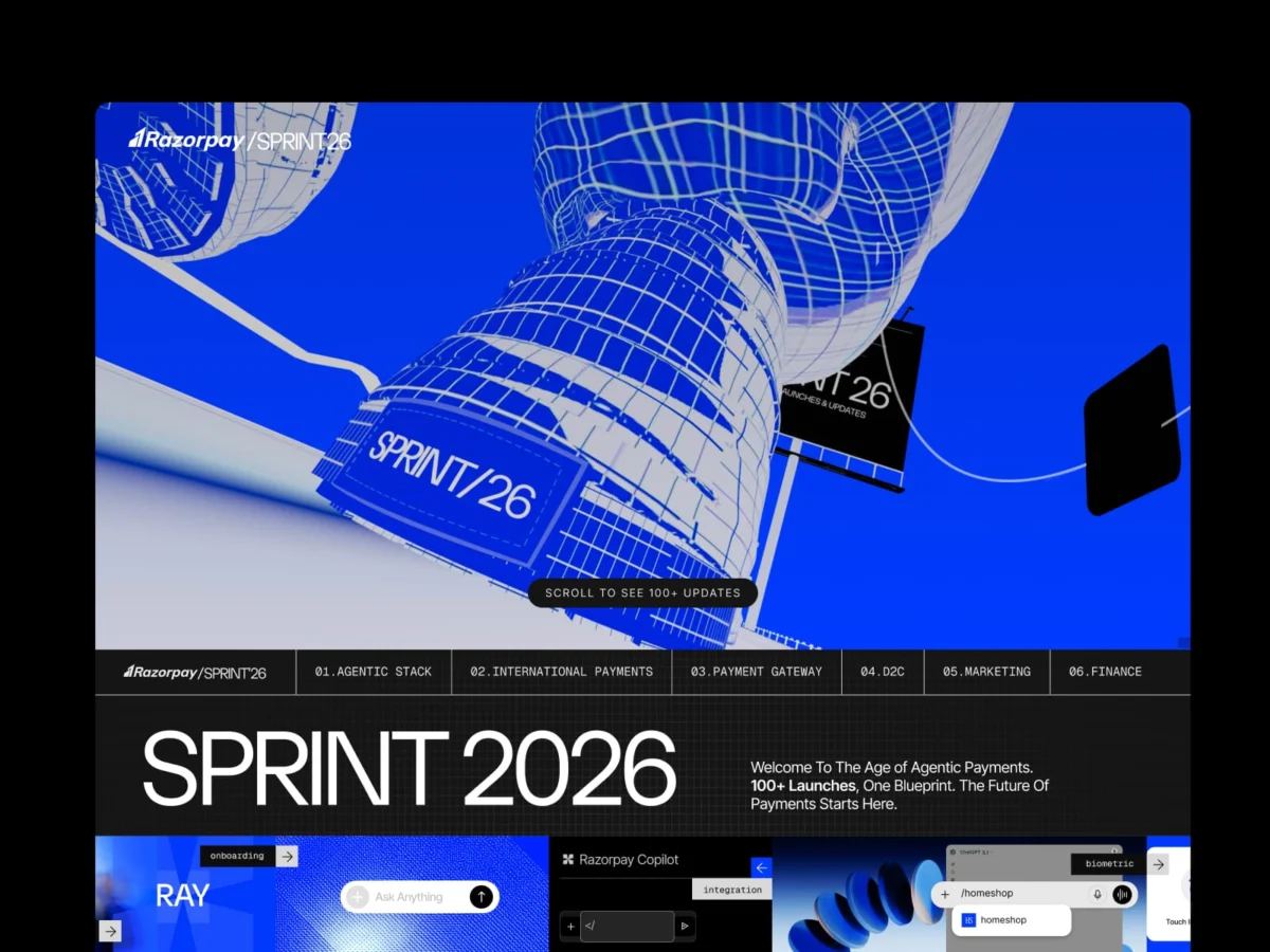
In the sterile world of B2B fintech, the rulebook is as rigid as a bank ledger: lead with trust signals, display a pricing table above the fold, and keep the product dashboard front and center. It is a formula designed for safety, predictability, and immediate conversion.
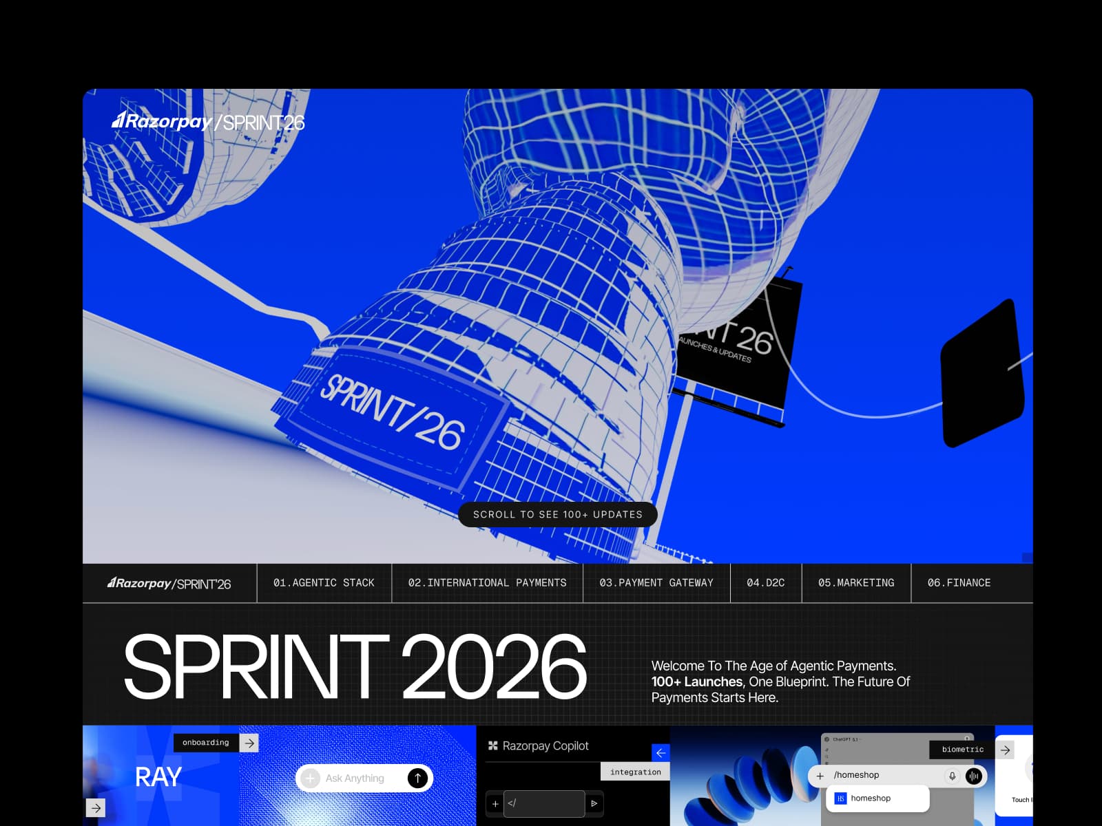
Razorpay, India’s leading payment infrastructure provider, recently shattered this orthodoxy with the launch of "Sprint26." Rather than greeting users with a sterile hero image or a list of API capabilities, the company’s annual innovation showcase opens with a massive, floating sneaker. It is a jarring, surreal, and deeply intentional departure from industry standards. By prioritizing narrative over immediate feature-dumping, Razorpay has provided a masterclass in how to translate complex technical infrastructure into a cohesive, immersive, and human-centric experience.
The Genesis: From Feature Lists to Narrative Journeys
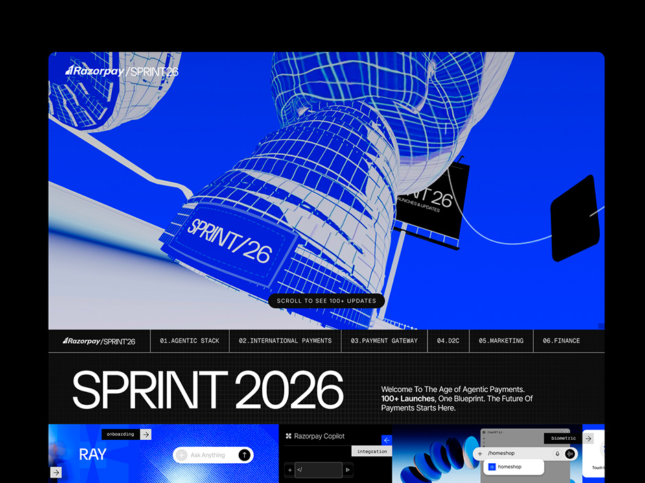
Sprint26 represents the pinnacle of Razorpay’s annual product cycle—a digital event analogous to Apple’s WWDC, tailored for the Indian financial ecosystem. The 2026 edition was tasked with the Herculean challenge of articulating over 100 distinct product updates across six critical verticals: Agentic Stack, International Payments, Payment Gateway, D2C, Marketing, and Business Banking.
The traditional approach to such a volume of information would be a dense, multi-column grid of product cards. However, the design team recognized that a grid would fail to capture the vision of the company’s latest evolution: the "Age of Agentic Payments."
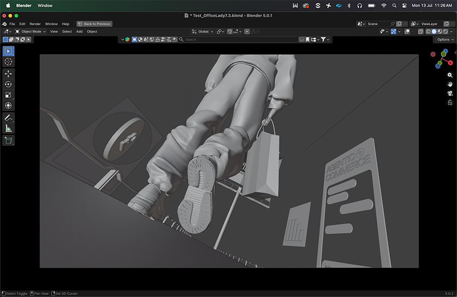
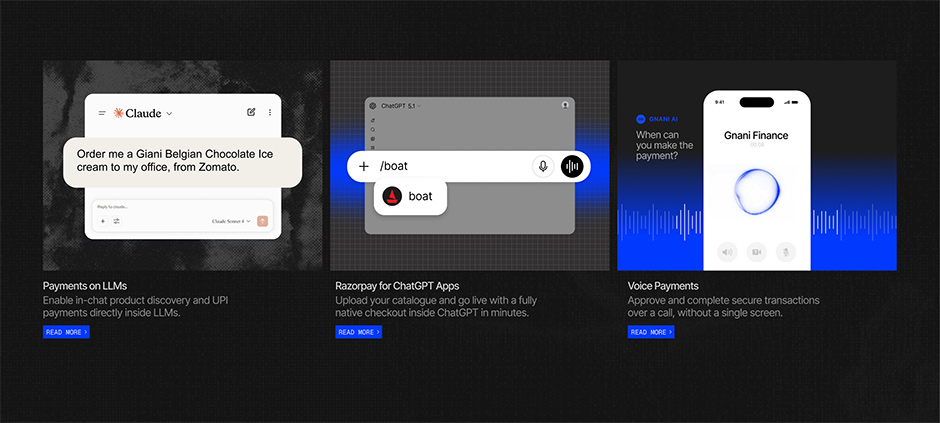
The central metaphor—the shopper’s journey—emerged from the product itself. With the advent of AI-led commerce, where consumers complete purchases within LLMs, voice assistants, and chat interfaces, the concept of a traditional "checkout page" is becoming obsolete. By centering the website around a continuous, scrollable narrative of a shopper navigating a digital store, Razorpay successfully mirrored the fluidity of its new infrastructure. The website stopped being a brochure and became a simulation of the future they were building.
Chronology of a Disruption
The development of Sprint26 was a rapid, two-month sprint that challenged the conventional separation between design and development.
- Phase 1: Conceptualization and Metaphor (Weeks 1–2): The team moved away from product-first design, focusing instead on the "Agentic" theme. The giant shoe was selected as the hero element—not as a gimmick, but as a symbolic anchor for consumer-facing, AI-driven commerce.
- Phase 2: Architectural Blueprints (Weeks 3–5): The team adopted a "modern blueprint" aesthetic. By utilizing a monochromatic palette of Electric Blue (#0039FF) and near-black (#151515), they ensured that the complex animations and 3D spatial transitions remained legible and focused.
- Phase 3: The Build (Weeks 6–8): This phase saw the most significant departure from corporate norms. The Communication Design team at Razorpay took full control of the build in Webflow, bypassing the traditional "design-to-dev" handoff. This allowed for real-time adjustments to scroll curves, physics, and interaction triggers without the dilution that occurs in standard agency-client pipelines.
- Launch Day: The site went live, marking a transition from a static repository of product specs to a dynamic, interactive storytelling platform.
Technical Architecture: Engineering the "Living" Web
The success of Sprint26 lies in its technical execution. The site is a feat of browser-based performance, managing over 100 interactive triggers without sacrificing speed or fluidity.
The Stack
The team utilized a robust stack to achieve their vision:
- Animation Engine: Rive was used to build state-machine-driven animations, ensuring that interactions were responsive to user behavior rather than just scroll depth.
- Spatial Layer: Three.js and WebGL provided the 3D depth, allowing the "walking figure" and the floating objects to transition seamlessly between sections.
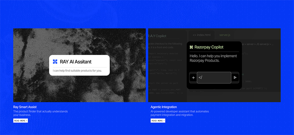
- Content & Logic: Claude and ChatGPT were deeply embedded in the workflow, acting not as automated writers, but as co-architects for interaction logic and information hierarchy.
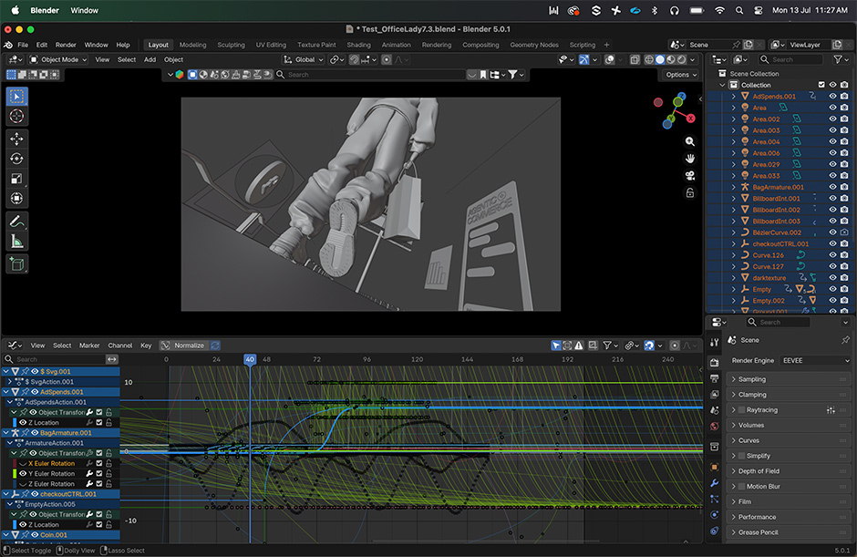
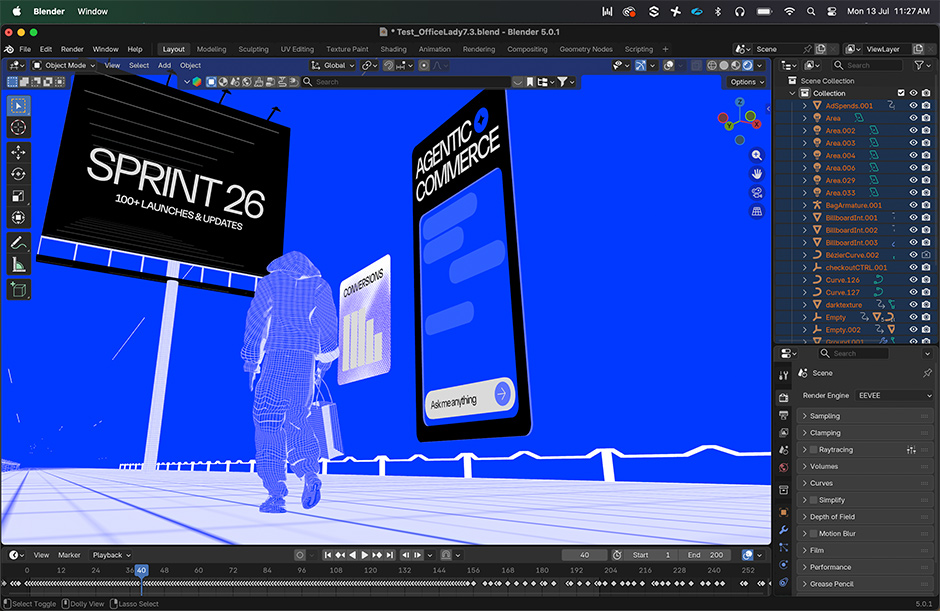
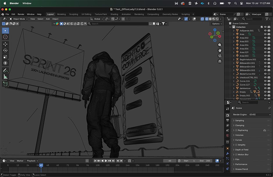
- Asset Creation: Blender Studio served as the foundation for the 3D assets, which were then optimized for the web environment.
By compiling animations to WebAssembly via Rive, the team ensured that the site remained fast, despite the high density of visual data. Every animation was designed to be "earned"—there are no looping GIFs. If a feature card unfolds or a pipeline diagram assembles itself, it is because the user has scrolled to the exact point where that information is required.
Official Perspectives: The Philosophy of "Design-as-Builder"
The decision to handle the entire project in-house was a calculated risk that paid off in creative consistency. According to the design leadership at Razorpay, the "design-as-builder" model is the future of high-velocity tech companies.
"In most organizations, the thing that gets built is a compromise," says a spokesperson from the Communication Design team. By erasing the gap between the designer’s intent and the final deployment, the team avoided the "technical debt of communication" that often ruins ambitious projects.
The project was not just an aesthetic endeavor; it was an internal culture shift. It proved that designers who are proficient in tools like Webflow and Rive can execute at a level that traditionally required an army of front-end developers. This "tool-native" approach allowed the team to iterate at lightning speed, ensuring that the final output remained true to the original, unconventional vision of the "giant shoe."
Implications: The New Benchmark for B2B
The success of Sprint26 signals a paradigm shift for B2B marketing. The "safe" choice—the grid of feature cards—is no longer the only way to communicate enterprise-grade technology.
1. The Death of the "Safe" Website
Razorpay has demonstrated that B2B customers, even in the highly regulated fintech sector, are attracted to bold, narrative-driven experiences. The "shoe" was not a distraction; it was a hook that signaled that the company is playing on a different field than its competitors.
2. The Rise of Narrative-First Tech
For companies launching dozens of products simultaneously, the challenge is not just information delivery—it is information synthesis. By framing 100+ updates within a single, continuous, and logical journey, Razorpay avoided the "feature soup" that plagues most product launch pages.
3. The In-House Advantage
The "no-agency" model used by Razorpay serves as a case study for internal teams. By keeping the design-build cycle in-house, companies can maintain a level of craft and coherence that is almost impossible to replicate when outsourcing, especially when the project requires deep integration between brand identity and complex product logic.
Conclusion: A New Blueprint for Innovation
Sprint26 is more than just a website; it is a declaration of maturity. By rejecting the tropes of its industry, Razorpay has set a new standard for how fintech companies present themselves to the world. It proves that the future of commerce—which is increasingly autonomous, agentic, and invisible—requires a front-end that is equally sophisticated.
The giant shoe at the center of the experience was a bold, deliberate rejection of mediocrity. In an industry where trust is usually bought with predictable, boring UI, Razorpay chose to earn it through unparalleled execution and creative bravery. As the industry moves toward a future where payments are increasingly integrated into the background of our digital lives, the lesson of Sprint26 is clear: if you want to tell a story about the future, you have to build it, not just describe it.
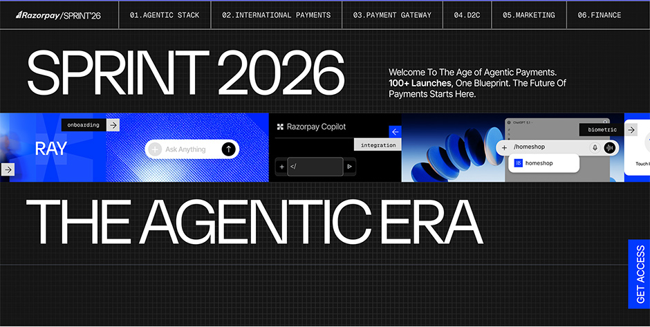
The team behind Sprint26—Priyank Hegde, Divya Lohia, Aman O S, Rajat Bire, Monika Maharana, Rashi Mishra, and Anushka Braganza—have proven that when designers become builders, the results are nothing short of transformative. The "Blueprint for a New Kind of Fintech Web" has been written, and it is a map that leads far away from the safety of the grid.

 Sagoh

 Asep Darmawan
 Raul Delapena Setiawan

 Reynand Wu


 Azzam Bilal Chamdy

 Ali Ikhwan
