
 Nana Wu
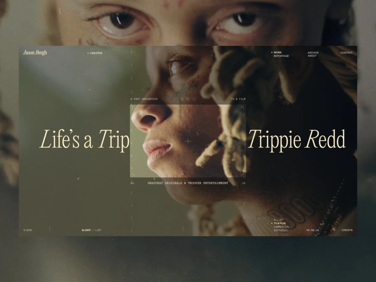
In an era defined by hyper-optimized conversion funnels and the frantic pace of the "attention economy," most digital portfolios function as glorified brochures—static grids designed to categorize, label, and direct. However, the latest project from the boutique creative studio BL/S® for acclaimed director Jason Bergh stands as a defiant rejection of this status quo.
This was not an exercise in web development; it was a translation of a creative philosophy. By stripping away the conventional "digital architecture" of menus, sidebars, and explicit navigation, the team created a space that prioritizes presence over utility, and rhythm over categorization.
Main Facts: The Philosophy of Subtraction
The core objective of the collaboration between Jason Bergh and BL/S® was to reconcile the director’s cinematic medium—built on emotion, tension, and pacing—with the constraints of a digital interface. Traditional websites, the team argued, were too "noisy," filled with instructional layers that distracted from the work itself.
The result is a digital environment that behaves less like a website and more like a cinematic screening room. By intentionally killing the interface, the designers shifted the focus from "operating" a site to "experiencing" a space. This project challenges the industry-standard belief that a portfolio must explain itself; instead, it trusts the viewer’s intuition to navigate through a sequence of curated, emotive scenes.
A Chronological Evolution: From Structure to Flow
The development process was characterized by a deliberate departure from established UX patterns. The journey can be broken down into three distinct phases:
Phase I: The Audit of Noise
Initially, the team evaluated Bergh’s existing digital footprint. While technically functional, the site relied on standard UI patterns that failed to capture the gravitas of his directing work. The realization dawned that adding features would only increase the "signal-to-noise" ratio. The team concluded that they weren’t tasked with building a better website, but rather with excavating a more authentic digital presence.
Phase II: The Act of Subtraction
The second phase saw the systematic removal of traditional navigation elements. Menus became ephemeral, then entirely absent. Every button, prompt, and instructional label was scrutinized; if it didn’t contribute to the atmosphere, it was removed. This was not minimalism for the sake of aesthetics, but for the sake of clarity. By creating "white space" in the interaction design, the team provided the audience with the mental room to process the director’s work without interruption.
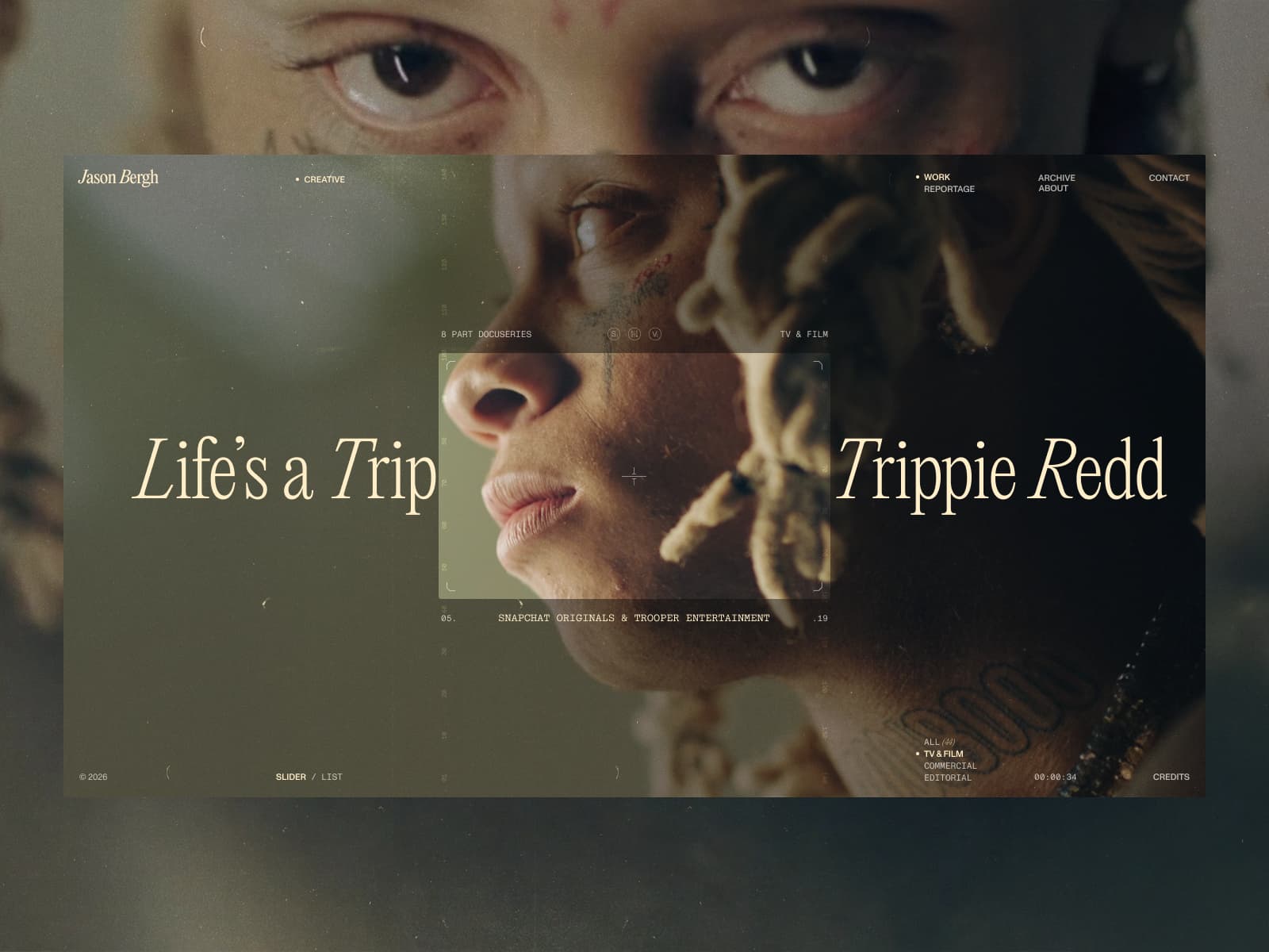
Phase III: Engineering the Rhythm
The final phase focused on technical execution. With the "crutches" of traditional UI gone, the burden of communication shifted entirely to motion and timing. The team utilized GSAP (GreenSock Animation Platform) to manage the sequencing, treating every scroll event as a "cut" in a film. Transitions were no longer just functional movements; they became narrative devices that guided the viewer through a carefully curated temporal experience.
Supporting Data: The Technical Architecture
To achieve a seamless, fluid experience without the overhead of traditional page-based architecture, the technical requirements were rigorous. The project necessitated a shift in how frontend frameworks are typically deployed:
- Frontend Precision: The site relies on a bespoke implementation of JavaScript and GSAP to ensure that animation triggers are precise. The team prioritized "perceived performance," ensuring that the load times for high-fidelity video content felt instantaneous.
- Backend Restraint: A lightweight, headless backend was employed, stripping away unnecessary database queries to favor a fast, content-first delivery model.
- Performance as Design: The engineering team treated performance as a creative constraint rather than a technical hurdle. Every line of code was evaluated for its impact on the "rhythm" of the user experience.
Official Perspectives: The Philosophy of Trust
In reflecting on the project, the creators at BL/S® emphasized that the greatest challenge was a psychological one: the willingness to cede control.
"We had to step away from the idea of structure altogether," the studio noted. "There is a strong tendency in digital design to anticipate every user action and provide guardrails. We chose to move in the opposite direction."
This approach requires "trust in the audience." By removing explicit paths, the design forces the viewer to engage with the content intuitively. While this risks alienating users who prefer the efficiency of a traditional sitemap, it rewards those who are willing to linger. As the studio stated, "Not every digital project needs to solve a problem in the traditional sense. Some are meant to create a specific feeling and hold it long enough for it to resonate."
Implications for the Creative Industry
The collaboration between Jason Bergh and BL/S® carries significant implications for the future of creative web design:
1. The Death of the "Template"
The industry’s reliance on template-based, modular design has led to a homogenization of creative portfolios. This project serves as a case study for why bespoke, motion-led experiences are essential for high-end creative professionals. It suggests that if your work is unique, your digital home should not be built from a standardized kit.

2. Motion as Narrative
The project effectively argues that motion design should no longer be a secondary layer of "delight" or "polish." Instead, it is the primary interface. By using motion to establish continuity, designers can remove the need for explicit navigational signposts, allowing for a more immersive and cinematic brand experience.
3. The Shift from Efficiency to Resonance
Most UX research is focused on reducing "time-to-task." However, this project prioritizes "time-spent-with-content." In the context of film and high-end creative direction, efficiency is often the enemy of engagement. By slowing the user down, the site ensures that the work is not merely scanned, but felt.
Conclusion: A New Standard for Digital Presence
The portfolio created for Jason Bergh is a masterclass in restraint. It stands as a testament to the idea that in a digital world drowning in data, silence and space are the most valuable commodities.
By treating the screen as a canvas for a film rather than a dashboard for a database, BL/S® has successfully created an environment that reflects the true nature of its subject. It is an experience that demands attention not through flashing lights or intrusive prompts, but through the sheer coherence of its rhythm. For directors, artists, and creators who prioritize the emotional impact of their work, this project sets a new, elevated benchmark for what a digital presence can truly achieve.
About BL/S®:
Based at the intersection of luxury and rebellion, BL/S® is a boutique creative studio dedicated to pushing the boundaries of web experience. With a track record of winning SOTY (Site of the Year) honors and Lovie Awards, the studio specializes in crafting immersive, motion-heavy digital landscapes for clients who refuse to conform to the standard digital mold.
- Website: blacklead.studio
- Socials: @blacklead.studio | @blackleadStudio

 Sagoh

 Asep Darmawan

 Raul Delapena Setiawan

 Reynand Wu



 Azzam Bilal Chamdy

 Ali Ikhwan
