Rifan Muazin
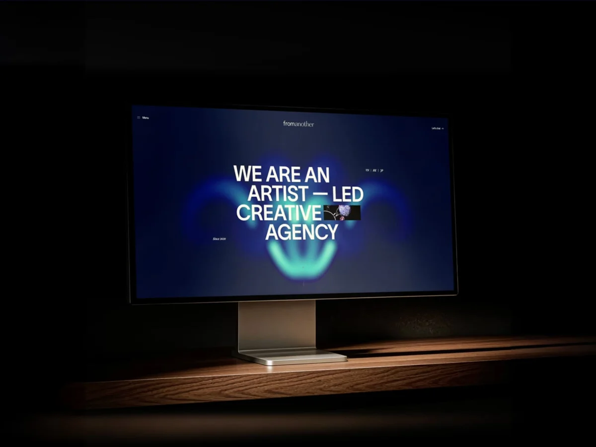
In the shifting landscape of digital branding, many agencies find themselves trapped in a taxonomic struggle. Are they a studio? A collective? A production house? For the creative powerhouse fromanother, the answer is purposefully elusive. Their newly unveiled digital experience, fromanother.love, is more than a portfolio; it is a manifesto on the necessity of fluid identity in a rigid industry. By eschewing the conventional "case study" grid for an immersive, light-driven environment, the agency has crafted a space that refuses to be pinned down.
The Core Concept: Representing the Intangible
For years, fromanother has navigated the liminal space between commercial output and artistic practice. This duality is their greatest asset, yet it posed a significant design challenge: how do you visually represent a brand that defies definition?
The solution was found in the physics of light. The agency’s creative directors opted for a visual language defined by swirls of luminescence, fluid motion, and atmospheric shifts. Unlike traditional websites that rely on rigid UI components, fromanother.love treats the browser window as an ecosystem. As the user scrolls, the background drifts through evolving color states, creating an ambient energy that mirrors the brand’s dynamic nature without distracting from the core content.
This visual strategy is anchored by a strict design discipline: the foreground remains stark, minimal, and typographic. This contrast allows the "intangible" background to breathe while ensuring that the agency’s professional services—brand, film, 3D, and experiential design—remain legible and focused.
Chronology: A Evolution of Clarity
The path to this current iteration of fromanother.love was not an overnight endeavor. It represents the culmination of years of iterative development and internal reflection.
Phase 1: The Initial Foundation
The previous version of the site performed its duty adequately, serving as a functional repository for client work. However, the team realized it lacked a cohesive narrative voice. It was built during a period where the agency was still discovering its own identity, leading to a site that felt somewhat disconnected from the actual depth of their output.
Phase 2: The Period of Synthesis
Between the launch of the original site and the current redesign, the agency underwent a massive maturation process. They expanded their presence across Vietnam, China, and France, diversifying their portfolio and refining their creative strategy. This period served as a "slow-build" for the brand’s philosophy. They stopped trying to force the brand into a specific box and instead embraced their role as an artist-led entity.
Phase 3: The Redesign
With a clearer understanding of their own value proposition, the redesign began. The team took a subtractive approach: they kept the functional structures that worked and discarded the "desire-based" features that lacked justification. The resulting experience is a testament to the belief that true innovation comes from restraint.

The Technical Alchemy: "Cheating" the Impossible
One of the most compelling aspects of the new site is its technical execution. In an era where many agencies over-engineer their sites with heavy shaders and complex GLSL code, fromanother took a more pragmatic—and often more effective—approach.
The Illusion of Complexity
Visitors often assume that the shifting background gradients and ethereal menu transitions are the result of high-octane 3D shader work. In reality, the team utilized a clever mix of layered videos with varying opacity and blend modes. This "cheat" provides the desired fluid aesthetic without the performance tax associated with complex real-time rendering.
Targeted 3D Integration
The team recognized that while video layering could handle the atmosphere, true 3D was required for tactile interaction. They focused their heavy-duty technical resources on the "ripple" effect, implemented using Three.js and React Three Fiber.
"The goal was never to build something technically impressive for its own sake," the agency noted in their internal post-mortem. "It was to make something that feels right and leaves the method hidden." This discipline—knowing which illusions to build and which to fake—marks a significant departure from the trend of "tech-first" web design.
Supporting Data: The Stack and Performance
The technical backbone of the project was designed to facilitate, rather than dictate, the user experience.
- Core Framework: Next.js and React.
- Content Management: Prismic (Headless CMS).
- Interaction/Motion: GSAP and React Three Fiber.
- Fine Control: Web Animations API.
The primary engineering hurdle was not the stack itself, but performance optimization. By offloading the visual heavy lifting to optimized video assets and confining the WebGL interaction to specific "ripple" zones, the agency achieved a seamless, continuous browsing experience that feels as fluid on mobile devices as it does on desktop.
Official Perspective: The Art of the Wandering Eye
The agency’s approach to user interaction is rooted in the philosophy of a modern art museum. For instance, the showreel is not forced upon the visitor. It exists as a small, unassuming thumbnail within the "Artist-Led" section. If a user chooses to engage, it expands; if they move past it, the narrative of the site continues uninterrupted.
This "wandering" design extends to the layout itself. Team members are arranged diagonally, forcing the eye to traverse the screen, while services and client lists scroll on calculated curves. By refusing to follow the standard "top-to-bottom" consumption pattern, fromanother forces the user to become an active participant in the discovery process.

The "Lab"—a dedicated page for non-client experimental work—serves as the bridge between the agency’s two halves: the commercial and the artistic. It is here that the duality of the brand is most fully realized, providing a space for pure expression that requires no client brief or external justification.
Implications for the Creative Industry
The success of the new fromanother.love signals a broader shift in the digital agency world. As generative AI and standardized website builders continue to commoditize the "standard" portfolio, agencies are finding that differentiation lies in the intentionality of their digital presence.
The Death of the "Box"
By successfully resisting the urge to label themselves, fromanother proves that a strong brand identity is not about a static definition, but a consistent energy. The agency demonstrates that you do not need to choose between being an "artist" or a "consultant"; you can be a fluid entity that changes states based on the needs of the project.
The Value of Subtractive Design
The industry is currently saturated with "wow-factor" interactions that often result in high bounce rates due to poor performance or confusing navigation. Fromanother’s focus on "invisible methods" highlights a growing trend: the return to user-centric design where the technology serves the emotion of the brand, rather than the ego of the developer.
Final Thoughts: The Clarity of Maturity
The redesign of fromanother.love is a case study in the power of patience. The team acknowledges that they could not have built this version of the site years ago—they simply hadn’t earned the perspective required to execute it.
"Clarity is a slow-build resource," they reflect. By removing the noise and focusing on a core visual metaphor—light in motion—they have created a digital space that feels human, intentional, and profoundly modern. For the visitor, the site is a reminder that the most compelling stories are often the ones that are told through atmosphere rather than explicit instructions. In a digital world obsessed with pinning things down, fromanother has found a way to let their identity glow, shift, and, ultimately, remain free.

 Ali Ikhwan
 Lina Hope
 Siti Muinah
 Jia Lissa