Azzam Bilal Chamdy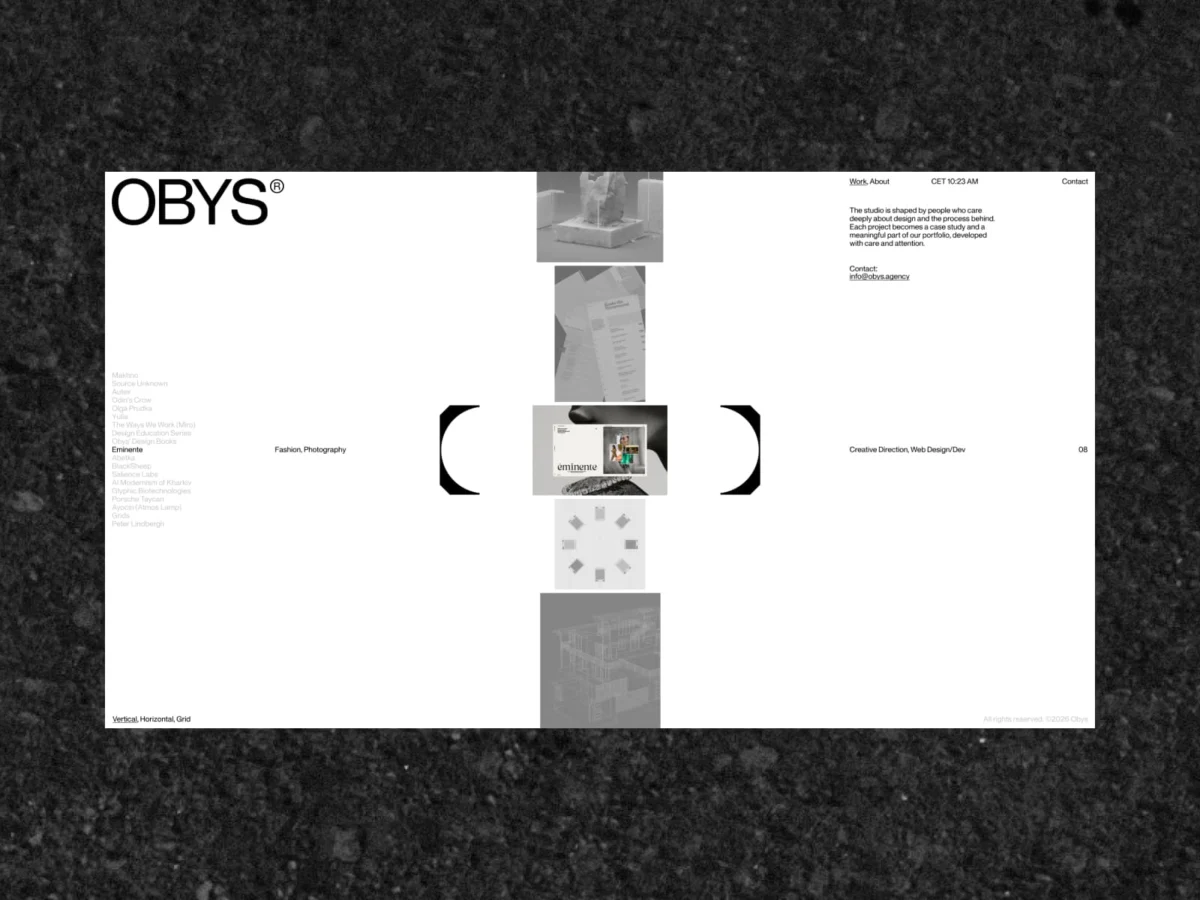
Every creative studio eventually arrives at a reckoning—a moment where the output of the present no longer aligns with the digital facade of the past. For Obys, the award-winning, EU-based concept-driven design studio, that moment arrived after seven years of rapid growth, hundreds of high-profile collaborations, and a constant sharpening of their creative philosophy.
The studio’s newly unveiled digital home is not merely a website; it is a manifestation of seven years of accumulated wisdom. It is a calculated exercise in reductionism, proving that in a digital landscape cluttered with noise, the most powerful design choice is often what you choose to leave out.
The Chronology of Transformation
The metamorphosis of the Obys brand did not begin with a sitemap or a mood board. It began with the fundamental building block of visual language: typography.
Phase 1: The Typographic Foundation
The studio recognized early on that their existing identity was beginning to feel like a relic of a younger, less defined firm. To bridge the gap between their current work and their brand identity, they embarked on the creation of OTF Obys NG.
This custom neo-grotesque typeface was designed to be the spine of the entire project. By developing their own font, Obys gained the ability to dictate hierarchy, rhythm, and character without compromise. The typeface serves as a functional tool for legibility and an expressive medium that communicates the studio’s modern, precision-oriented design ethos.
Phase 2: Refinement Over Reinvention
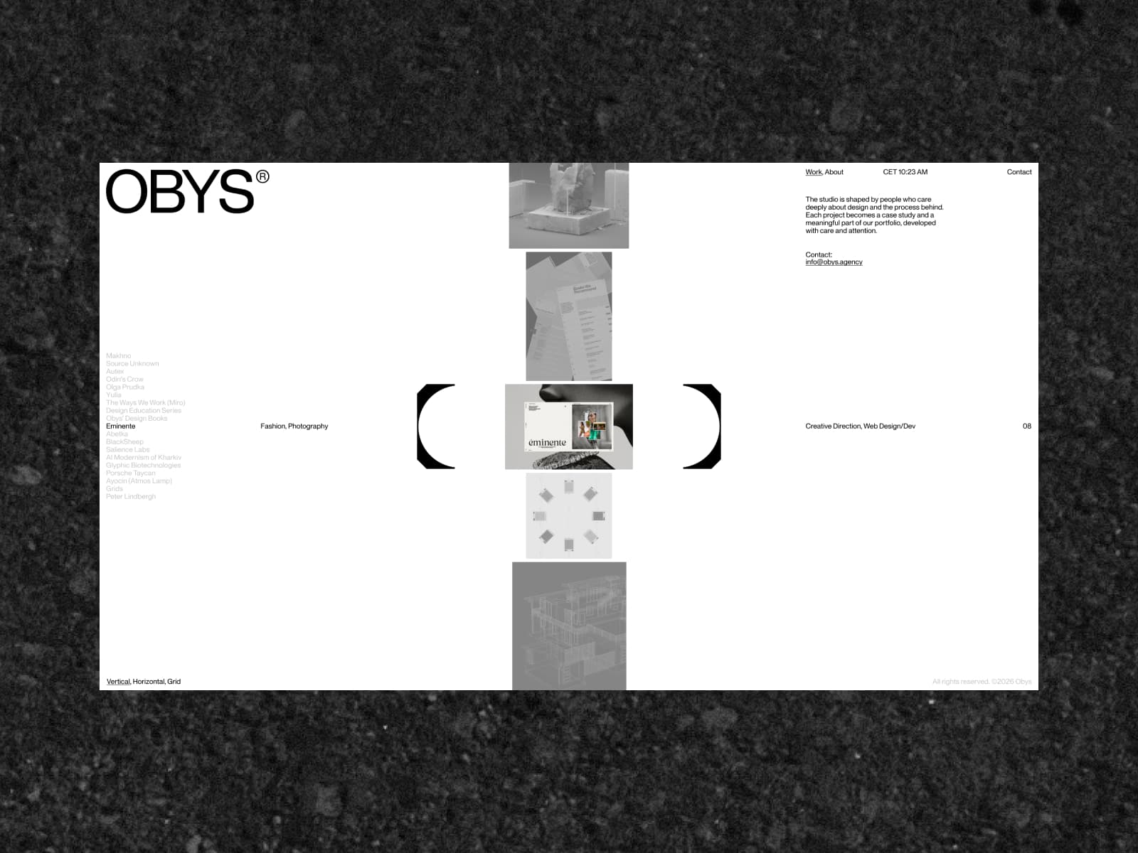
Once the typographic DNA was set, the design team turned their attention to the logo. Rather than discarding the existing brand mark—which held years of equity—they chose to refine it. The updated logo acts as a bridge, preserving the familiarity of the "Obys" identity while aligning its geometry with the sharper, more sophisticated design language of the new site.
Phase 3: Spatial Design and Motion Language
With the identity anchored, the team pivoted to the user experience. The concept evolved into viewing the website not as a page-based document, but as a "space." In this digital architecture, the logo is no longer a static header; it is an active, responsive entity that travels with the user, anchoring the navigation and tying disparate sections into a singular, cohesive environment.
Supporting Data: The "Less is More" Methodology
One of the most profound challenges in rebranding a seasoned studio is the "Archive Problem." After nearly a decade of international work, Obys faced an overwhelming catalog of projects, accolades, and experiments. The temptation to build a comprehensive, exhaustive digital museum was high.
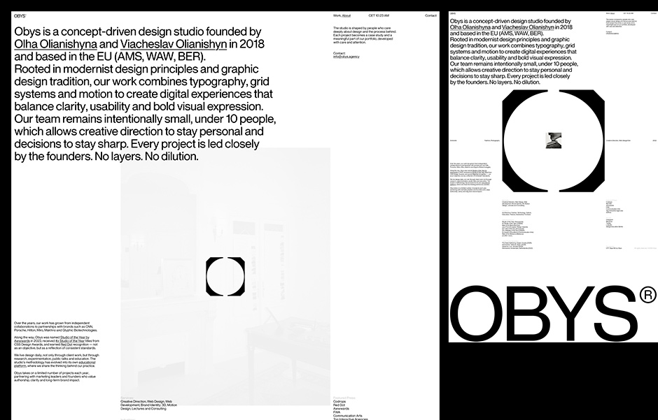
However, the team made a strategic decision to embrace radical curation. By stripping away legacy archives, secondary case studies, and extraneous awards lists, the studio achieved a level of clarity that is rare in the agency world.
Architectural Decisions
- Curated Portfolio: Instead of showing everything, the studio selected only the projects that reflect their current creative peak.
- Spatial Navigation: The site supports multiple viewing modes—vertical, horizontal, and grid—allowing the user to dictate how they consume the information, rather than forcing a linear narrative.
- Interaction Design: Motion is used as a functional bridge, not a decorative layer. Transitions between states (such as the light-to-dark transformation) serve to guide the user’s eye and provide a sense of place within the UI.
The Technical Infrastructure: Precision Engineering
While the visual design leans into minimalism, the backend is a testament to modern engineering efficiency. Obys moved away from the bloat of standard CMS-heavy frameworks to build a bespoke engine tailored for speed and control.
The Stack
- Runtime & Bundling: The site is powered by Bun, which handles both the HTTP server and the build processes, ensuring a lightning-fast delivery.
- Server-Side Logic: React is utilized strictly as a server-side templating engine. By eschewing client-side rendering, the team eliminated the "jank" often associated with heavy JavaScript frameworks, resulting in a cleaner, more performant user experience.
- Animation Engine: Animations, virtual scrolling, and page transitions are handled via an in-house system built on the Web Animation API and Request Animation Frame. This allows for fluid, frame-perfect interactions that feel native to the browser.
- Management: Content is handled through Strapi, while the visual styling is written in plain, uncompiled CSS, keeping the codebase transparent and easily maintainable.
Official Perspectives: The Philosophy of Omission
In explaining the shift, the team at Obys emphasizes the courage required to "leave things out." The new website is a direct response to the "more is more" trend that dominates contemporary web design. By reducing the UI to its absolute essentials, the studio invites the user to focus on the work itself.
"Sometimes clarity comes not from adding more, but from having the confidence to leave things out," the team noted in their launch manifesto. This sentiment echoes throughout the site’s design, where navigation is intuitive and predictable, allowing the creative output to occupy the center of the stage.
Implications for the Creative Industry
The new Obys website sets a benchmark for how established studios should approach digital evolution. It suggests that the future of agency branding lies in Systemic Identity—the idea that a logo, a typeface, and a line of code should function as a single, unified organism.
A Scalable System
This redesign is not an isolated digital project; it is a prototype for the studio’s broader operations. The principles established in this digital space—the rhythm of the typography, the logic of the motion, and the hierarchy of the content—are now being translated into the studio’s print materials, client presentations, and physical touchpoints.
The Shift Toward Performance
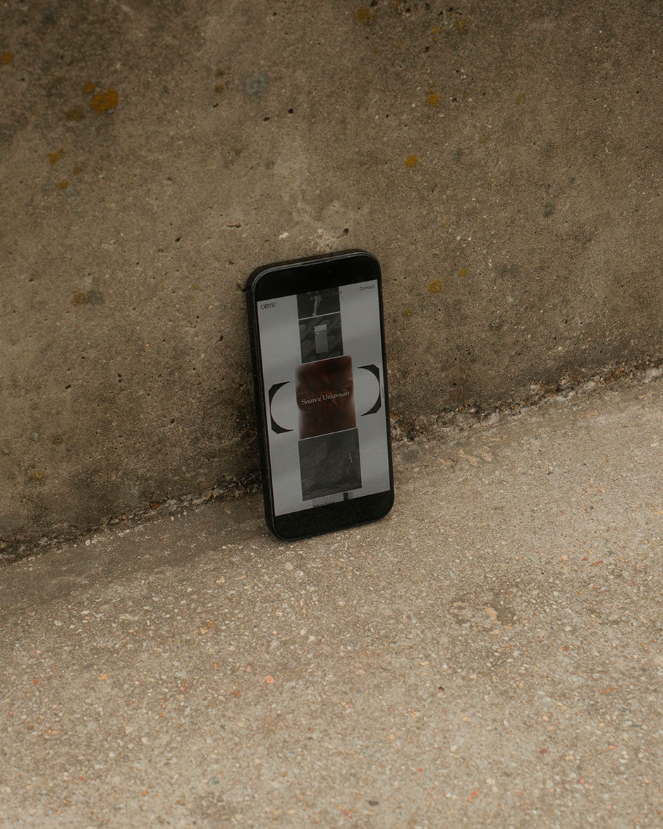
By prioritizing a "lightweight" technical approach, Obys is also taking a stance against the trend of over-engineered, heavy websites that often sacrifice accessibility and speed for unnecessary visual flair. The result is a platform that feels "effortless," a quality that is notoriously difficult to achieve in digital design.
Conclusion: A Living Document
The new Obys website is a testament to the fact that a brand is not a static logo—it is a living, breathing system that must evolve alongside the creators behind it. By successfully distilling seven years of experience into a refined, focused, and technically superior platform, Obys has provided a roadmap for how agencies can stay relevant in an ever-changing creative landscape.
As the studio continues to iterate, the platform remains built for growth. It is a space that is ready for the next hundred projects, not by becoming larger, but by remaining consistently, perfectly, and intentionally simple.
About the Studio
Obys is a concept-driven design studio based in the EU. Recognized as the Awwwards Studio of the Year 2023, they specialize in high-end digital experiences that prioritize motion, typography, and clean, modular systems. For more information, visit obys.agency.

 Asep Darmawan
 Raul Delapena Setiawan
 Lina Irawan
 Nana
Nana
 Rifan Muazin
 Ali Ikhwan
 Evan Lee Salim