
 Nana Muazin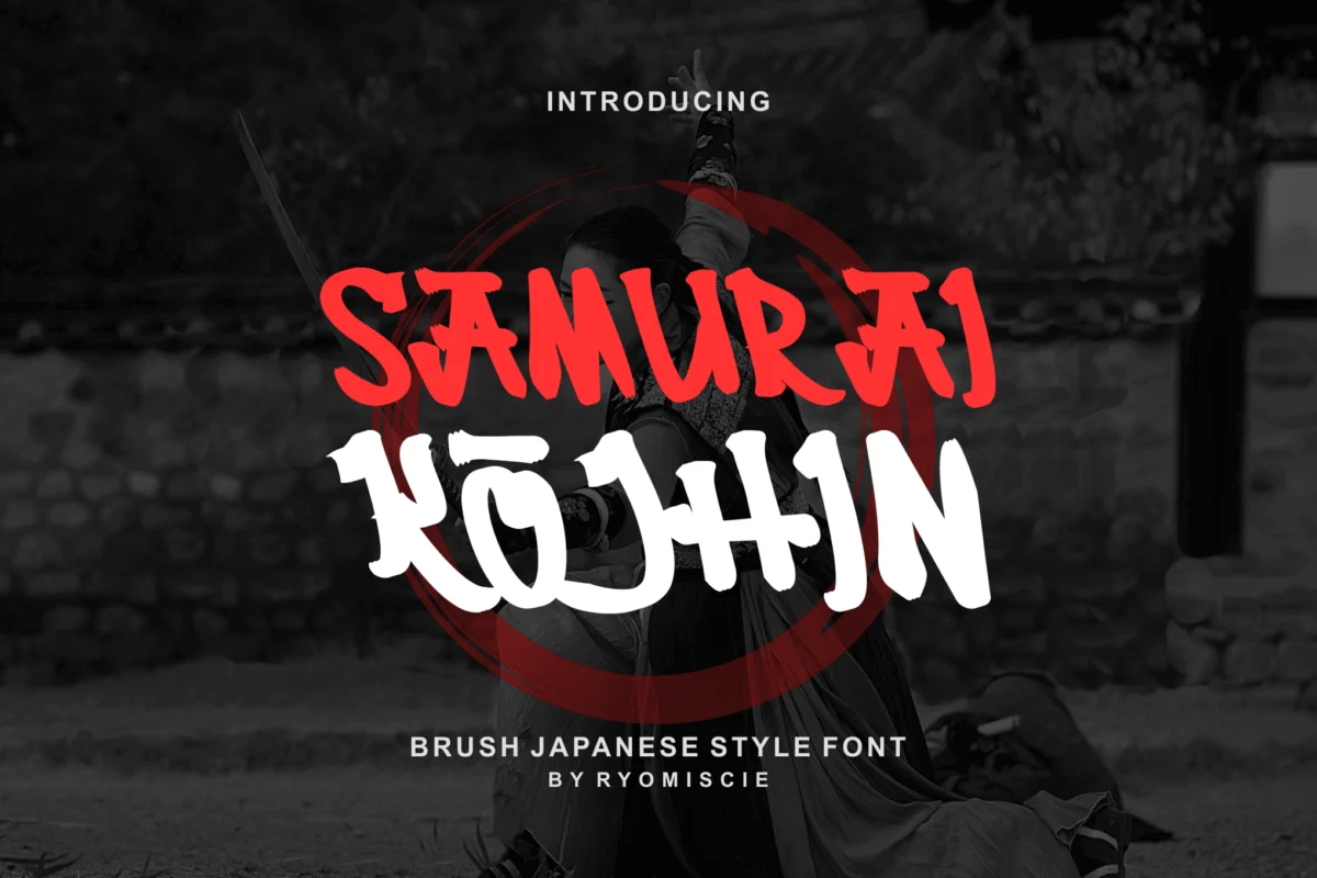
Few design elements command the same immediate, visceral reaction as typography inspired by the age of the samurai. These fonts do more than just display text; they evoke the clash of steel, the discipline of the dojo, and the quiet, lethal elegance of feudal Japan. By blending traditional Japanese aesthetics—such as shodo (calligraphy)—with modern, aggressive graphic design, these typefaces have become an essential tool for creatives looking to inject cinematic tension and cultural gravitas into their work.
Whether you are designing a logo for an esports team, crafting a title sequence for an action-oriented film, or developing branding for a high-end Japanese culinary brand, the right font acts as the visual voice of your narrative. This comprehensive guide explores the evolution, application, and top selections of samurai-inspired typography in the modern design landscape.
The Genesis of Samurai Aesthetics in Design
To understand the popularity of samurai-inspired fonts, one must look at the intersection of history and modern branding. The samurai era (roughly the 12th to the 19th century) is characterized by a paradox: extreme violence tempered by rigorous aesthetic refinement.
In the world of typography, this is translated through "brush-style" fonts. These typefaces aim to replicate the raw, unrefined energy of an ink-laden brush hitting handmade paper. The characteristics are distinct: irregular edges, varying line thickness (mimicking the pressure applied by a calligrapher’s hand), and a sense of movement that suggests a blade mid-swing. This "hand-painted" quality provides an authenticity that digital, sterile sans-serif fonts simply cannot replicate, grounding the design in human history while remaining versatile enough for the digital age.
Chronology: From Ancient Calligraphy to Digital Display
The journey of these letterforms can be traced through several distinct eras of design:
- The Classical Era (Pre-20th Century): The foundation was built on Sumie and Shodo. These were not "fonts" but unique artistic expressions where every character held spiritual and cultural weight.
- The Post-War Influence (Mid-20th Century): As Japan modernized, graphic design began to experiment with blending traditional scripts with Latin character sets. This was the birth of the "faux-Japanese" aesthetic, which sought to make Western characters feel "Eastern" in spirit.
- The Digital Revolution (1990s–2010s): With the rise of Adobe Creative Suite and accessible font creation software, independent designers began creating high-fidelity digital brushes that captured the "Samurai spirit" with mathematical precision, leading to the current golden age of thematic display fonts.
- The Cinematic/Gaming Renaissance (Present Day): Today, we see a massive demand for fonts that feel "cinematic." Titles like Ghost of Tsushima or the resurgence of samurai anime have pushed designers to create fonts that are not just readable, but atmospheric, often including "damage" textures or "slashed" stroke endings.
The Anatomy of a Warrior Font: Supporting Data and Features
When selecting a typeface for a project requiring a samurai aesthetic, designers look for specific technical features. A font that is merely "styled" is insufficient for professional work; it must be functional.
Key technical requirements for professional-grade display fonts include:
- OpenType Features: Ligatures and alternates are vital. A "samurai" font should ideally have multiple versions of each letter to avoid the repetitive look that gives away digital typesetting.
- Multilingual Support: As global branding grows, the ability to support diverse character sets (including those with diacritics) is essential.
- Versatility of Format: The industry standard remains a combination of OTF (OpenType Font) for high-end print and WOFF (Web Open Font Format) for web implementation.
- Stroke Contrast: The most effective fonts balance thick, heavy strokes (power) with thin, wispy ends (elegance).
Curated Collection: Premium Samurai-Inspired Typefaces
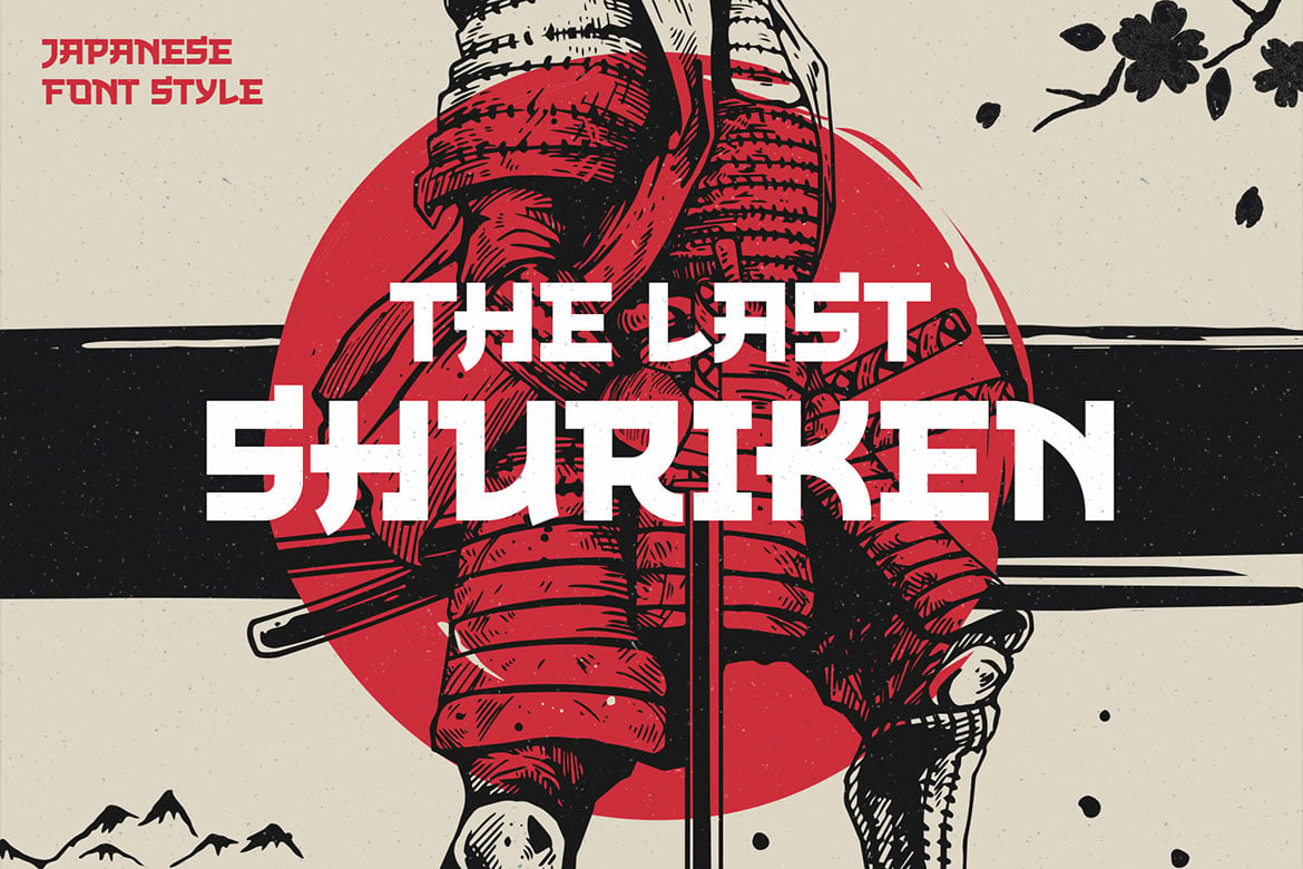
1. The Last Shuriken: The Modern Edge
The Last Shuriken is a dynamic all-caps typeface that draws heavily from modern food branding and high-octane anime aesthetics. It features a uniform cap height that allows for massive, readable titles. It is particularly effective for posters where the text needs to scream "action" without sacrificing legibility.
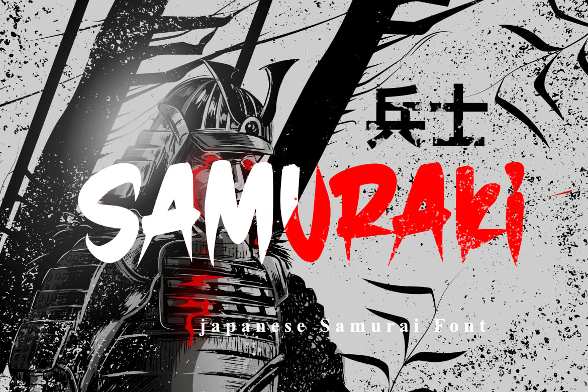
2. Samuraki: The Traditionalist’s Choice
Samuraki bridges the gap between the ancient and the modern. It is a premium choice that supports full punctuation and numerals, making it one of the most reliable options for flyers and quotes. Its letterforms are balanced, making it feel less like a "gimmick" and more like a refined calligraphic set.
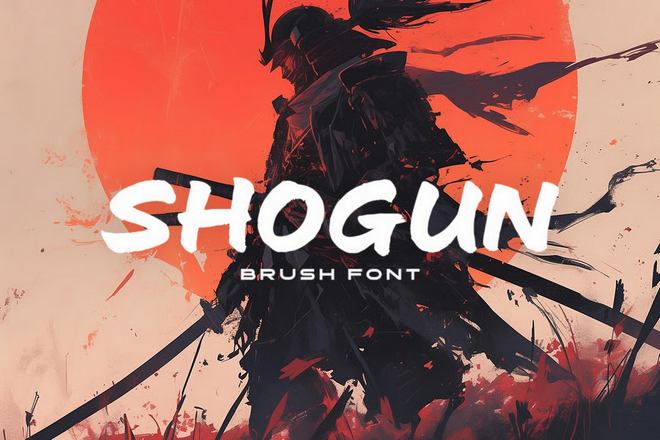
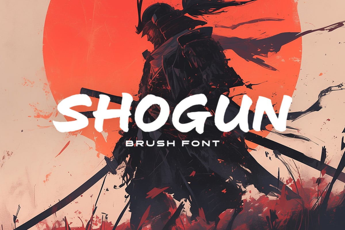
3. Shogun: Elegance and Strength
Inspired by the leadership of the Shogunate, Shogun is a wide-brush font. It doesn’t rely on aggression; it relies on stature. Its breadth makes it ideal for titles that require a sense of permanence and authority.
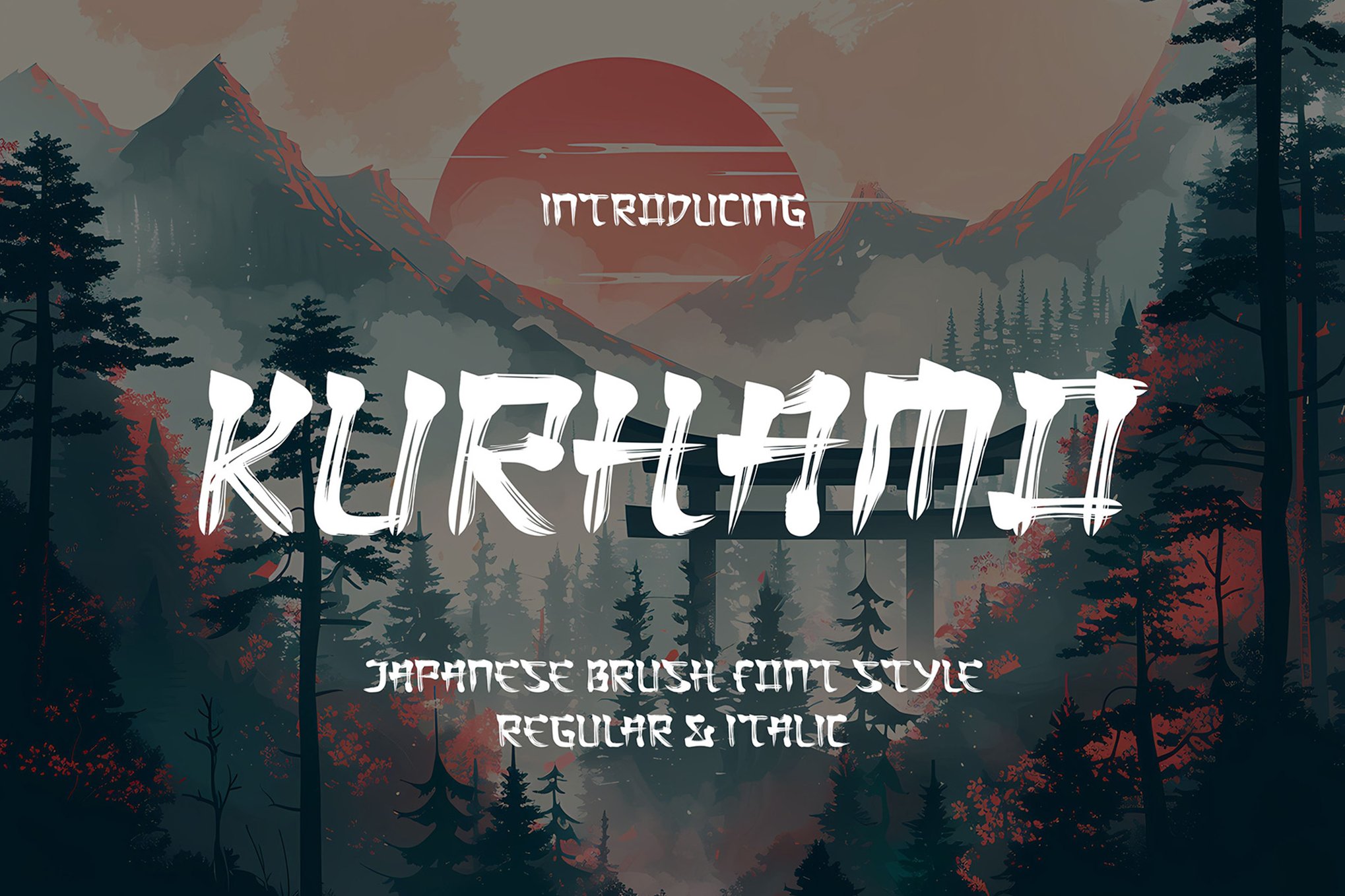
4. Kurhamo: The Calligrapher’s Soul
Kurhamo is perhaps the most "authentic" of the collection. With both Regular and Italic styles, it captures the fluidity of motion found in traditional Japanese brushwork. It is the perfect choice for branding that wants to lean into the sophistication of Japanese artistry rather than the violence of the warrior.
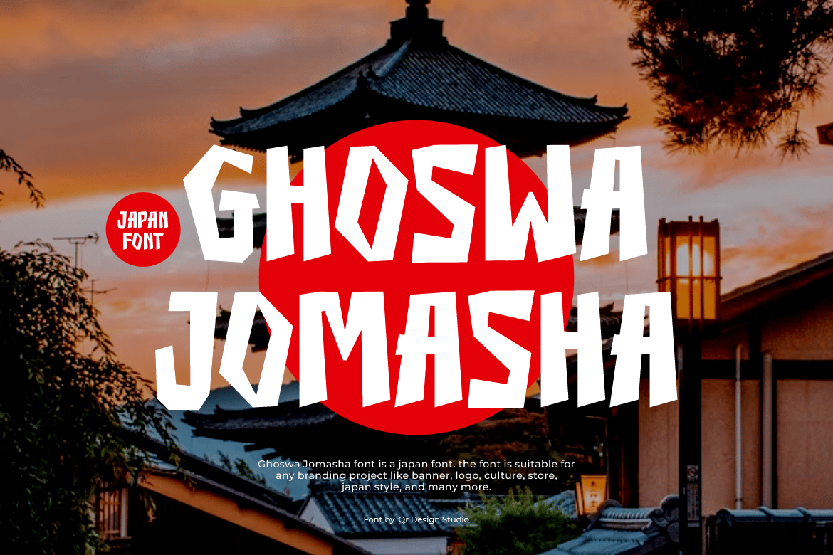
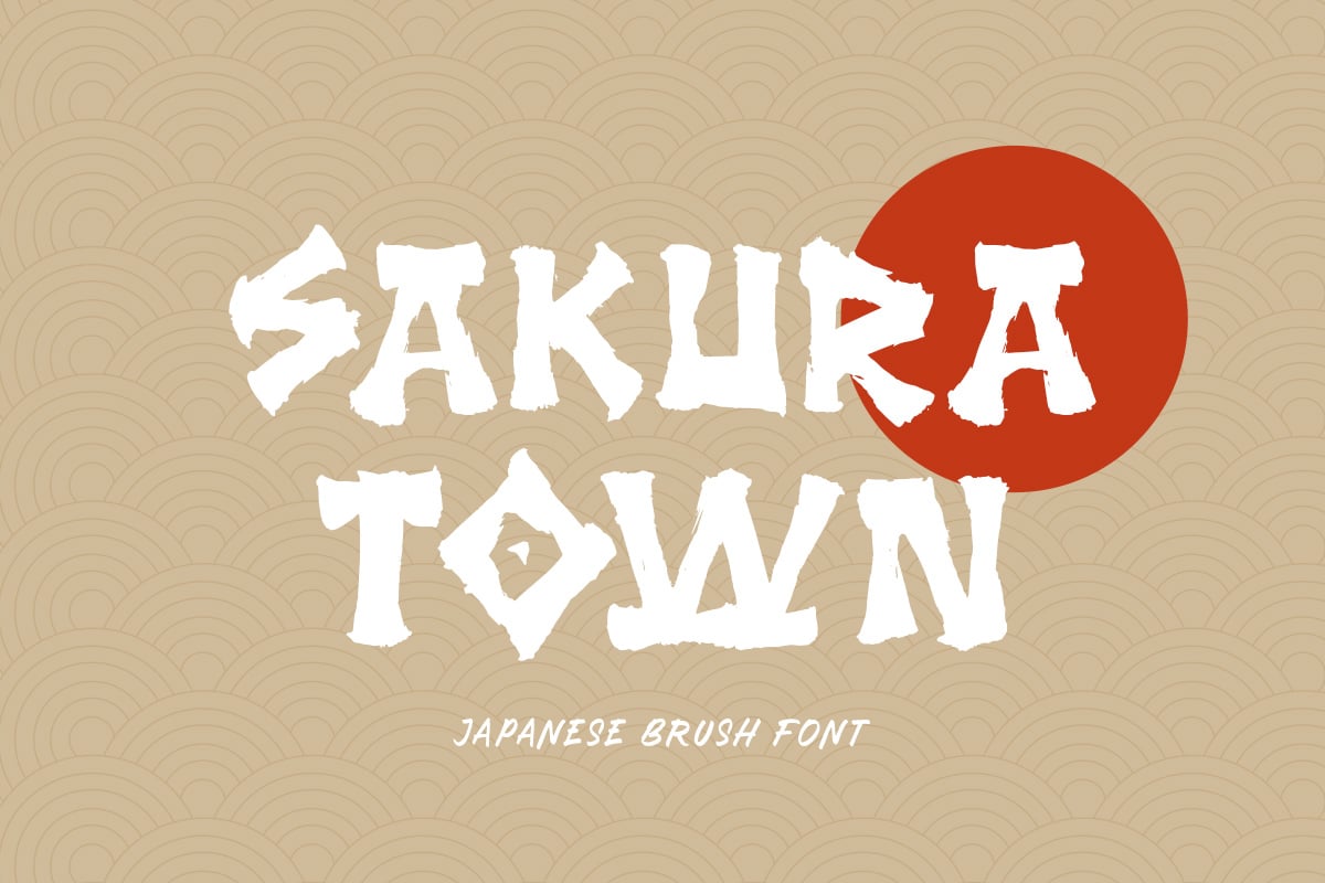
5. Ghoswa Jomasha & Sakura Town
Both fonts provide a "display" approach. While Ghoswa Jomasha focuses on an authentic, raw display look, Sakura Town is more versatile, including full lowercase support which makes it usable for longer strings of text, such as book covers or menu designs.
6. Samurai Kojhin & King Samurai
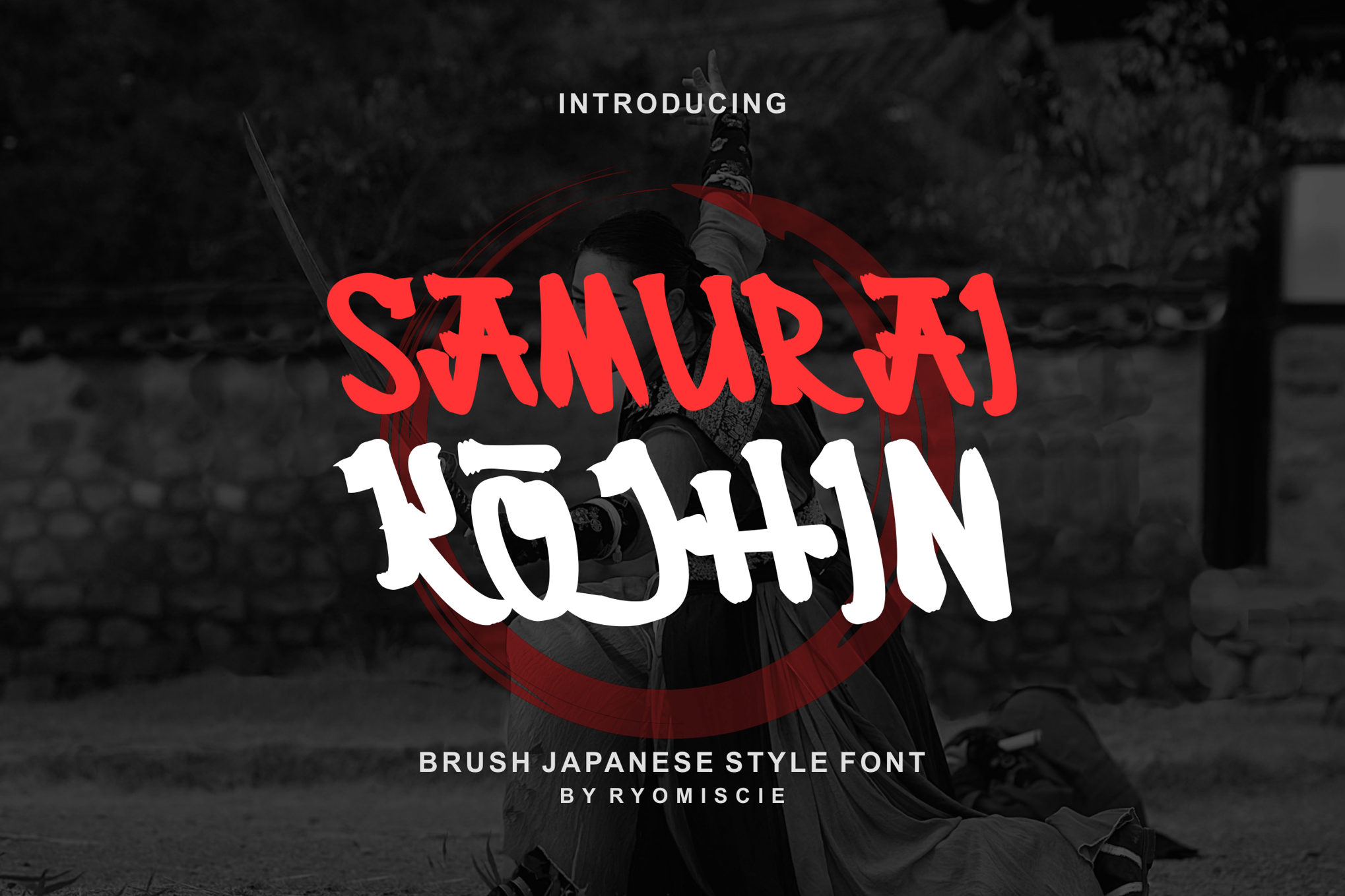
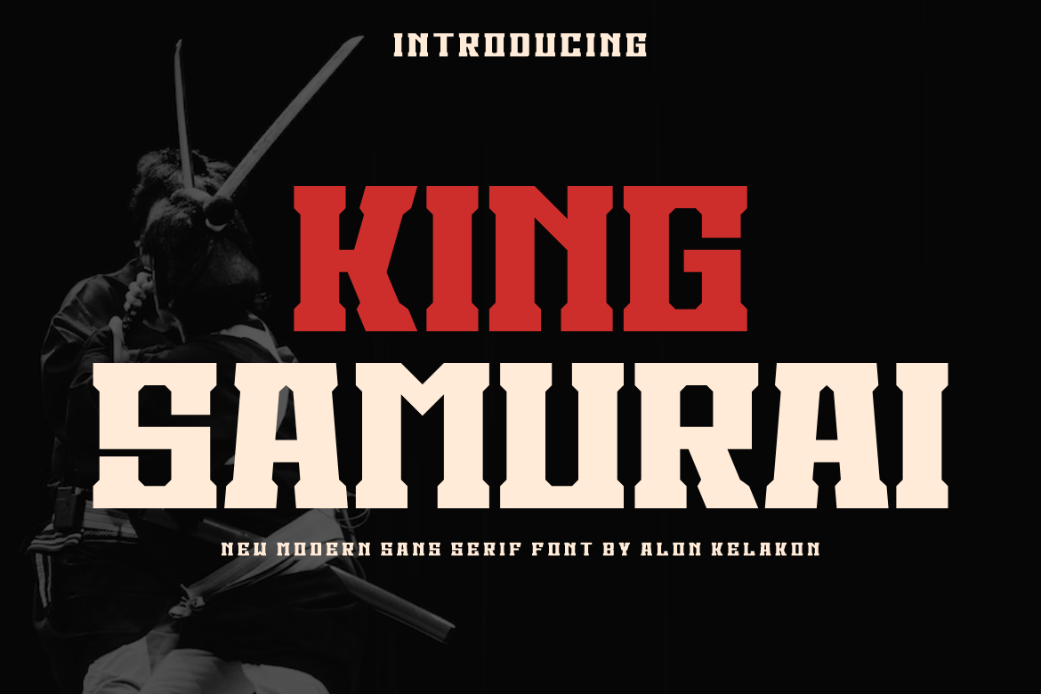
For those working in the gaming or esports sector, Samurai Kojhin and King Samurai are the heavy hitters. King Samurai is a bold, modern sans-serif that eschews traditional brushwork for thick, slab-like power. It is designed to be seen from a distance—perfect for competitive gaming logos.
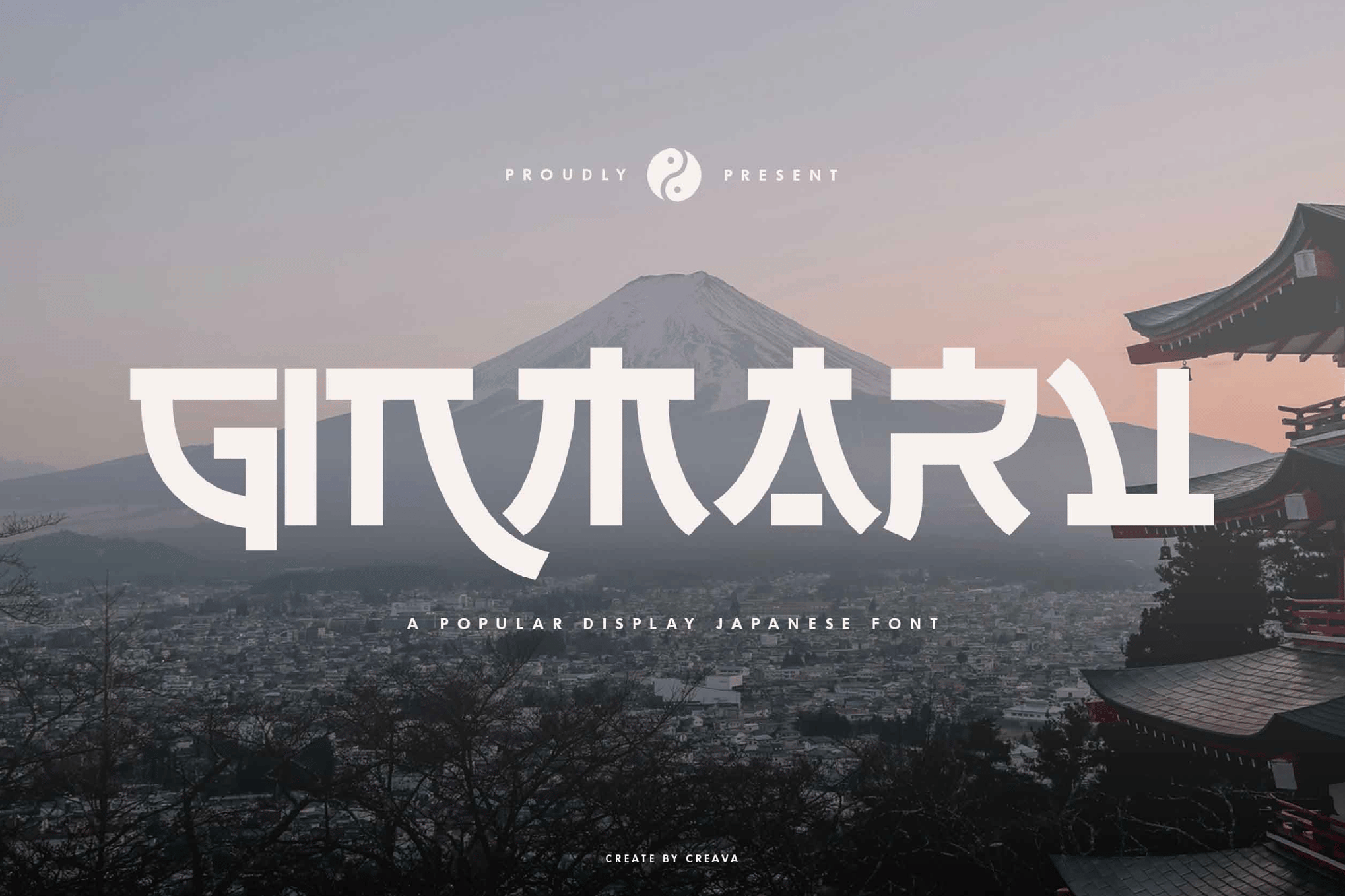
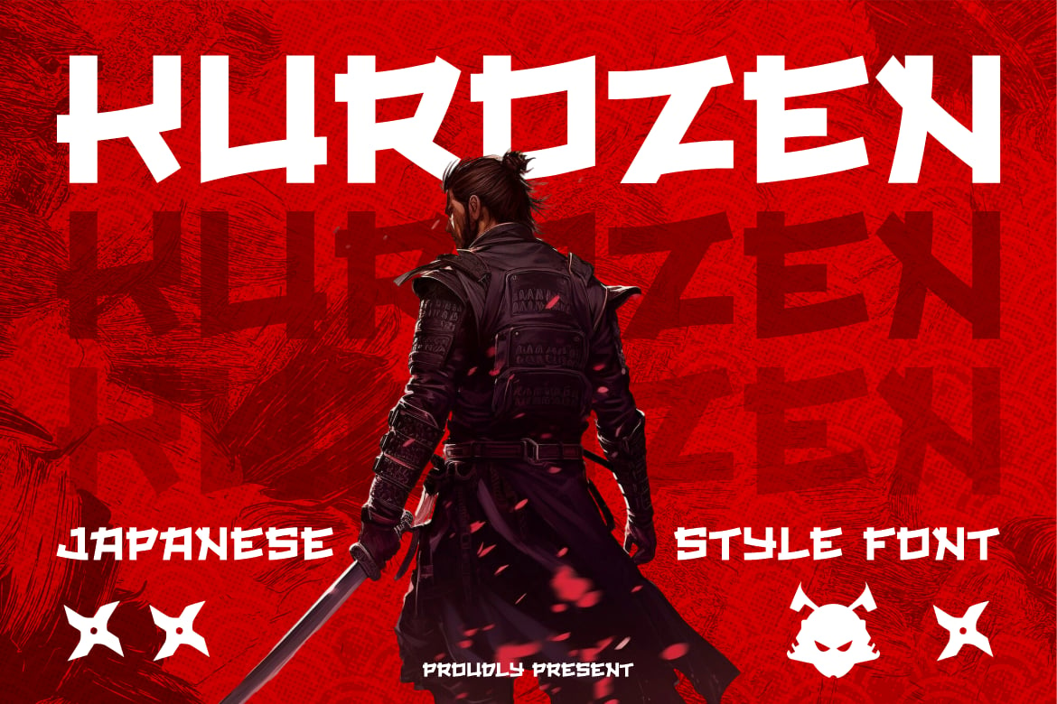
7. Fujimoto, Kurozen, & Ginmaru
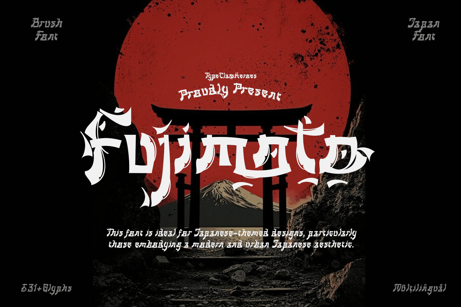
These three typefaces represent the "designer’s trio." Fujimoto is noted for its hane (hook) and uroko (scale) tips, which are technical terms in Japanese typography for the stroke endings that mimic traditional Mincho style. Kurozen and Ginmaru offer superior ligature support, allowing for that seamless, flowing look that is the hallmark of professional-level design.
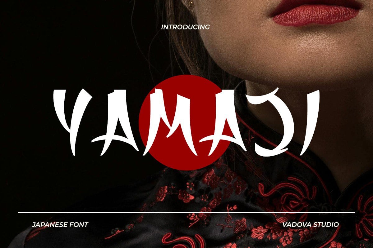
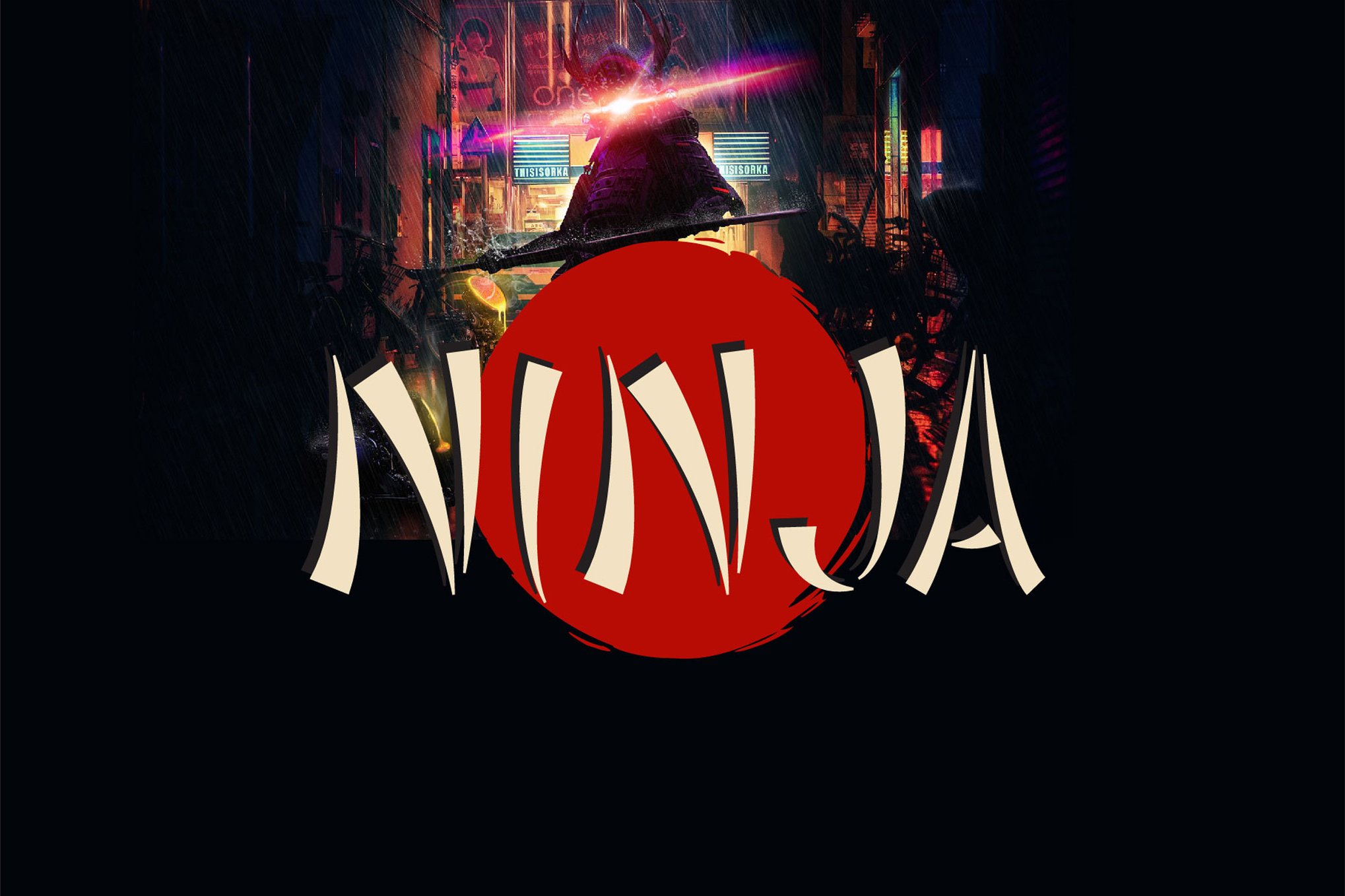
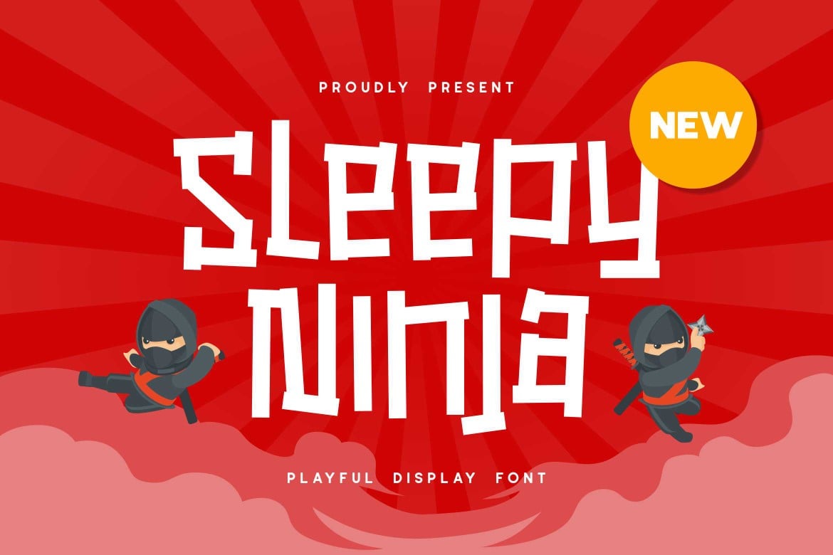
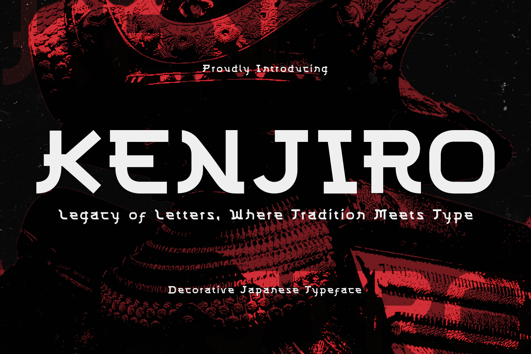
8. Yamaji, Ninja, Sleepy Ninja, & Kenjiro
This group emphasizes the "narrative" side of design. Yamaji and Kenjiro are heavily inspired by ukiyo-e prints, making them ideal for high-concept projects that need to feel "period-accurate." Ninja and Sleepy Ninja provide a more lighthearted, character-driven look, suitable for branding that requires a hint of wit alongside the traditional aesthetic.
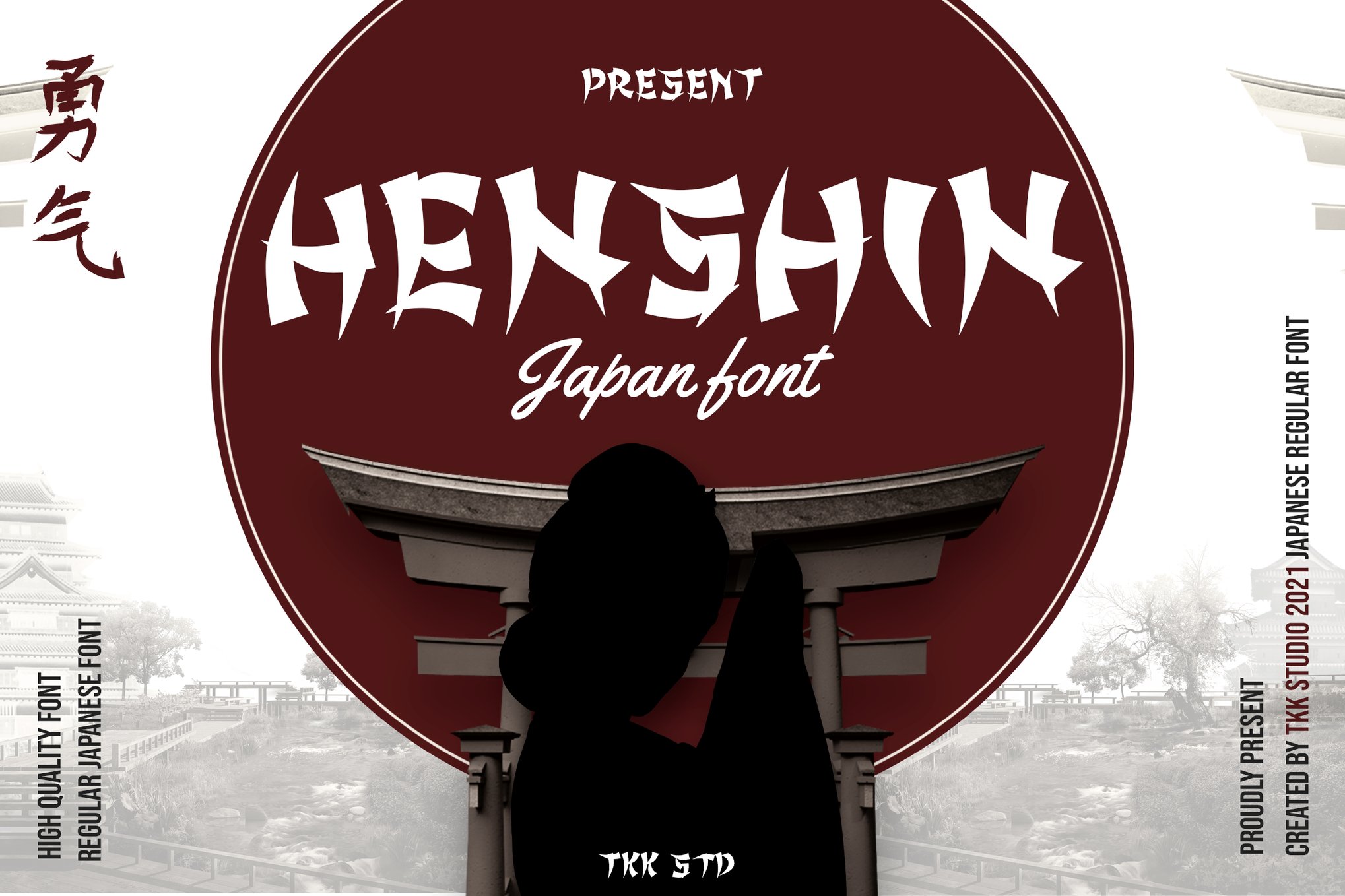
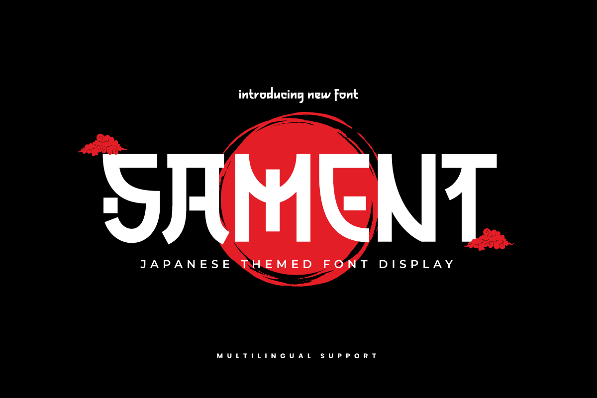
9. HENSHIN & SAMENT
HENSHIN stands out for its high-contrast, "katana-like" strokes. It is aggressive and sharp. SAMENT acts as a counterpoint, offering a more balanced, readable aesthetic that works well on websites and mobile applications where "readability first" is the golden rule.
Free Resources for Budding Creatives
For students or independent designers operating on a limited budget, the open-source and free-for-personal-use market has expanded significantly.
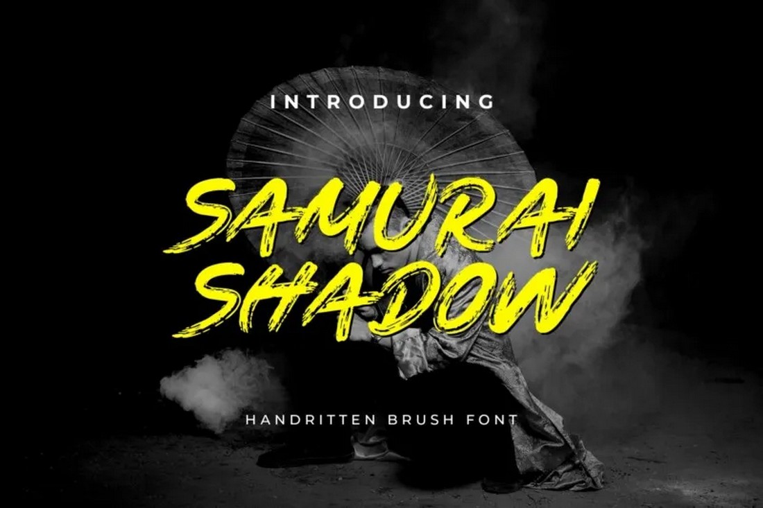
- Samurai Shadow: A masterclass in "action" typography. Its dramatic edges are designed specifically for martial arts posters.
- Takashi Japan: This font is surprisingly clean. It is less about "brush mess" and more about "geometric structure," making it a great entry point for those intimidated by the complexity of more expressive brushes.
- Shirouga: A testament to the power of the ink-brush feel. It is one of the few free fonts that truly captures the texture of wet ink on paper.
- Gunbai: Named after the war fan used by samurai commanders, this font is all about command and control. It is thick, heavy, and leaves an indelible mark on any page.
Implications for Modern Design
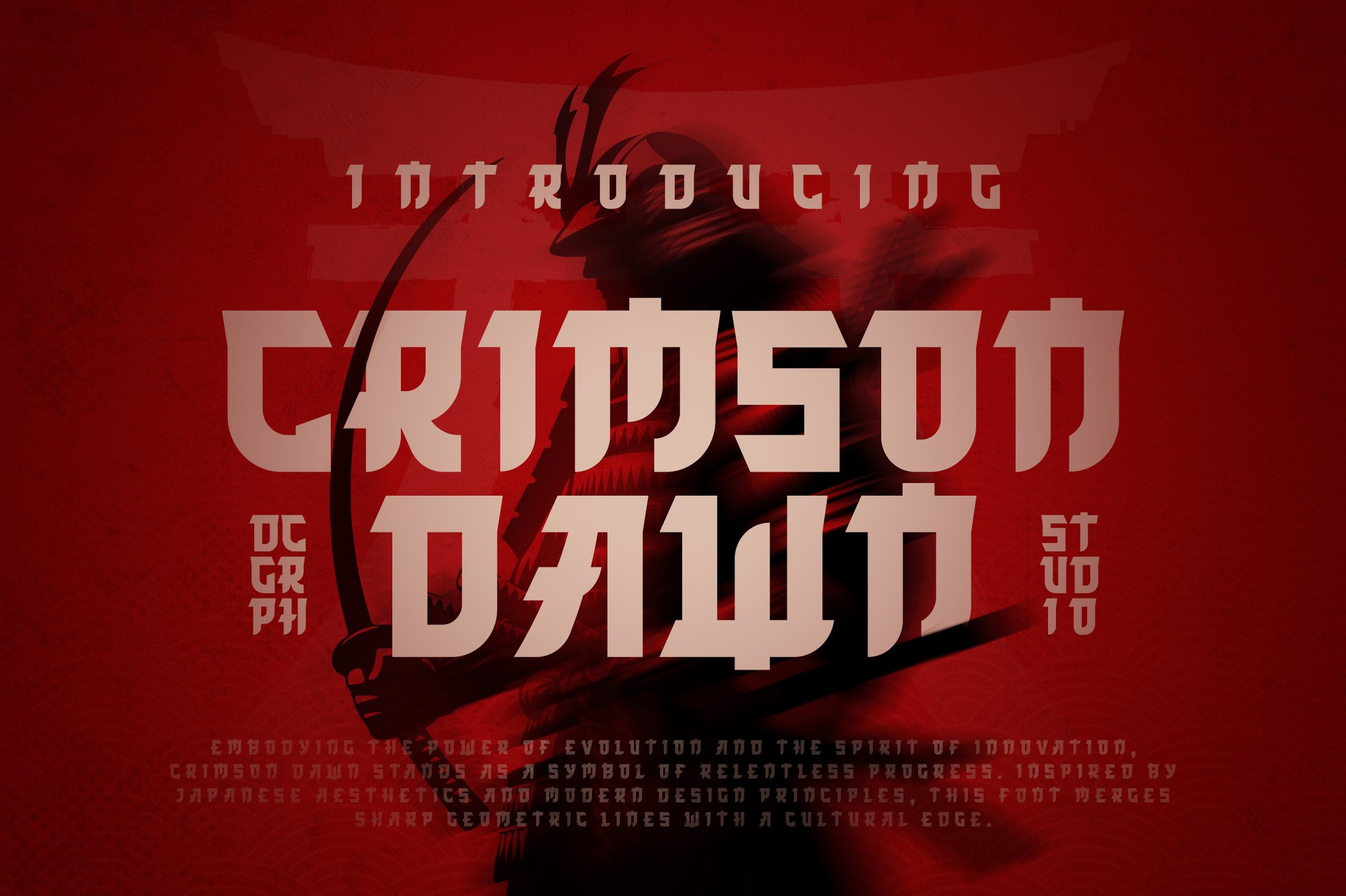
The rise of these fonts has significant implications for how we view cultural appropriation versus appreciation. Designers must tread carefully; using these fonts effectively requires an understanding of the source material. A "samurai" font used for a sushi restaurant that has no ties to Japanese culture can feel hollow, whereas using these fonts to highlight the craft of a Japanese artisan or the history of the samurai era adds depth and respect to the work.
Furthermore, as the market becomes saturated with "brush-style" fonts, the key differentiator becomes customization. Designers who use these fonts as a base, then manually adjust kerning, add custom ligatures, or apply unique texture overlays, will be the ones who elevate their work from "thematic" to "iconic."
Final Verdict: Choosing the Right Blade
When selecting your typeface, ask three questions:
- What is the intensity of the project? (Use King Samurai for high energy, Kurhamo for high elegance).
- Where will the text appear? (Large display on a screen? Go for high-contrast, sharp fonts like HENSHIN).
- What is the cultural context? (Ensure the font’s history aligns with the story you are telling).
Typography is the silent negotiator of your design. By choosing a font that honors the disciplined, artistic, and powerful history of the samurai, you are not just writing a headline—you are setting a stage. Whether you choose the free-spirited energy of Shirouga or the authoritative stance of King Samurai, you are engaging in a centuries-old tradition of visual communication that continues to evolve with every stroke of the digital brush.

 Sagoh
Sagoh
 Asep Darmawan
 Raul Delapena Setiawan
 Reynand Wu
 Azzam Bilal Chamdy
 Ali Ikhwan