
 Nana Muazin
In the high-stakes world of real estate, your visual identity is often the silent partner in every transaction. Long before a client walks through the front door of a property, they have likely interacted with your brand through a logo, a listing flyer, or a digital brochure. In this visual landscape, the choice of typeface is not merely an aesthetic preference—it is a strategic business decision that dictates how your audience perceives your professionalism, reliability, and market position.
Good real estate design makes an immediate, visceral impression. Whether you are marketing luxury high-rises to international investors, cozy starter homes to first-time buyers, or commercial office space to corporate tenants, your font choice acts as the voice of your brand. A typeface that feels too casual can undermine the gravity of a million-dollar investment, while one that is overly ornate may sacrifice the clarity needed for essential property data.
This guide explores the intersection of design and market psychology, profiling a curated selection of premium and free fonts designed to elevate your real estate collateral.
The Strategic Importance of Typography in Property Marketing
The Psychology of First Impressions
In real estate, the "first impression" is the difference between a click and a scroll-past. When potential buyers scan a property listing, their eyes are drawn to the typography before they process the copy. Research suggests that viewers associate serif fonts with tradition, stability, and high-end luxury, while sans-serif fonts are perceived as modern, approachable, and transparent.
Clarity and Conversion
Beyond branding, utility is paramount. Real estate materials are data-heavy. Between square footage, listing prices, school district statistics, and agent contact information, there is a lot of information to convey. A typeface with poor legibility or inconsistent kerning can lead to cognitive fatigue, potentially causing a lead to abandon your marketing materials prematurely. Selecting a font family with multiple weights—from thin to heavy—allows designers to create a clear visual hierarchy that guides the reader’s eye from the headline to the call-to-action.
Premium Typefaces for Professional Real Estate Branding
For firms looking to establish a distinct market presence, premium typefaces offer superior craftsmanship, extensive language support, and unique stylistic alternates that set a brand apart from competitors relying on default system fonts.
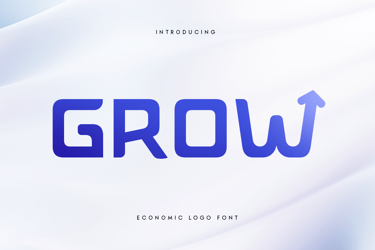
1. Grow: The Economic Choice for Modern Logos
Grow is a powerhouse for firms seeking to bridge the gap between elegance and fiscal pragmatism. Its geometric structure feels stable, making it an excellent candidate for brokerage logos and corporate signage. Because it features robust multilingual support, it is particularly effective for international real estate agencies that need to maintain a consistent brand voice across different global markets.
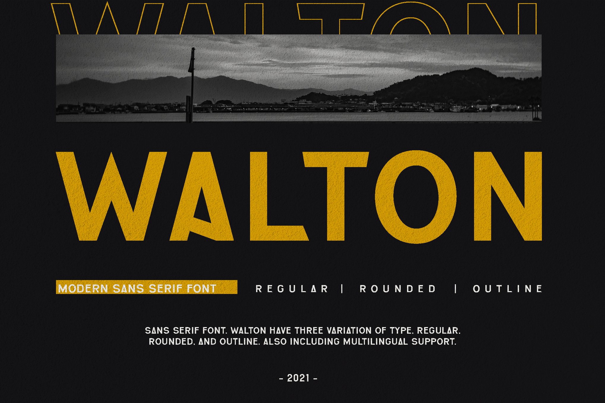
2. WALTON: The Modern Serif Hybrid
WALTON is a masterclass in modern sans-serif design. It offers a sophisticated, minimalist aesthetic that pairs beautifully with high-resolution interior photography. In a competitive market, WALTON provides the clean lines necessary for modern property developments while retaining enough personality to distinguish your agency from the sea of generic corporate branding.
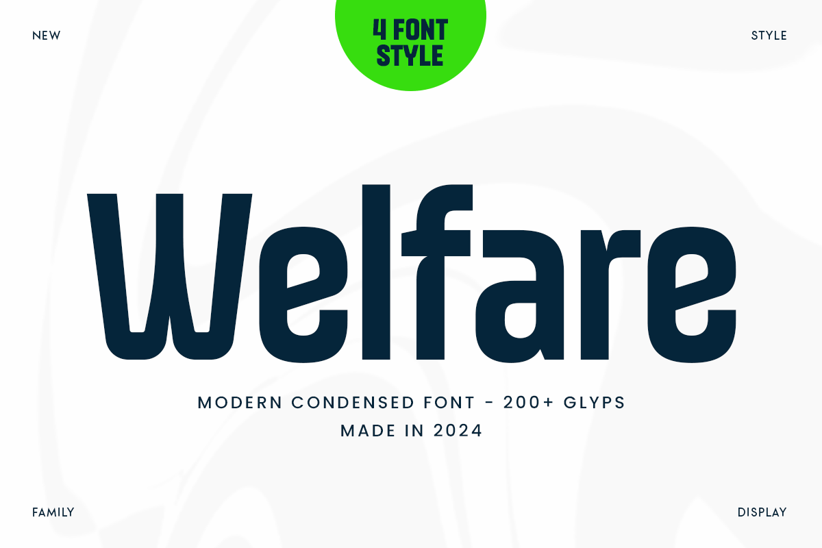
3. Welfare: Sleek and Condensed
In the realm of print media—such as property brochures and large-format outdoor signage—space is a premium commodity. Welfare is a condensed, modern typeface that excels in high-density layouts. By using condensed letterforms, you can fit more descriptive copy into a flyer without sacrificing the "air" or white space that defines luxury branding.
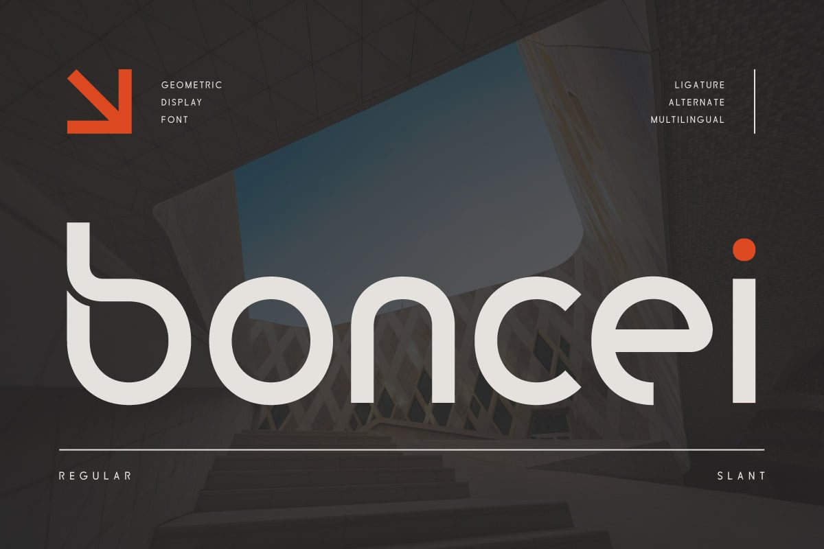
4. Cash Flow: Sophistication in Design
As the name suggests, Cash Flow is designed with the high-end business sector in mind. It balances a high-contrast stroke with clean, legible terminals. This font is best utilized in editorial-style listings or luxury lifestyle magazines, where the typeface itself serves as a signal of exclusivity and high value.
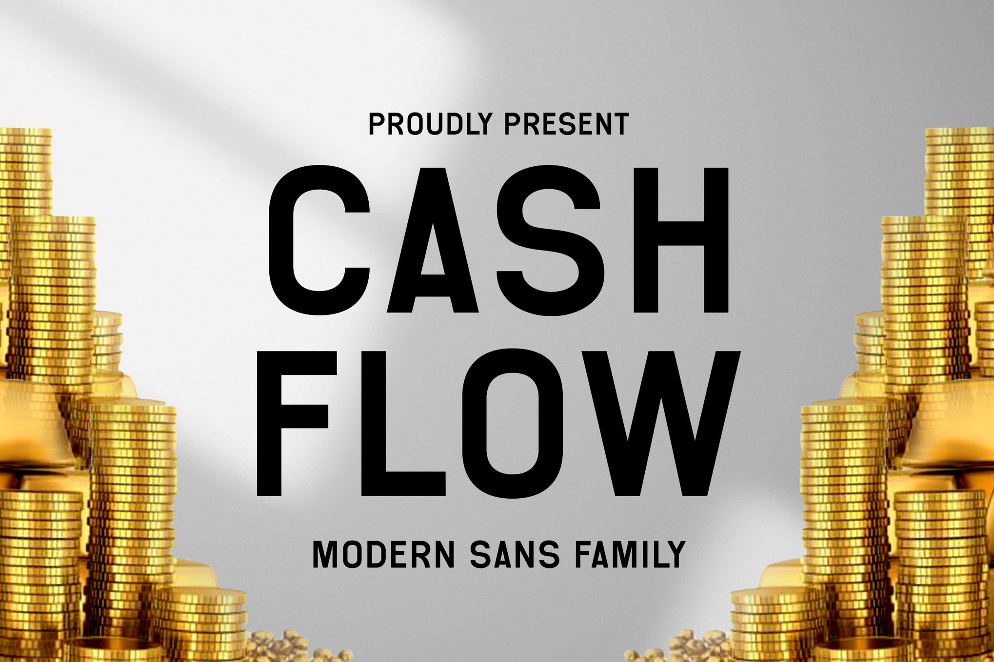
5. Random: The Corporate Authority
Random is a typeface that commands attention through its structured, authoritative silhouette. It is perfectly suited for institutional real estate, such as commercial property management and large-scale residential development firms. Its design imparts a sense of reliability—a key factor when managing the legal and financial complexities of commercial leases.
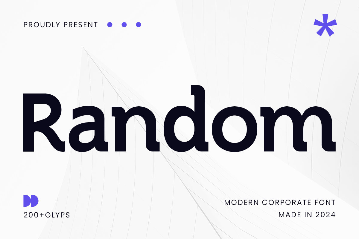
6. Boncei: Geometric Perfection
For startups and tech-forward real estate firms, Boncei offers a geometric, balanced approach. The font’s architecture is built on circles and clean, vertical lines, reflecting the precision of modern architecture. It works exceptionally well in digital environments, maintaining its integrity across mobile devices and desktop browsers.
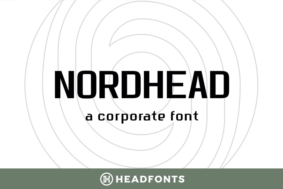
7. Nordhead: The Versatile Sans-Serif
With 258 glyphs and extensive Latin script support, Nordhead is a workhorse. It is a bold, modern sans-serif that features gentle, rounded curves. This softness makes it more approachable than traditional, harsh industrial fonts, making it an ideal choice for residential real estate where the goal is to evoke the feeling of a "home" rather than just a "property."
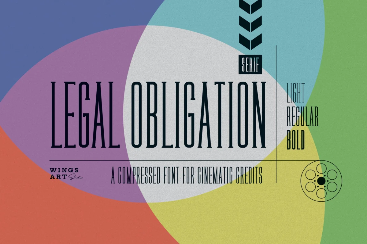
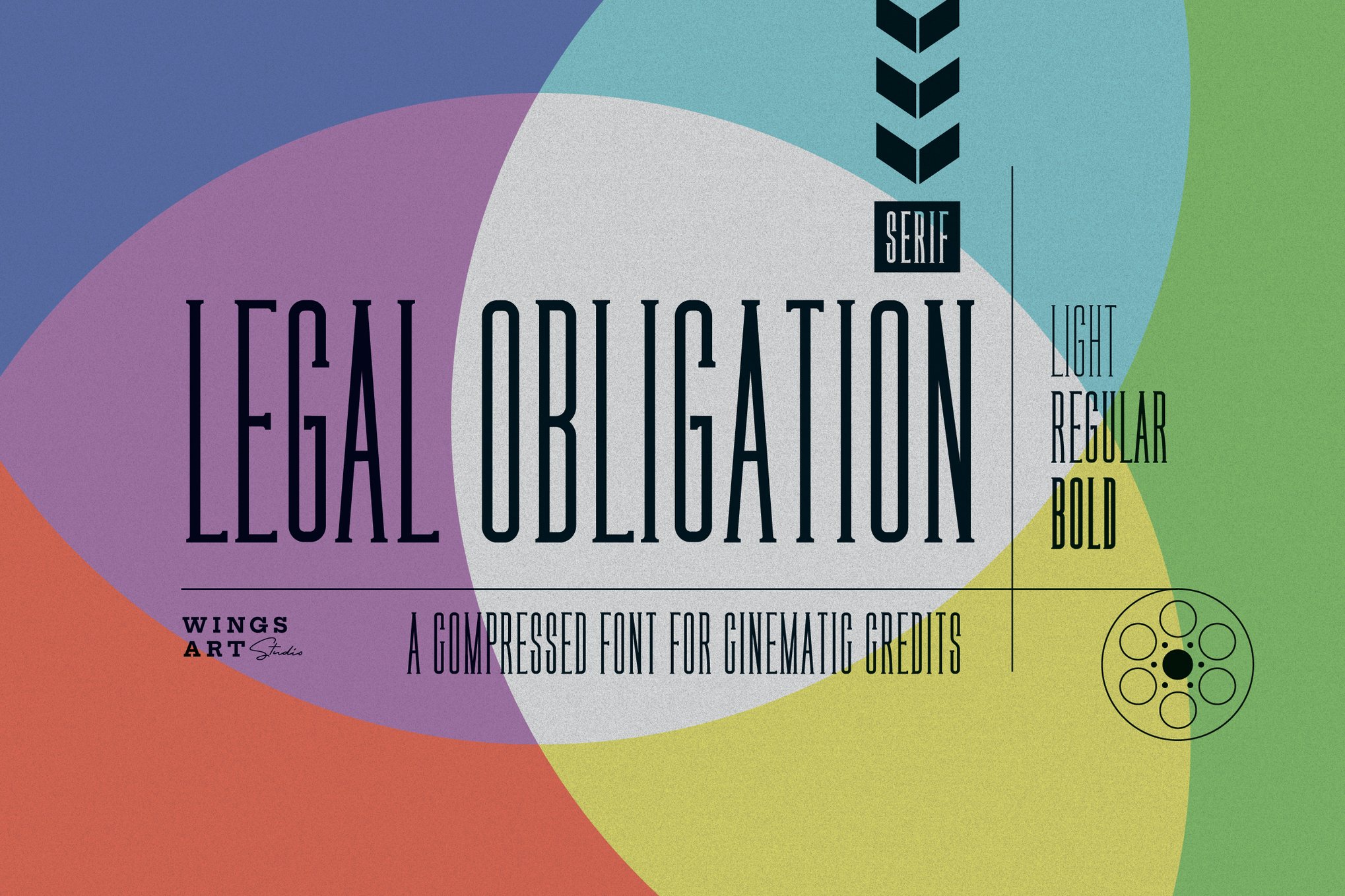
8. Legal Obligation: The Serif Standard
Despite its utilitarian name, Legal Obligation is a beautiful, highly readable serif font. It is an excellent choice for legal-heavy documents, property contracts, or detailed brochures where you need to communicate large blocks of text without overwhelming the reader. Its availability in multiple weights allows for a rich, textured design experience.
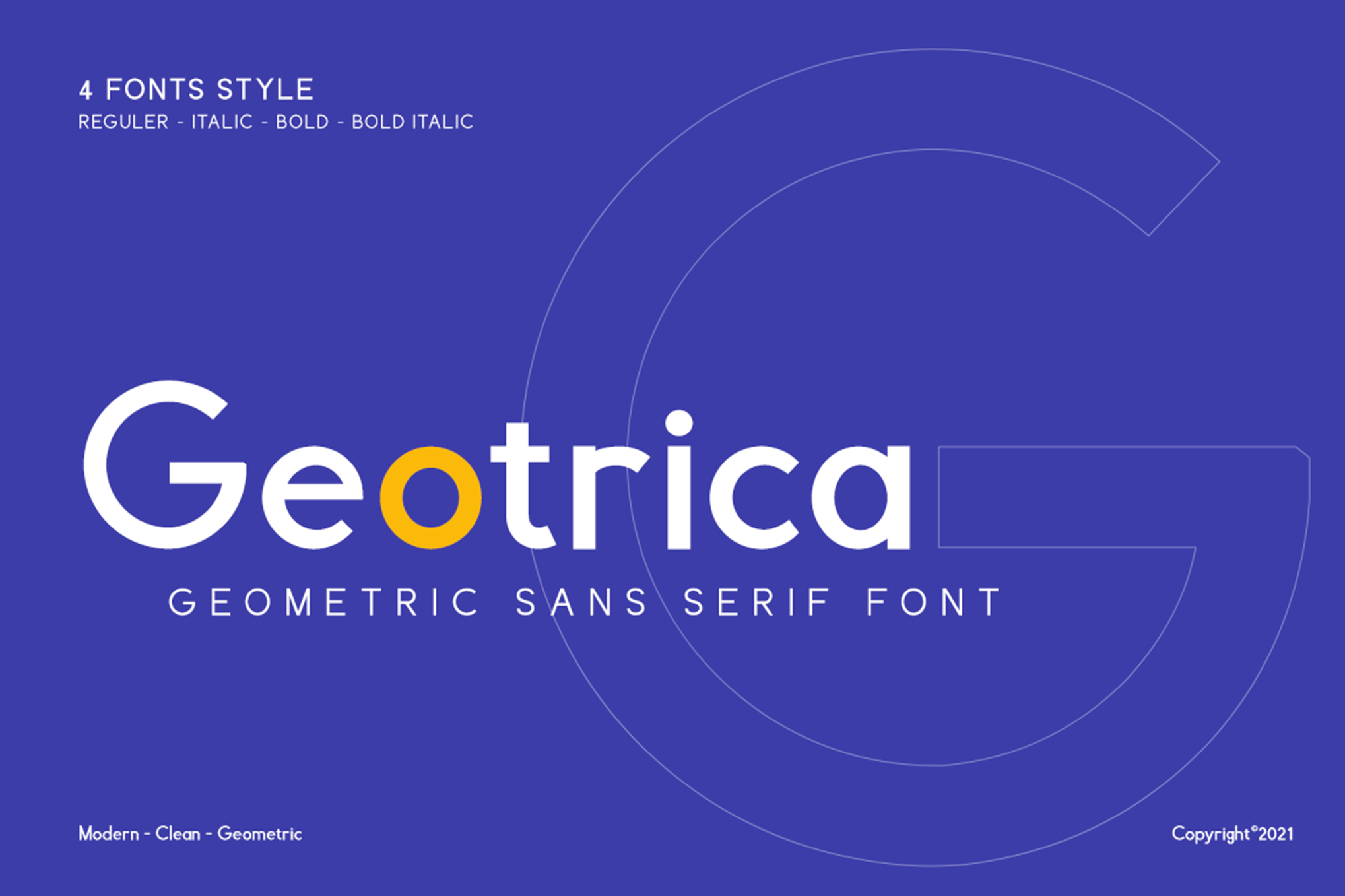
9. Geotrica: Geometric Flexibility
Geotrica is designed for flexibility. Whether you are using the light weight for elegant subheaders or the bold weight for high-impact property headlines, this font family remains cohesive. Being PUA encoded, it is also highly accessible for designers using standard software suites.
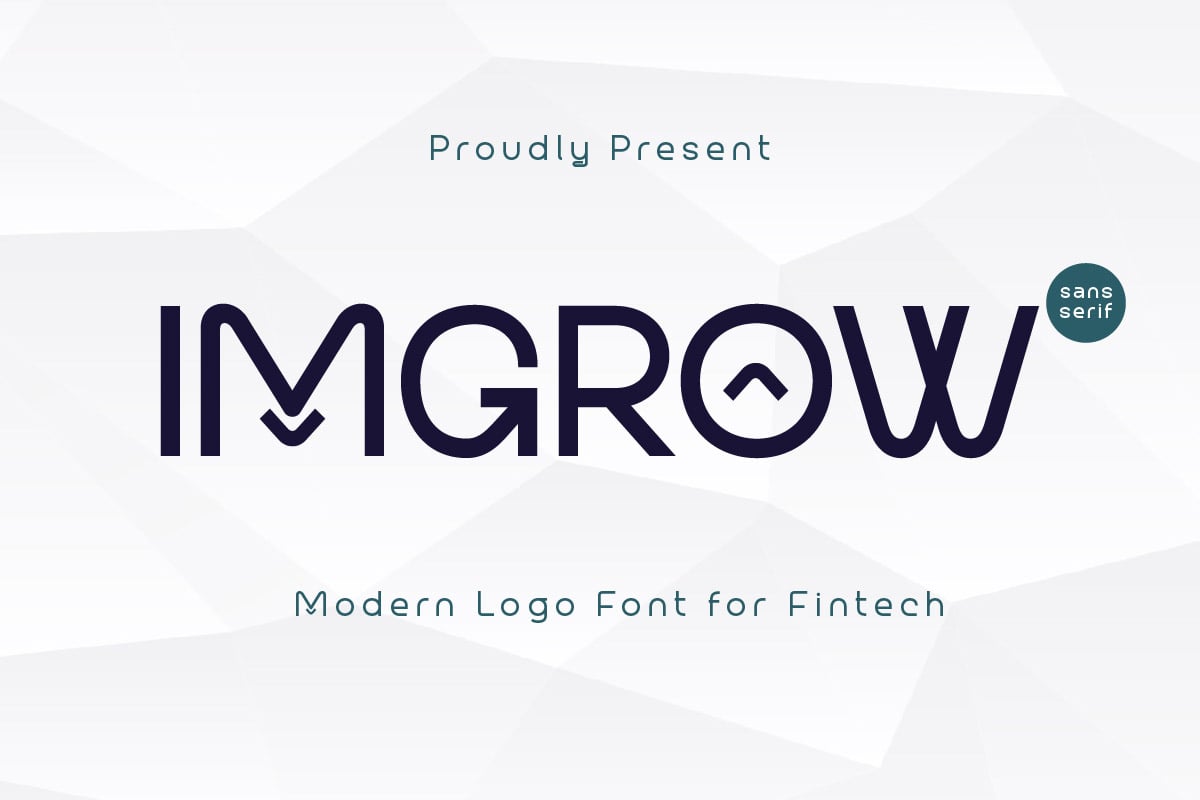
10. Imgrow, Lifing Home, and Orenza: The Logo Specialists
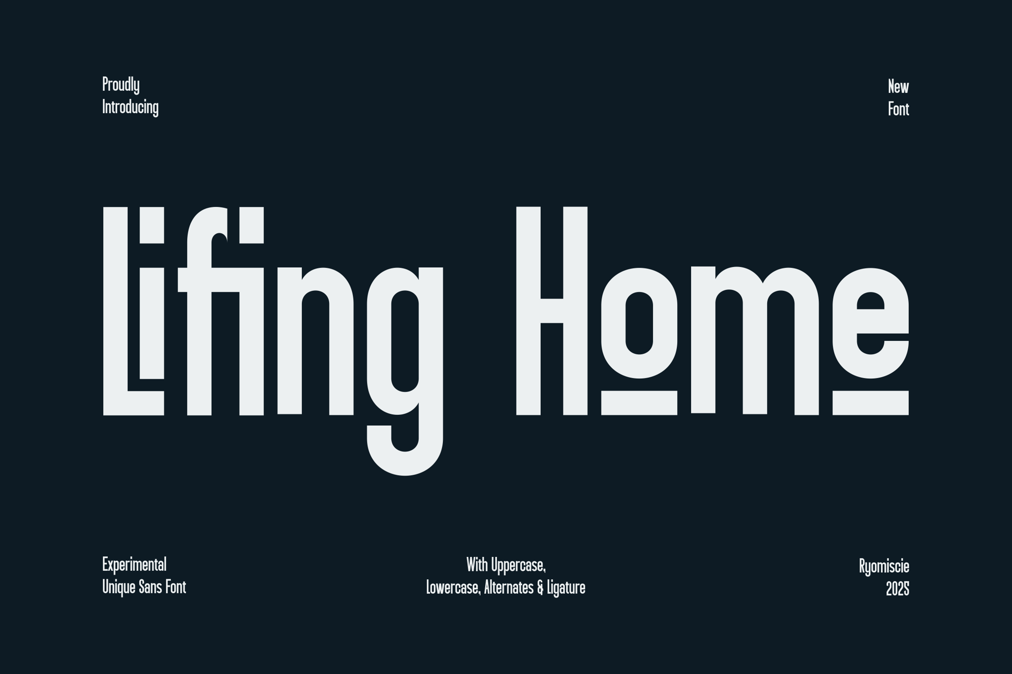
These three fonts share a common goal: creating high-impact brand marks. Imgrow brings a sleek, slanted aesthetic that suggests momentum and growth; Lifing Home offers an authentic, display-oriented character set that works well for lifestyle branding; and Orenza Bold brings a classic, weighted look that ensures your logo is legible from a distance, such as on a "For Sale" sign.
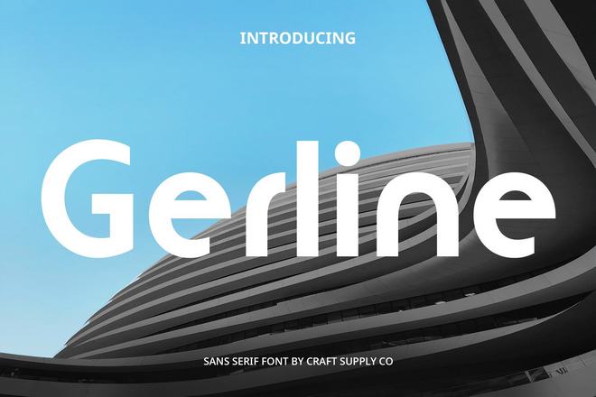
11. Gerline and Bensoon: The Modern Standards
Gerline and Bensoon represent the current trend in real estate design: the contemporary sans-serif. Both fonts prioritize clarity and "invisible" design—they communicate the message without drawing unnecessary attention to the characters themselves. They are the go-to choices for agencies that want to appear professional, timeless, and organized.
12. Mestric and Request: Distinctive Branding
For agencies that want a more "boutique" feel, Mestric and Request offer unique flourishes. Mestric is a display font that brings a sense of modern, architectural flair, while Request is clean and distinctive, designed specifically to build trust through balanced, thoughtful proportions.
13. Montreal and Gunty: City and Startup Aesthetics
Montreal draws inspiration from urban environments—clean, functional, and efficient. Gunty, on the other hand, is built for the "startup" mentality, catering to fintech real estate platforms and modern property management apps.
14. Exotica: The Professional Choice
Exotica concludes our premium list as a balanced, versatile typeface that serves as a bridge between corporate rigidity and creative freedom. It is the perfect choice for a firm that wants to maintain a "safe" professional appearance while still standing out in a crowded market.
Best Free Real Estate Fonts
You do not always need a massive budget to achieve high-end design. Several high-quality, open-source, or free-to-use fonts offer the same level of polish as their premium counterparts.
- Rawizard: This font is an architectural marvel. Its lines mimic the blueprints and structural integrity of a building, making it perfect for developers and architects.
- Morning Person: As the name implies, this is an optimistic, warm font. It is the antithesis of the cold, corporate look, making it the ideal choice for family-oriented residential marketing.
- Mirano: Sleek, geometric, and elegant. Mirano is a hidden gem for high-end boutique agencies that want an upscale, "designer" look without the premium price tag.
- PT Sans: The gold standard for readability. If you are producing long-form reports, market analyses, or extensive listing descriptions, PT Sans is the most reliable, professional, and accessible choice available.
Implications of Strategic Typography
Building Long-Term Brand Equity
The cumulative effect of using a consistent, well-selected typeface across all touchpoints is brand equity. When a client sees your font on a sign, then on an email, and then on a business card, they begin to associate that visual style with your agency’s reputation. If your fonts are inconsistent or poorly chosen, it signals to the market that your business processes may be equally uncoordinated.
The Role of Digital Adaptation
In 2024, your font must be "web-ready." The fonts discussed above are chosen not just for their appearance on paper, but for their rendering capabilities on screens. As the real estate industry shifts further toward digital-first interactions—3D tours, mobile-responsive listing portals, and social media advertising—the technical performance of your chosen typeface (its ability to scale and remain sharp) is just as critical as its style.
Conclusion: Making the Final Choice
Selecting a font for your real estate business is an exercise in balancing your brand’s personality with the needs of your audience. If you are an agency that focuses on high-end luxury, lean toward the serifs like Legal Obligation or Cash Flow. If you are a modern, tech-forward firm, the geometric precision of Boncei or Gunty will serve you better.
Ultimately, the best font is one that disappears into the background, allowing the property and the client’s dreams to take center stage. By choosing a typeface that reflects the professionalism of your services and the quality of your listings, you ensure that your brand is not just seen, but remembered.

 Sagoh
 Asep Darmawan

 Raul Delapena Setiawan

 Reynand Wu

 Azzam Bilal Chamdy

 Ali Ikhwan
