Trending News:Beyond the Cone: Why Updated Hurricane Graphics Are Failing to Change Public BehaviorThe Sentinel of Silicon: Inside the UK’s £300 Million Bid to Defend Against Biological Threats with AIFrom Autonomous Vehicles to AI Sovereignty: How Tech Giants are Rewriting the Rules of InfrastructureIkea Scales Up Circular Ambitions: Second-Hand Marketplace Enters Three New MarketsFrom Countertop Scraps to a $173 Million Exit: The Relentless Rise of TrubarBeyond the Transaction: How to Transform Your Email List Into a Thriving CommunityTarget’s Strategic Pivot: How AI and "Luxe for Less" Are Defining the 2024 Holiday SeasonThe Evolution of Frugality: Mr. Money Mustache’s $30,000 "Abundance" ExperimentEnhancing the Backyard Experience: Hansö Expands Its Flagship ‘Apex’ Pergola Line to Meet Evolving Homeowner NeedsThe Architecture of Intent: Why "Manifesting" Money Is More Than Just Wishful ThinkingGlobal Justice Reached: Nigerian National Sentenced to Eight Years for Multi-Million Dollar Cyber-Fraud CampaignBeyond the Alphabet: How Zig Engelmann’s Radical Pedagogy Challenged the Educational EstablishmentCritical Memory-Corruption Flaw in Google’s Brotli Decoder: A Deep Dive into CVE-2026-111497Roadrunner Expands North American Footprint with New Canada-to-U.S. LTL Service and General Rate IncreaseThe AI Reckoning: Why Procurement Leaders Must Choose Innovation Over ParalysisThe End-to-End Myth: Why Supply Chain Management Remains a House of SilosMastering the Art of the Career Narrative: A Guide to Adobe InDesign Resume TemplatesBeyond the Wireframe: Building a Defensible ROI Case for UX DesignThe Repairability Revolution: Are Sennheiser’s Momentum True Wireless 5 the Death Knell for Disposable Audio?Beyond the Grid: How Gregory & Thomas Redefined the Architectural Web Experience for Telha ClarkeThe Post-Tool Paradigm: Why AI is Demanding a Fundamental Shift in Software DesignThe Art of Adorability: A Comprehensive Guide to Kawaii Typography in Modern DesignBeyond the Memory Wall: How to Master Large-Scale JSON Processing in PythonThe Geometry of Light: Scientists Unlock a Hidden Ability to Control Optical "Handedness"The Sovereign Shift: European Public Sector Embraces Matrix for Secure, Interoperable CommunicationsThe PKI Reckoning: eMudhra’s Market Exit Exposes Hidden Risks in Global Trust InfrastructureBeyond the Code: How Formal Verification is Shaping the Future of Software EngineeringBeyond the Star: How GitHub Reimagined Repository Metrics for Scale and SecurityDecoding the Latency Tax: A Deep Dive into Token-Level Filtering PerformanceClosing the Gap: Why Coding Agents Need Real-World Browser VerificationBridging the Future: Insights and Innovations from JetBrains GameDev Day 2026A Botanical Tribute to a Legend: Salvia messii Discovered in the Peruvian AndesOpinions expressed by Entrepreneur contributors are their own.Beyond the Geography of Discontent: Rethinking Regional Development in an Era of InequalityBarclays Announces 5,000 Job Cuts Amid Strategic Shift Toward Artificial Intelligence and Operational EfficiencyThe Future of Narrative: Google Vids Integrates Gemini Omni and Personal Avatars to Revolutionize Content CreationThe Weekly Pulse: Navigating Server Downtime, AI Crawler Protocols, and URL ArchitectureThe Return of the Voice of a Generation: What We Need from the ‘Girls’ RevivalEvening News Ratings Report: NBC Nightly News Shows Momentum as ABC and CBS Navigate Volatile LandscapeThe Microseries Dilemma: Brands Grapple with the High-Stakes World of Vertical StorytellingThe New Era of Search: Why Digital PR is Your Most Critical Asset for AI VisibilityOmnicom’s Strategic Pivot: Analyzing the Financial Architecture of a Media Giant in 2026Decoding the Instagram Algorithm: A Comprehensive Guide for Creators and BrandsThe Pulse of the Digital Age: Mastering Social Listening for Strategic GrowthThe Great Reshuffle: Analyzing the Seismic Shift in Corporate Sustainability LeadershipBeyond the Feed: How Three Global Brands Redefined Content InnovationThe Silent Mandate: Why Black Voters Are Reframing the Climate ConversationThe Sound of Intelligence: Block’s "Dessa" Signals a Paradigm Shift in Conversational AIThe Congo Basin at a Crossroads: The High Cost of the DRC’s Massive Oil ExpansionThe Martian Enigma: How Arsia Mons Defies Atmospheric PhysicsThe 2030 Biodiversity Crisis: A Global Reckoning at COP17Master Your Notifications: A Deep Dive Into Apple Watch’s Theater ModeGeological Paradox: Deep-Earth Rock Challenges Subduction ModelsThe Mt. Silver Challenge: How ‘Daily Red’ is Redefining the Pokémon MetaThe Great Correction: How New Import Rules are Reshaping the German E-commerce LandscapeThe Search for Clarity: How to Reclaim the Original Google ExperienceStop Guessing: Why Zero-Party Data is the New Gold Standard for Email MarketingThe Rise of ‘Adultoween’: How Halloween Transformed Into a Multi-Billion-Dollar Retail PowerhouseThe Great AI Rally: Navigating the Paradox of Prosperity in an Overheated MarketWalmart Empowers Consumers as Artificial Intelligence Takes the Wheel in RetailThe Hidden Tax of Financial Stewardship: Lessons from a Family Weekend in Las VegasThe Betrayal of Valor: Inside the Multi-Million Dollar Fraud Targeting America’s MilitaryFrom Warehouses to Workshops: How One Administrator Transformed Texas’s Disciplinary SystemGlobal Shipping Markets Under Pressure: Container Rates Climb Amidst Capacity Volatility and Shifting DemandBeyond the Bottom Line: Why Revenue Generation is the New Frontier for Procurement LeadershipSecurity Alert: The PHP2Shell Vulnerability Landscape and the Threat of "Potassium" MalwareThe Architecture of Illusion: Unmasking the Myth of End-to-End Supply Chain PlanningGlobeCross Consolidates Operations: Lufthansa Cargo’s New Frankfurt Headquarters Marks a Strategic PivotThe Resurgence of Elegance: A Curated Guide to Free Art Deco FontsThe Responsive Revolution: Why We Must Stop Treating Container Queries Like Media QueriesFrom Dormant Heritage to Digital Icon: The Resurgence of La RevoltosaThe Death of the "Dead" Design System: How AI Agents Are Transforming Digital InfrastructureThe Art of Micro-Typography: Master the Science of Small Text ReadabilityThe Rise of the Autonomous Developer: 5 Free AI Coding Agents You Should Try in 2026The Great Transparency Pivot: How Public Backlash is Reshaping the Hyperscale Data Center IndustryThe Ghost in the Lattice: Oxford Researchers Use Quantum Simulation to Observe "Invisible" Magnetic ForcesThe Future of AI Infrastructure: Google’s Agent Compute Engine and the Quest for Efficient PersistenceFrom Prototype to Production: The Maturity Model for Industrial-Grade AI AgentsFrom Scratch to Scikit: A Deep Dive into the Mechanics of Machine LearningEngineering Resilience: GitHub’s Progress Report on Infrastructure, Scalability, and Recent Service DisruptionsBeyond the Loop: Engineering Robust AI Agent Harnesses from ScratchUnmasking Deceit: The Subtle Power of Words to Reveal the TruthNavigating Uncertainty: The Act, Adjust, Absorb Framework for Entrepreneurial GrowthThe Accountability Gap: Why Sovereign Finance Needs a New Funding ArchitectureStrategic Realignment: GovTech Singapore Navigates Second Phase of Workforce TransformationThe "Poisoned" SERP Crisis: How SEO Tools Are Fighting Back Against Google’s Anti-Scraping TacticsIs Your Brand Invisible to AI? The Strategic Necessity of Prompt TrackingThe Post-Search Pivot: How The Verge is Redefining Audience Loyalty in an AI-Driven Media LandscapeThe Programmatic Toll Booth: Why Independent Agencies Are Trapped in a DSP Fee CycleThe 2026 Social Media Landscape: A Year of AI Integration, Strategic Pivots, and Community ShiftsThe Invisible Architecture: How Oil Built the Modern American HomeThe Vanishing Alps: Switzerland’s Glaciers Face Unprecedented CollapseThe Great Checkout War: Airbnb’s New Cleaning Policy Sparks Host Rebellion and Industry Soul-SearchingThe Silicon Scar: Finland’s Reckoning Over Google’s AI Infrastructure PushThe Post-Perspective Era: How Hindsight AI is Transforming Content Moderation with a $1M GuaranteeThe Great AI Content Standoff: Why the Licensing Boom is Fading and What Comes NextThe Borderless Marketplace: Europe’s E-commerce Landscape Reaches a Critical Inflection PointThe Resilience of Proximity: Why Local SEO Remains the Bedrock of Modern Digital MarketingThe Unsexy Billionaire: How David Royce Built a Pest Control Empire on the Foundations of Grit and "Blue-Collar" GeniusMastering Business Utilities: A Comprehensive Guide to Accounting, Taxation, and Operational Efficiency
Trending News:Beyond the Cone: Why Updated Hurricane Graphics Are Failing to Change Public BehaviorThe Sentinel of Silicon: Inside the UK’s £300 Million Bid to Defend Against Biological Threats with AIFrom Autonomous Vehicles to AI Sovereignty: How Tech Giants are Rewriting the Rules of InfrastructureIkea Scales Up Circular Ambitions: Second-Hand Marketplace Enters Three New MarketsFrom Countertop Scraps to a $173 Million Exit: The Relentless Rise of TrubarBeyond the Transaction: How to Transform Your Email List Into a Thriving CommunityTarget’s Strategic Pivot: How AI and "Luxe for Less" Are Defining the 2024 Holiday SeasonThe Evolution of Frugality: Mr. Money Mustache’s $30,000 "Abundance" ExperimentEnhancing the Backyard Experience: Hansö Expands Its Flagship ‘Apex’ Pergola Line to Meet Evolving Homeowner NeedsThe Architecture of Intent: Why "Manifesting" Money Is More Than Just Wishful ThinkingGlobal Justice Reached: Nigerian National Sentenced to Eight Years for Multi-Million Dollar Cyber-Fraud CampaignBeyond the Alphabet: How Zig Engelmann’s Radical Pedagogy Challenged the Educational EstablishmentCritical Memory-Corruption Flaw in Google’s Brotli Decoder: A Deep Dive into CVE-2026-111497Roadrunner Expands North American Footprint with New Canada-to-U.S. LTL Service and General Rate IncreaseThe AI Reckoning: Why Procurement Leaders Must Choose Innovation Over ParalysisThe End-to-End Myth: Why Supply Chain Management Remains a House of SilosMastering the Art of the Career Narrative: A Guide to Adobe InDesign Resume TemplatesBeyond the Wireframe: Building a Defensible ROI Case for UX DesignThe Repairability Revolution: Are Sennheiser’s Momentum True Wireless 5 the Death Knell for Disposable Audio?Beyond the Grid: How Gregory & Thomas Redefined the Architectural Web Experience for Telha ClarkeThe Post-Tool Paradigm: Why AI is Demanding a Fundamental Shift in Software DesignThe Art of Adorability: A Comprehensive Guide to Kawaii Typography in Modern DesignBeyond the Memory Wall: How to Master Large-Scale JSON Processing in PythonThe Geometry of Light: Scientists Unlock a Hidden Ability to Control Optical "Handedness"The Sovereign Shift: European Public Sector Embraces Matrix for Secure, Interoperable CommunicationsThe PKI Reckoning: eMudhra’s Market Exit Exposes Hidden Risks in Global Trust InfrastructureBeyond the Code: How Formal Verification is Shaping the Future of Software EngineeringBeyond the Star: How GitHub Reimagined Repository Metrics for Scale and SecurityDecoding the Latency Tax: A Deep Dive into Token-Level Filtering PerformanceClosing the Gap: Why Coding Agents Need Real-World Browser VerificationBridging the Future: Insights and Innovations from JetBrains GameDev Day 2026A Botanical Tribute to a Legend: Salvia messii Discovered in the Peruvian AndesOpinions expressed by Entrepreneur contributors are their own.Beyond the Geography of Discontent: Rethinking Regional Development in an Era of InequalityBarclays Announces 5,000 Job Cuts Amid Strategic Shift Toward Artificial Intelligence and Operational EfficiencyThe Future of Narrative: Google Vids Integrates Gemini Omni and Personal Avatars to Revolutionize Content CreationThe Weekly Pulse: Navigating Server Downtime, AI Crawler Protocols, and URL ArchitectureThe Return of the Voice of a Generation: What We Need from the ‘Girls’ RevivalEvening News Ratings Report: NBC Nightly News Shows Momentum as ABC and CBS Navigate Volatile LandscapeThe Microseries Dilemma: Brands Grapple with the High-Stakes World of Vertical StorytellingThe New Era of Search: Why Digital PR is Your Most Critical Asset for AI VisibilityOmnicom’s Strategic Pivot: Analyzing the Financial Architecture of a Media Giant in 2026Decoding the Instagram Algorithm: A Comprehensive Guide for Creators and BrandsThe Pulse of the Digital Age: Mastering Social Listening for Strategic GrowthThe Great Reshuffle: Analyzing the Seismic Shift in Corporate Sustainability LeadershipBeyond the Feed: How Three Global Brands Redefined Content InnovationThe Silent Mandate: Why Black Voters Are Reframing the Climate ConversationThe Sound of Intelligence: Block’s "Dessa" Signals a Paradigm Shift in Conversational AIThe Congo Basin at a Crossroads: The High Cost of the DRC’s Massive Oil ExpansionThe Martian Enigma: How Arsia Mons Defies Atmospheric PhysicsThe 2030 Biodiversity Crisis: A Global Reckoning at COP17Master Your Notifications: A Deep Dive Into Apple Watch’s Theater ModeGeological Paradox: Deep-Earth Rock Challenges Subduction ModelsThe Mt. Silver Challenge: How ‘Daily Red’ is Redefining the Pokémon MetaThe Great Correction: How New Import Rules are Reshaping the German E-commerce LandscapeThe Search for Clarity: How to Reclaim the Original Google ExperienceStop Guessing: Why Zero-Party Data is the New Gold Standard for Email MarketingThe Rise of ‘Adultoween’: How Halloween Transformed Into a Multi-Billion-Dollar Retail PowerhouseThe Great AI Rally: Navigating the Paradox of Prosperity in an Overheated MarketWalmart Empowers Consumers as Artificial Intelligence Takes the Wheel in RetailThe Hidden Tax of Financial Stewardship: Lessons from a Family Weekend in Las VegasThe Betrayal of Valor: Inside the Multi-Million Dollar Fraud Targeting America’s MilitaryFrom Warehouses to Workshops: How One Administrator Transformed Texas’s Disciplinary SystemGlobal Shipping Markets Under Pressure: Container Rates Climb Amidst Capacity Volatility and Shifting DemandBeyond the Bottom Line: Why Revenue Generation is the New Frontier for Procurement LeadershipSecurity Alert: The PHP2Shell Vulnerability Landscape and the Threat of "Potassium" MalwareThe Architecture of Illusion: Unmasking the Myth of End-to-End Supply Chain PlanningGlobeCross Consolidates Operations: Lufthansa Cargo’s New Frankfurt Headquarters Marks a Strategic PivotThe Resurgence of Elegance: A Curated Guide to Free Art Deco FontsThe Responsive Revolution: Why We Must Stop Treating Container Queries Like Media QueriesFrom Dormant Heritage to Digital Icon: The Resurgence of La RevoltosaThe Death of the "Dead" Design System: How AI Agents Are Transforming Digital InfrastructureThe Art of Micro-Typography: Master the Science of Small Text ReadabilityThe Rise of the Autonomous Developer: 5 Free AI Coding Agents You Should Try in 2026The Great Transparency Pivot: How Public Backlash is Reshaping the Hyperscale Data Center IndustryThe Ghost in the Lattice: Oxford Researchers Use Quantum Simulation to Observe "Invisible" Magnetic ForcesThe Future of AI Infrastructure: Google’s Agent Compute Engine and the Quest for Efficient PersistenceFrom Prototype to Production: The Maturity Model for Industrial-Grade AI AgentsFrom Scratch to Scikit: A Deep Dive into the Mechanics of Machine LearningEngineering Resilience: GitHub’s Progress Report on Infrastructure, Scalability, and Recent Service DisruptionsBeyond the Loop: Engineering Robust AI Agent Harnesses from ScratchUnmasking Deceit: The Subtle Power of Words to Reveal the TruthNavigating Uncertainty: The Act, Adjust, Absorb Framework for Entrepreneurial GrowthThe Accountability Gap: Why Sovereign Finance Needs a New Funding ArchitectureStrategic Realignment: GovTech Singapore Navigates Second Phase of Workforce TransformationThe "Poisoned" SERP Crisis: How SEO Tools Are Fighting Back Against Google’s Anti-Scraping TacticsIs Your Brand Invisible to AI? The Strategic Necessity of Prompt TrackingThe Post-Search Pivot: How The Verge is Redefining Audience Loyalty in an AI-Driven Media LandscapeThe Programmatic Toll Booth: Why Independent Agencies Are Trapped in a DSP Fee CycleThe 2026 Social Media Landscape: A Year of AI Integration, Strategic Pivots, and Community ShiftsThe Invisible Architecture: How Oil Built the Modern American HomeThe Vanishing Alps: Switzerland’s Glaciers Face Unprecedented CollapseThe Great Checkout War: Airbnb’s New Cleaning Policy Sparks Host Rebellion and Industry Soul-SearchingThe Silicon Scar: Finland’s Reckoning Over Google’s AI Infrastructure PushThe Post-Perspective Era: How Hindsight AI is Transforming Content Moderation with a $1M GuaranteeThe Great AI Content Standoff: Why the Licensing Boom is Fading and What Comes NextThe Borderless Marketplace: Europe’s E-commerce Landscape Reaches a Critical Inflection PointThe Resilience of Proximity: Why Local SEO Remains the Bedrock of Modern Digital MarketingThe Unsexy Billionaire: How David Royce Built a Pest Control Empire on the Foundations of Grit and "Blue-Collar" GeniusMastering Business Utilities: A Comprehensive Guide to Accounting, Taxation, and Operational Efficiency
There is an undeniable, magnetic pull to the bold, blocky typography that defined the 8-bit and 16-bit eras of the late 20th century. For those who grew up in the dimly lit, neon-soaked corridors of 1980s and 90s arcades, these fonts are more than mere aesthetic choices—they are temporal portals. Whether it is the flickering glow of a CRT monitor or the distinct, sharp edges of a pixelated "Game Over" screen, these typefaces capture the raw, unadulterated energy of a golden age of digital entertainment.
Today, this aesthetic is undergoing a massive resurgence. From indie game developers paying homage to their roots to graphic designers seeking to inject a sense of rebellious, retro-futuristic charm into modern branding, the demand for high-quality arcade fonts has never been higher. This comprehensive guide explores the evolution of this typography, the best tools currently available for your creative projects, and why this "coin-operated" vibe continues to dominate contemporary visual culture.
The Chronology of Digital Aesthetics: From Hardware Limitations to Design Staples
To understand why we remain obsessed with arcade fonts, one must first understand their origin. In the 1980s, typography in video games was not a stylistic choice; it was a mathematical necessity. Developers were constrained by severely limited memory and resolution. Every pixel had to be accounted for, leading to the creation of monospaced, grid-based letterforms that were legible even on low-fidelity displays.
The 8-Bit Era (Early 1980s)
During this period, fonts were purely functional. Designers worked within an 8×8 pixel grid, resulting in the iconic "chunky" aesthetic seen in classics like Pac-Man or Donkey Kong. These fonts were characterized by their rigid geometry and lack of kerning, which paradoxically created a unique, rhythmic visual language that is now synonymous with "retro."
The 16-Bit Transition (Late 1980s – 1990s)
As hardware advanced, developers began to experiment with color depth and shadow, moving toward the vibrant, high-contrast typography seen in fighting games like Street Fighter II or Mortal Kombat. This era introduced the "outline" and "extrude" styles, giving letters a 3D, punchy quality that leaped off the screen.
The Modern Renaissance (2010 – Present)
With the rise of indie gaming and the Y2K-inspired design trend, pixel typography has moved from the arcade cabinet to the mainstream. Modern fonts now replicate the "flaws" of the past—such as scanlines or slight pixel-drift—while offering the convenience of contemporary formats like OTF, TTF, and WOFF, ensuring they are as usable as they are nostalgic.
Curated Selection: Premium Arcade Fonts for Your Next Project
If you are looking to elevate your design portfolio, these premium typefaces offer the perfect balance of authentic nostalgia and modern versatility.
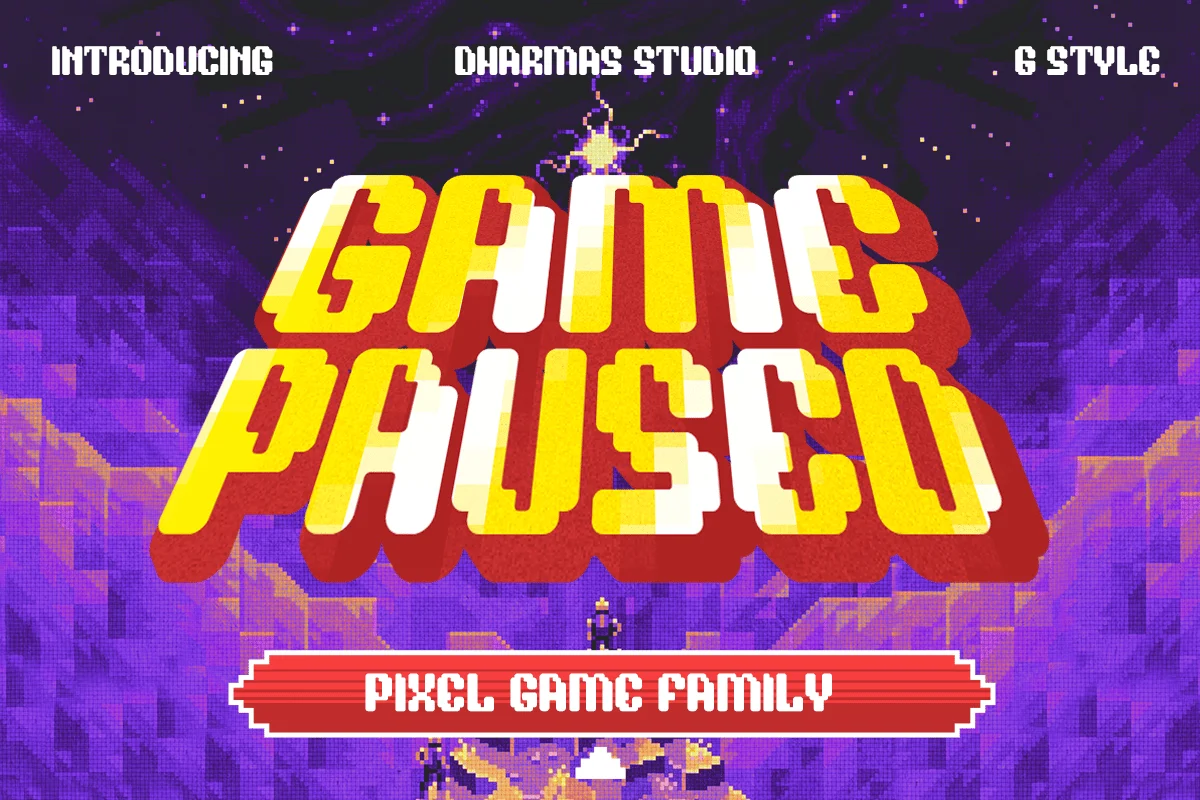
Game Paused: The Versatile Powerhouse
Game Paused is a standout choice for those needing variety. With six distinct styles—including Regular, Slant, Outline, and Extrude—it provides the flexibility to create dynamic compositions that evoke the high-octane energy of the early 2000s gaming scene.
Arcade Zone: The Bold Communicator
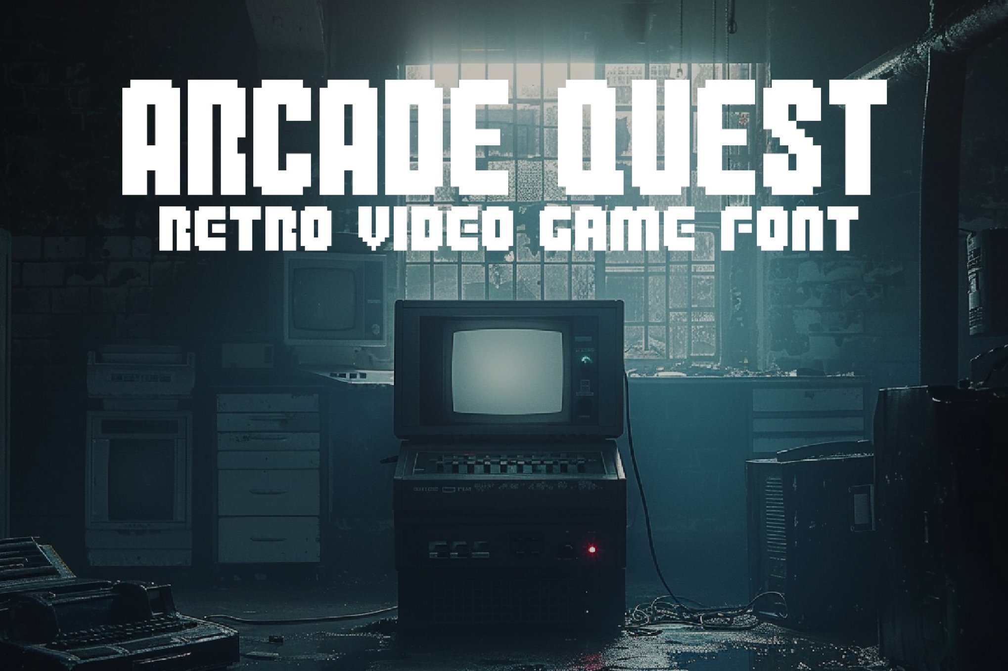
Inspired by the bold, chunky lettering of coin-op cabinets, Arcade Zone is a sans-serif display font that excels in high-visibility contexts. Its multilingual support makes it a favorite for global branding campaigns that require a youthful, energetic tone.
The Precision of Pixel Art
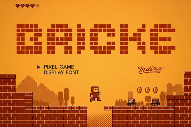
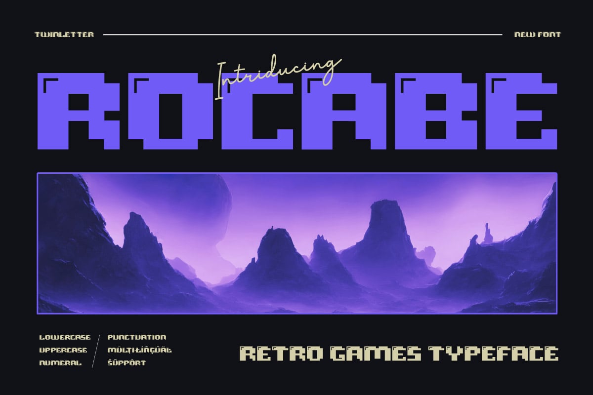
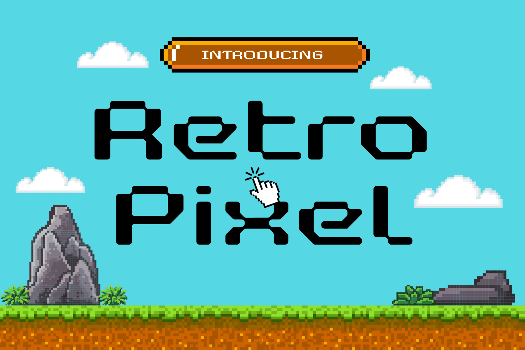
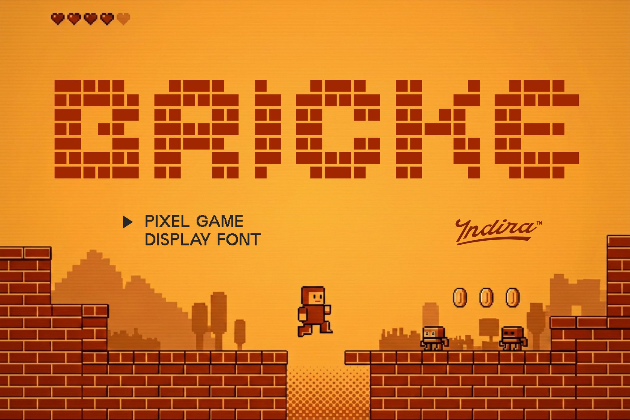
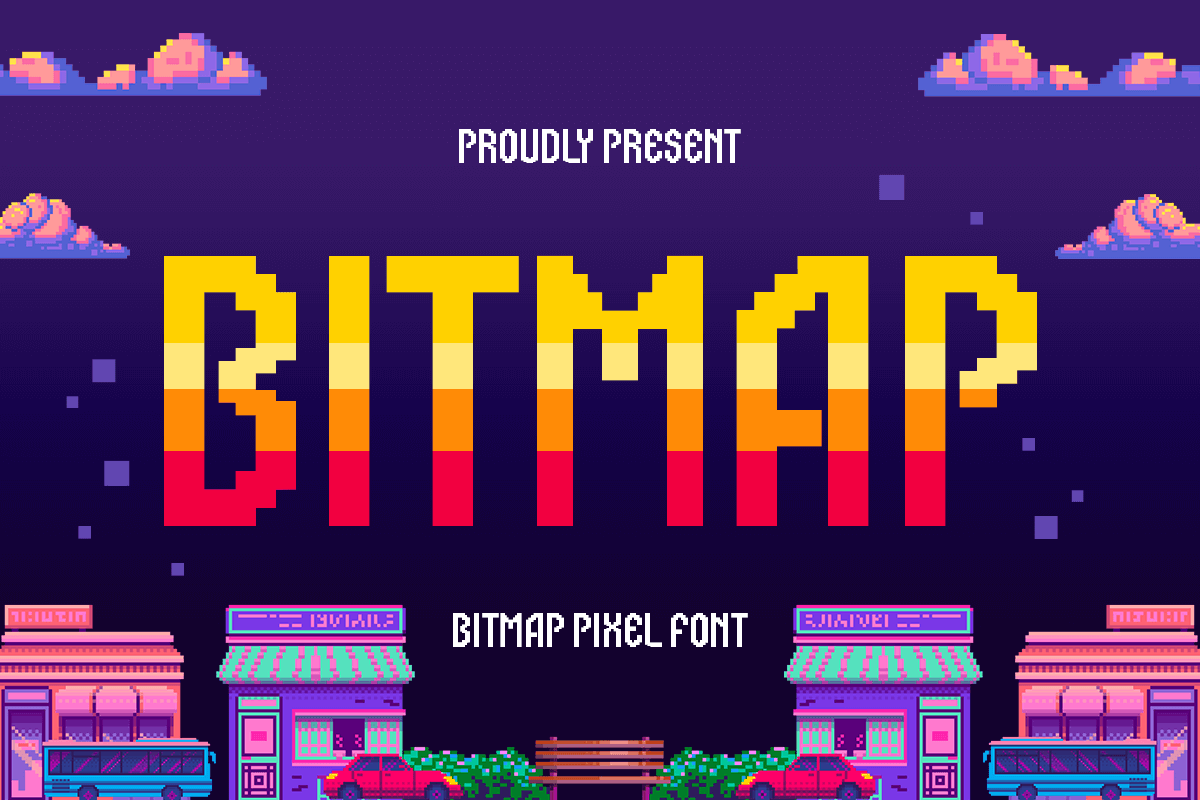
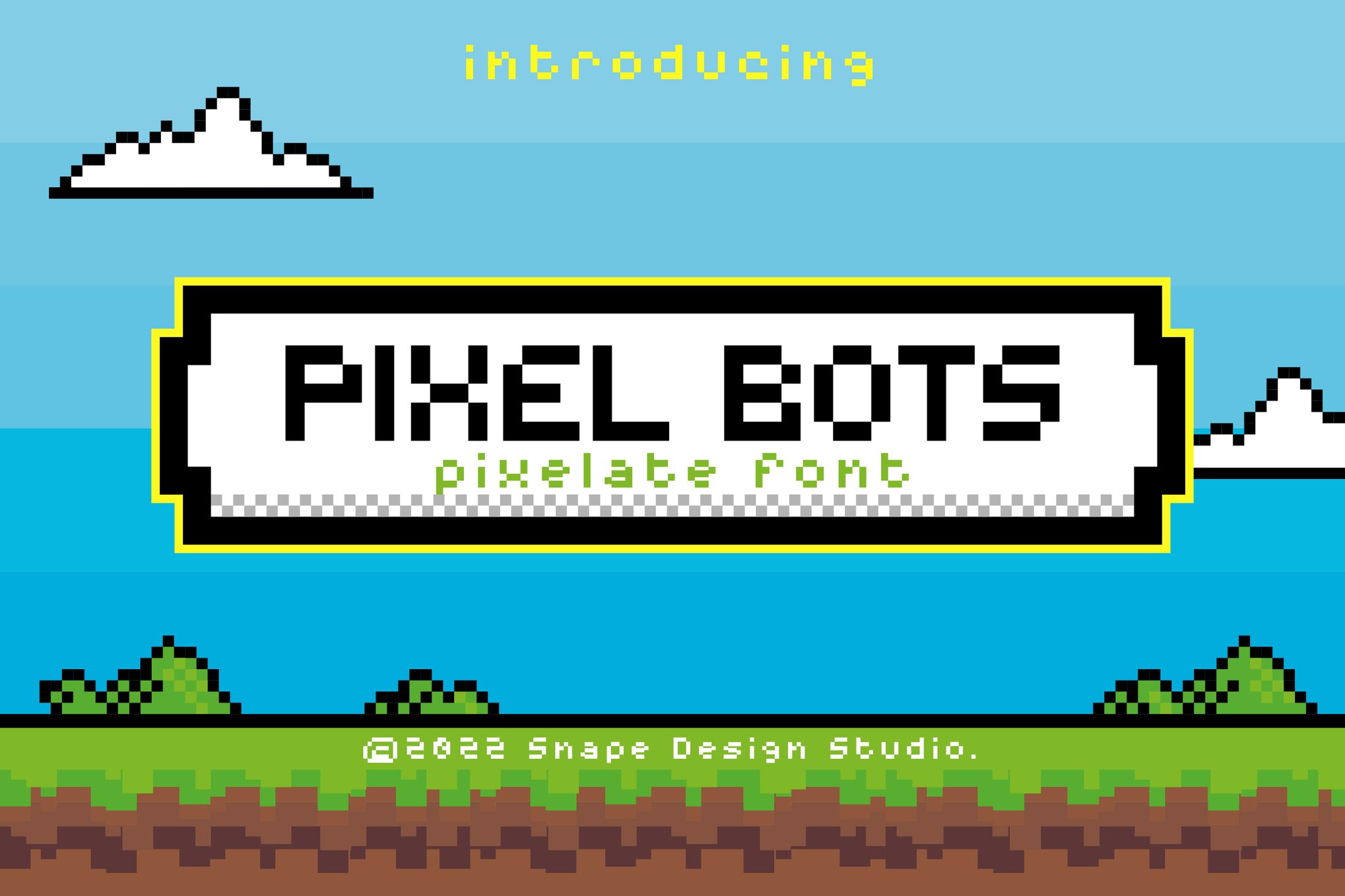
For those focusing on minimalist or 8-bit projects, fonts like Arcade Pixel, Bitmap, and Alpharush offer the cleanest interpretation of the genre. These typefaces are designed to be "pixel-perfect," meaning they maintain their sharp edges even when scaled, making them ideal for both UI/UX design and high-resolution print posters.
Experimental and Artistic Choices
For designers who want to push boundaries, fonts like Arcade Funk and Valmeria offer a twist. Arcade Funk blends arcade aesthetics with brutalist, punk-inspired geometry, while Valmeria uniquely marries medieval blackletter styles with pixel art, creating a "pixel-kingdom" aesthetic that is truly one-of-a-kind.
Supporting Data: Why Retro Typography Converts
Marketing research in the design industry suggests that nostalgia is a powerful psychological trigger. Studies on consumer behavior indicate that "retro" visual elements—specifically those reminiscent of childhood play—can increase engagement rates by up to 30% in specific demographics.
Legibility vs. Style: While retro fonts are inherently stylized, modern iterations have improved readability, allowing them to be used in secondary copy rather than just headlines.
Platform Compatibility: The transition from proprietary game code to standardized formats (OTF/TTF/WOFF) has allowed these fonts to dominate web-based design, as they are now lightweight and cross-browser compatible.
Market Saturation: Unlike standard serif or sans-serif fonts, arcade fonts possess high "visual distinctiveness," making them highly effective for logo design and social media thumbnails where standing out is essential.
Official Perspective: The Designer’s View on Retro Trends
Creative directors across the globe have noted that the "arcade aesthetic" is no longer a niche interest. In a recent interview, a leading brand strategist remarked:
"We are seeing a shift away from the overly clinical, minimalist sans-serifs that dominated the last decade. Brands want personality. They want to evoke a feeling. Arcade typography brings an instant sense of warmth, excitement, and history that clean, modern fonts simply cannot replicate."
This trend is further supported by the proliferation of "cyberpunk" and "vaporwave" aesthetics in mainstream media, which rely heavily on the visual language of 8-bit games to build their world-building narratives.
Implications: The Future of Arcade Typography
As we look forward, the trajectory of arcade fonts seems to be moving toward "Generative Nostalgia." Designers are now using AI tools to create fonts that simulate the degradation of old game hardware, such as flickering scanlines, color bleeding, and phosphor decay.
Furthermore, the rise of the "Metaverse" and virtual reality spaces has created a new frontier for these fonts. In virtual worlds, designers are utilizing these 8-bit typefaces to create immersive, retro-inspired user interfaces that feel both grounded in reality and digitally stylized.
Practical Tips for Implementation:
Use Hierarchy: Combine a bold, arcade-style display font with a clean, readable body font to ensure your message remains professional.
Color Palettes: Pair your typography with high-contrast, neon-heavy color palettes—cyan, magenta, and lime green are standard for a reason.
Spacing Matters: In pixel fonts, kerning is often tight. Don’t be afraid to manually adjust tracking to give your letters "breathing room."
Best Free Alternatives for Aspiring Creators
For those just starting their design journey, the barrier to entry is low. High-quality free fonts like Cyber Bytes, Digital 808, Game City, and Start Signal offer professional-grade quality without the price tag. These fonts are perfectly suited for:
Esports Branding: Creating logos that look aggressive and competitive.
Streaming Overlays: Enhancing the visual appeal of Twitch or YouTube gaming streams.
Educational Materials: Making learning fun for younger audiences through playful, game-inspired graphics.
Conclusion
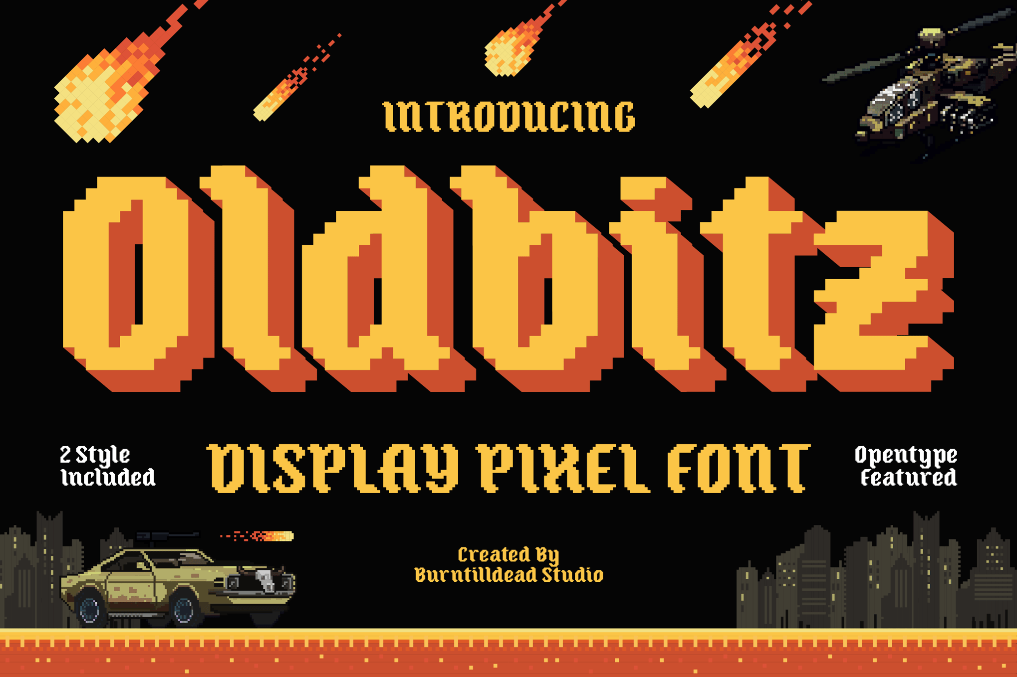
The fascination with arcade typography is more than just a passing trend; it is a celebration of the era where digital interaction first became a part of the human experience. By choosing the right font, you aren’t just selecting a typeface—you are tapping into a shared cultural memory of wonder, challenge, and the joy of the game. Whether you opt for the premium, high-detail options like Oldbitz or the free-to-use classics like Start Signal, your project is guaranteed to gain a sense of timeless, pixelated character.
Now, with the right resources at your fingertips, it’s time to hit "Start" on your next design adventure.
Mastering the Art of the Career Narrative: A Guide to Adobe InDesign Resume Templates
In the modern job market, where recruitment algorithms and HR managers often spend mere seconds scanning a document, the visual architecture of your resume is as critical as the professional…
Beyond the Wireframe: Building a Defensible ROI Case for UX Design
In the modern corporate landscape, the era of the five-minute pitch—where a few slick wireframes and a promise of "delightful user experiences" could secure a six-figure budget—has firmly concluded. Today,…

 Rifan Muazin










 Sagoh

 Asep Darmawan

 Raul Delapena Setiawan

 Reynand Wu



 Azzam Bilal Chamdy

 Ali Ikhwan
