
 Laily UPN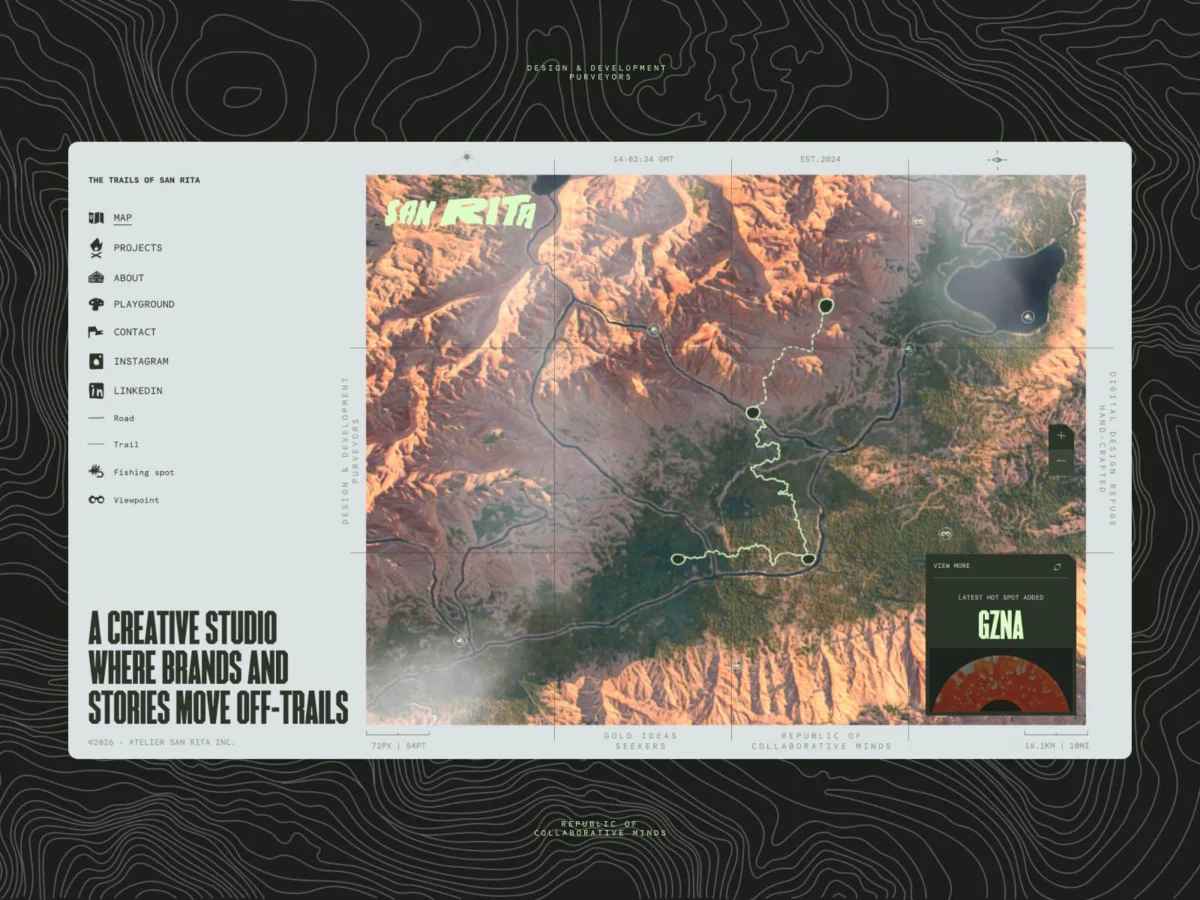
In an industry often criticized for a relentless march toward homogenization—where "clean" UI design frequently devolves into sterile, indistinguishable grids—Montreal-based creative studio Atelier San Rita has charted a different course. With the launch of their new digital home, sanrita.ca, the team has moved beyond the traditional boundaries of a portfolio. Instead, they have constructed an interactive, 3D-rendered landscape that marries the tactile nostalgia of vintage National Park maps with cutting-edge web performance.
This article explores the architectural, philosophical, and technical journey behind the project, detailing how a small team transformed a browser into an immersive, living territory.
The Philosophy: Rejecting the "Default" Web
For the founders of Atelier San Rita—Julien Sister, Alexis Malin, and Martin Thienpont—the decision to build a bespoke 3D environment was born from a growing frustration with the "default" web. Modern digital experiences have become increasingly predictable: perfectly aligned white space, standardized typography, and predictable interactions. While functional, this design language often lacks soul.
"We wanted to build something that felt like a home rather than just another portfolio," the studio notes. Situated in Montreal, a city defined by the juxtaposition of urban grit and the untamed wilderness of the Quebec landscape, the studio sought to capture that tension. They rejected the sterile gallery format, aiming instead to build a space that reflects both their technical precision and their deep-rooted love for the outdoors.
The "North Star" for the project was the aesthetic of 1950s-era topographic maps. These artifacts possess a specific, human quality—sun-faded colors, hand-drawn elevation lines, and a grainy, organic texture that feels lived-in. By digitizing this aesthetic, San Rita sought to move away from the "plastic" sheen of modern UI and toward something that felt tactile and grounded.
Chronology of a Digital Expedition
The development of the site was not a linear process; it was a year-long "tug-of-war" between artistic ambition and the hard limitations of browser performance.
Phase 1: Conceptualization and Prototyping
The project began as an investigation into how to translate tactile, nostalgic charm into a living, 3D space. The team spent months defining what "Digital Craft" meant to them, moving away from using technology for the sake of novelty and toward using code as a narrative tool.
Phase 2: Terrain Generation
The heart of the site is an interactive 3D map, a narrative bridge between the studio’s dual identities: the warm, laid-back atmosphere of California and the raw, wild landscape of Canada. To achieve this, the team didn’t just model shapes; they performed a digital survey. Using actual GPS data and heightmaps, they sculpted terrain in Blender to ensure the elevations felt intentional and geologically plausible.
Phase 3: The Performance Crisis
Mid-development, the project hit a wall. High-poly models were visually stunning but resulted in massive file sizes that crashed mobile browsers. This forced the team into the "art of killing darlings." They pivoted to a workflow using Adobe Substance 3D Painter, baking high-resolution details onto low-poly meshes. This allowed the ridge lines and valleys to remain sharp while keeping the asset footprint manageable.
Phase 4: Final Polish and Interaction Design
The final months were dedicated to the "feel"—fine-tuning the scroll speed, the light reflection on the "paper" textures, and the integration of the UI layer. By the time of launch, the site was no longer a gallery, but a singular, continuous 3D journey.
Technical Architecture: Supporting Data and Methodology
The technical achievement of San Rita lies in its ability to maintain a high-fidelity experience without sacrificing performance. The team utilized a sophisticated stack to bridge the gap between design and development.
The "Global" Canvas Approach
Most Three.js sites suffer from "jank" because the 3D scene unmounts and remounts as the user moves between pages. San Rita adopted a "global canvas" strategy, keeping the 3D scene mounted outside the Next.js App Router. This ensures that the terrain is always present; when a user clicks a project, the camera simply navigates to a new coordinate within the existing world. This creates a seamless, continuous, and cinematic flow.
Optimization Strategies
To maintain high frame rates, the studio implemented a series of advanced optimizations:
- Draco Compression: Used to shrink the size of 3D geometry without losing detail.
- KTX2 Textures: A format far more GPU-friendly than standard JPEGs, ensuring faster rendering.
- Adaptive Quality System: A real-time engine that detects frame rate drops and dynamically reduces shadow resolution or grain density to ensure the experience remains fluid, even on lower-end hardware.
Custom Shaders
To achieve the "paper" aesthetic, the team wrote custom GLSL shaders. These shaders inject noise and grain directly into the materials, allowing light to interact with the terrain in a way that suggests a physical surface. This was a direct response to the "plastic" look of modern 3D web design.
Official Perspectives: The Studio’s Stance on Craft
In a statement regarding the project’s success, the partners emphasized the value of restraint. "There were dozens of features we built and then deleted because they felt like ‘too much,’" the studio explained. "We had versions with birds, weather systems, and day-night cycles, but we realized those were distractions from the core story."
The studio views the site as a living product. By connecting the frontend to their headless CMS, DatoCMS, they have laid the groundwork for a future where every new project added to the studio’s roster automatically spawns a new landmark on the 3D map.
"In an era where AI can generate a standard layout in seconds," the team notes, "we believe that human intuition and ‘imperfect’ design are more valuable than ever. We want our digital home to grow as we do."
Implications: The Future of Portfolio Design
The success of sanrita.ca signals a shift in how agencies may view their online presence. As the web becomes increasingly commoditized by AI-driven templates and rigid design systems, the "hand-crafted" digital experience becomes a powerful differentiator.
The Return of Atmosphere
San Rita demonstrates that the most successful digital experiences are not those with the most features, but those with the most cohesive atmosphere. By prioritizing the feeling of the site over the utility of the grid, the studio has set a new benchmark for agency portfolios.
Human-Centric Innovation
The project serves as a rebuttal to the idea that "tech-heavy" equals "soulless." By obsessing over the texture of the grain, the weight of the scroll, and the continuity of the camera movement, San Rita has shown that technology, when applied with intent, can heighten human emotion rather than replace it.
A New Standard for Small Teams
Finally, the project underscores the power of a small, focused team. Because Atelier San Rita is not a massive agency, they were afforded the luxury of experimentation—the ability to spend an entire afternoon debating the specific shade of "National Park Green." This level of obsessive detail is what defines "Digital Craft." It is the digital equivalent of a master carpenter ensuring every joint is perfectly seated.
As the industry moves forward, San Rita’s work stands as a reminder that the web is a territory waiting to be mapped—not just a billboard for services, but a place to inhabit. For those willing to step off the beaten path, the potential for digital storytelling remains virtually limitless.


 Raul Delapena Setiawan
 Suro Senen
 Nana Wu
 Asro
Asro
 Jia Lissa
 Neng Nana
 Dwi Wanna
 Siti Muinah