Suro Senen
In the high-stakes world of digital retail, the most formidable opponent a brand faces is not a competitor’s lower price point or a flashier marketing campaign. It is the silent, internal monologue of the shopper. When a potential customer visits a product page, they are constantly performing a subconscious cost-benefit analysis. Every time a site forces them to pause, calculate, or interpret, the brand risks losing them.
As Steve Krug famously articulated in his seminal work on user-interface design, Don’t Make Me Think, the goal of any effective digital storefront is to minimize "cognitive load." When a shopper asks, "What does this mean?" or "Do I need one or two of these?", they are no longer shopping—they are performing labor. And for the modern, time-poor consumer, labor is the fastest way to trigger an exit.
The Science of Friction: Why Shoppers Abandon Carts
To understand the mechanics of conversion, one must view the shopper’s journey as a reservoir of "goodwill." Every click is an investment of mental energy. If a shopper has to navigate a confusing quantity selector, decode a jargon-heavy product name, or mentally convert a bulk price into a unit price, they draw from that reservoir. Once the reservoir is depleted, the urge to purchase evaporates.
The primary culprit is often the demand for mathematical or logical processing. When an interface fails to provide immediate clarity, it creates a "hesitation gap." In this gap, doubt creeps in. "Is this enough for a month?" "Is this price for one item or a case?" When these questions remain unanswered or require active research, the friction becomes a barrier to entry.

Chronology of a Conversion Failure
- The Arrival: The shopper lands on the product page, motivated by intent.
- The Encounter: The shopper engages with the product details, seeking confirmation of their needs.
- The Friction Event: The interface presents a variable—such as bulk sizing or complex pricing—that requires manual calculation.
- The Cognitive Stall: The shopper stops scanning the page and begins "figuring out the site."
- The Exit: The mental tax exceeds the perceived value of the product, leading the shopper to abandon the session.
Strategic Simplification: Real-World Case Studies
Leading direct-to-consumer brands have begun to master the art of "no-math" e-commerce. By eliminating the need for the user to perform arithmetic, these brands are successfully reducing bounce rates and increasing average order values.
The "Occasion-Based" Model: Gush
Gush, a beverage brand, has revolutionized the standard pack-size selector by moving away from purely numerical labels. Instead of offering "12-pack," "24-pack," and "48-pack" options, they utilize labels like "With a Friend," "With the Crew," and "For the Party."
This is a masterclass in cognitive offloading. The shopper does not need to calculate how many pouches they require for an event; they simply identify the scenario that matches their intent. By aligning the product quantity with the user’s lifestyle, Gush removes the "how much is enough" variable entirely.
The Clarity First Approach: Waju
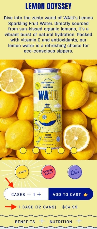
Waju, an innovative drink brand, tackles the ambiguity of quantity by explicitly defining the unit of measurement. On their product pages, the quantity selector is clearly labeled "Cases," with a supplementary, high-contrast line of text stating, "1 case (12 cans)."

This simple visual cue prevents the common anxiety of "did I just order one can or a whole box?" By placing this information directly beneath the quantity selector, Waju ensures that the shopper never has to hunt for the information, maintaining the flow of the purchase path.
Outcome-Oriented Naming: Blueland
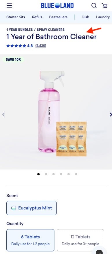
Blueland has taken a different route by prioritizing the "outcome" over the "contents." When selling cleaning tablets, they frame their product names and quantities based on usage duration—for example, "1 Year of Bathroom Cleaner."
By doing so, they shift the shopper’s focus from "how many tablets are in this box?" to "how long will this last me?" The conversion becomes a decision based on personal household needs rather than a complex math problem. By providing pre-calculated options based on family size (e.g., 6 tablets for 1–2 people, 12 for 3+), they allow the user to make a confident selection in seconds.
The Visual Anchor: The Farmer’s Dog
Perhaps the most intuitive example of reducing cognitive friction is found at The Farmer’s Dog. Recognizing that dog owners often struggle to visualize the correct amount of food for their pets, the brand uses clear, high-quality illustrations of filled bowls.
Rather than showing the quantity in grams or boxes, they display the food in three visual portions: full, half, and small. By pairing these visuals with a price-per-day calculation, they align the price with the user’s mental budget. The addition of the clarifying text, "Contains two weeks of food," ensures that the shopper understands the commitment without having to perform any unit conversions.
The Data-Driven Implications of UX Design
The implications of these design choices are profound. In the e-commerce sector, A/B testing consistently shows that when friction is removed, conversion rates increase. A study on "Decision Fatigue" suggests that consumers who are forced to make complex choices are more likely to default to the "do nothing" option—in this case, leaving the site.
Impact on Conversion Metrics
- Reduced Cart Abandonment: When shoppers don’t have to "solve" the page, they are less likely to leave out of frustration.
- Increased Average Order Value (AOV): By making larger quantities easier to understand (e.g., "1 Year Supply"), brands can nudge customers toward bulk purchases that feel like a logical, long-term solution rather than a high-cost expenditure.
- Customer Lifetime Value (CLV): A seamless checkout experience builds trust. When a customer feels that a brand understands their needs so well that it "thinks" for them, they are significantly more likely to return.
Official Industry Perspectives on Frictionless Design
Industry experts and UI designers often argue that the "minimalist" approach is not just a trend, but a necessity of modern attention spans.
"The modern shopper has the attention span of a goldfish, but the critical eye of an auditor," says one veteran UX strategist. "If they have to perform more than two mental steps to understand what they are buying, they will find a competitor who makes it easier."
The prevailing consensus is that "clarity is a feature." Brands that view their website as a digital salesperson—one that guides the customer through a frictionless, helpful, and logical journey—are the ones winning the battle for market share.
Conclusion: The Path Forward
The "No Counting" strategy is more than a design preference; it is a fundamental shift in how e-commerce brands should approach the customer experience. To succeed in an increasingly crowded market, retailers must audit their product pages for "friction points."
Every question asked of the user is a potential leak in the sales funnel. By replacing numbers with scenarios, shifting from contents to outcomes, and using visual cues to anchor expectations, brands can create a frictionless experience that feels less like a transaction and more like a service.
As Steve Krug posited, the goal is to make the interface transparent. When the design disappears, the product remains—and that is exactly where the sale happens.


 Evan Lee Salim
 Nana
Nana
 Lina Irawan

 Rifan Muazin
 Ali Ikhwan