
 Pevita Pearce
For the better part of a decade, the design world was held in the firm, sterile grip of minimalism. It was a digital epoch defined by vast swathes of white space, the ubiquity of Helvetica, and a relentless pursuit of pixel-perfect grid systems. This aesthetic, once hailed as the pinnacle of modern sophistication, eventually began to suffer from its own success. As digital experiences became increasingly homogenized, the creative industry hit a wall of exhaustion. In response, a rebellious counter-movement—"anti-design"—has emerged, trading clinical precision for the raw, the jarring, and the deliberately imperfect.
But what lies beneath this aesthetic pivot? Is it merely a fleeting reaction to the boredom of digital cleanliness, or does it represent a fundamental shift in how brands communicate with a cynical, AI-saturated public? To explore this, I spoke with Ollie Patterson, managing director at the creative agency Mynt, to dissect the rise of anti-design, the vital role of human intent, and what the future holds for a world moving away from the "perfect."
The Chronology of a Counter-Movement
To understand anti-design, one must first map the timeline of the "Perfect Design" era. Following the chaotic, high-contrast maximalism of the late 1990s and early 2000s, the design world pivoted toward the "Swiss Style" revival. Facilitated by the rise of mobile-first web design and the demands of UX/UI consistency, brands across the globe converged on a singular look: flat colors, sans-serif typography, and generous negative space.
By 2018, however, the industry began to experience "minimalism fatigue." As users grew accustomed to highly curated digital environments, those environments began to feel manufactured and soulless. The emergence of anti-design—characterized by clashing colors, unconventional layouts, and "ugly" typography—began as a subcultural statement, often found in indie zines and experimental music posters. By 2022, it had entered the mainstream. Major fashion houses and tech startups alike began incorporating these "flaws" into their branding, signaling a desire to disrupt the digital status quo.

The Psychology of Imperfection
The core tenet of anti-design is not just to be "ugly," but to be human. As Ollie Patterson explains, the pivot is driven by a deep-seated craving for authenticity.
"A desire to feel real and authentic is what’s driving this fatigue for perfect design," Patterson notes. "Imperfections are the things we can relate to and fall in love with. When everything is too polished and perfect, it feels out of reach."
In a market saturated with high-fidelity imagery and perfectly color-graded social media feeds, the consumer’s radar for "manufactured" content has become incredibly sharp. We are wired to detect when something is synthetic. Consequently, small, intentional flaws—a slightly off-kilter alignment, a tactile texture, or a non-standard font—act as a signal of genuine human effort.
"It’s the small flaws and unexpected design elements which demonstrate genuine human effort and give a design its authenticity and character," Patterson says. "And it’s that authenticity that creates connection and builds trust. In an increasingly filtered and curated world, it’s genuine, honest design which stands out."
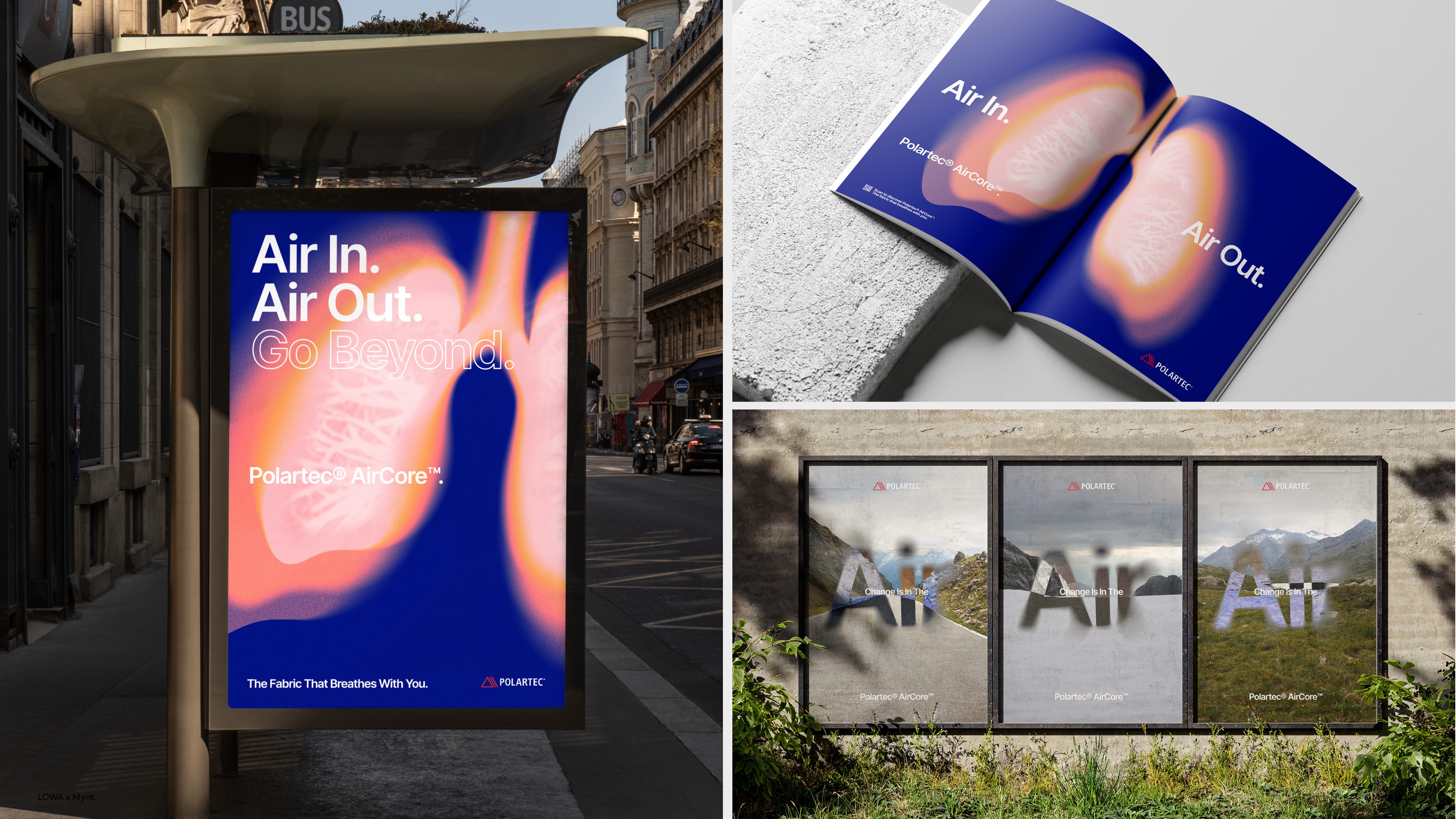
The AI Paradox: Why "Perfect" is No Longer Enough
The rise of generative AI has acted as an accelerant for the anti-design movement. With tools like Midjourney and DALL-E, the barrier to creating "perfectly polished" visuals has dropped to near zero. Paradoxically, this has made perfection less valuable.
"AI can produce lots of clean, polished visuals," Patterson observes. "But when everyone has access to the same tools and the easier ‘perfection’ becomes to create, the less interesting it becomes."
This creates a new hierarchy of value in the creative economy. If AI can generate a perfect, generic logo in seconds, the value shifts to the perspective behind the work. The brands that win will not be those who adopt the most advanced automation, but those who use those tools as a support layer for a uniquely human point of view. Authenticity is the ultimate differentiator in an age of automated abundance.
The Anatomy of "Crafted Imperfection"
A frequent criticism of anti-design is that it is simply "bad design." However, there is a technical distinction between accidental incompetence and deliberate, crafted imperfection.
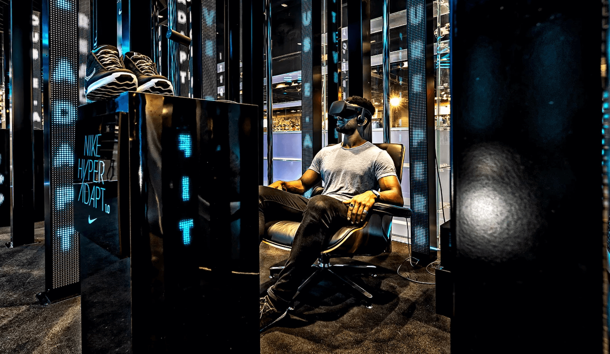
"The defining factor is the intent behind it," Patterson clarifies. "Crafted imperfection still has a clear purpose and communicates brilliantly—it just doesn’t feel over-engineered. Poor design is accidental."
This distinction is crucial for brands attempting to leverage the trend. When a brand uses a jarring layout to force the user to pay closer attention, that is a strategic choice. When a brand uses poor contrast or broken hierarchies without reason, it is simply a failure of communication. The goal of anti-design is to provoke, to engage, and to humanize—not to confuse.
Case Study: The Polaroid Rebellion
One of the most successful examples of this philosophy in action is Polaroid’s recent campaign for their "Flip" camera. In an era dominated by cloud-based, infinitely reproducible digital images, Polaroid leaned into the "imperfect" nature of analog photography.
Patterson points to this as a masterclass in modern brand positioning. "I really liked Polaroid’s campaign last year when they launched their ‘Flip’ camera, taking AI head-on by celebrating realness. The focus was on print photography as a lifestyle choice over endless scrolling and digital images saved in the cloud."

The campaign was physically confrontational. By placing billboards in close proximity to the offices of tech giants like Apple and Google, Polaroid didn’t just market a product; they marketed a philosophy. The use of gritty, tactile layouts served as a visual manifestation of the camera’s analog nature, proving that "imperfection" can be a powerful, high-end branding tool when executed with precision.
Implications for the Future: A Balanced Equilibrium
As we look toward the future, the question remains: where does the trend cycle go from here? Will we see a return to rigid minimalism, or is this the new permanent state of design?
Patterson suggests that the industry is moving toward a state of equilibrium. "I don’t think we’ll suddenly swing back into a world of ultra-perfect design," he says. "I think we’ll see a balance. Brands will continue to embrace authenticity, but they’ll become more selective about where they introduce imperfections."
The future of design is not about choosing between the "perfect" and the "imperfect," but about understanding the context of communication. The winners in the coming years will be the designers and brands that possess the emotional intelligence to know when to be beautifully, technically precise, and when to break the rules to capture the heart.
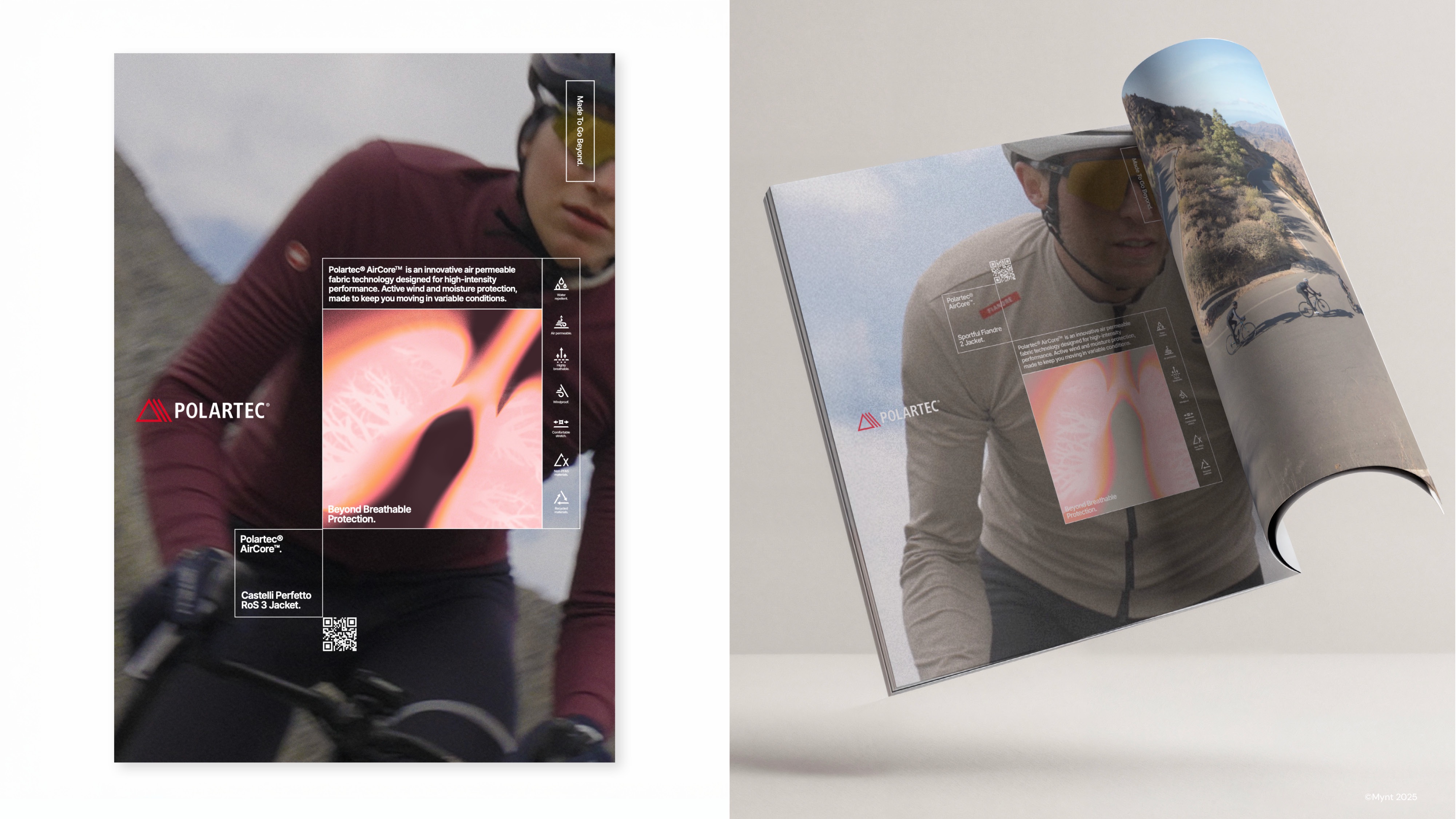
"Perhaps perfection catches the eye," Patterson concludes, "but imperfection catches the heart." As we navigate an increasingly automated world, that human connection will be the most valuable currency of all.

 Sagoh
Sagoh
 Asep Darmawan
 Raul Delapena Setiawan
 Reynand Wu

 Azzam Bilal Chamdy
 Ali Ikhwan