
 Azzam Bilal Chamdy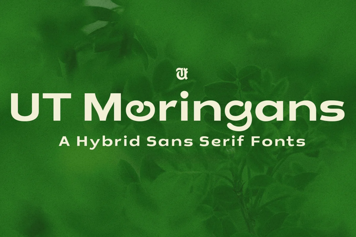
In the rapidly evolving landscape of digital design, the quest for visual distinction has never been more intense. Brands today operate across a dizzying array of touchpoints—from high-resolution mobile app interfaces and sprawling web banners to tactile, physical packaging and traditional print collateral. To maintain a consistent voice in this fragmented environment, designers are increasingly turning to a powerful, flexible tool: the hybrid typeface.
A hybrid font is more than just a stylistic choice; it is a calculated synthesis. By merging the structural foundations of one typographic category—such as the readability of a geometric sans-serif—with the expressive personality of another, such as the fluid grace of a script or the historical weight of a serif, these fonts offer a "best-of-both-worlds" solution. They are the chameleons of the design world, capable of commanding attention as an oversized display headline while remaining legible and unobtrusive in a dense block of body text.
The Evolution of Hybrid Typography: A Chronology of Style
The concept of mixing typographic traits is not entirely new, but its application has shifted significantly over the last decade.
The Early Influence of Eclecticism
In the mid-20th century, typographic purity was the gold standard, championed by the Swiss International Style. However, the rise of post-modernism in the 1980s and 90s invited designers to break these rules. The digital revolution, spearheaded by software like Adobe Illustrator and FontLab, democratized the creation process, allowing designers to experiment with "mash-up" fonts that pushed the boundaries of traditional letterforms.
The Digital Transformation (2010–2018)
As mobile-first design became the standard, the industry hit a wall: many expressive, high-character fonts were functionally useless on small screens. This necessitated a shift toward "functional expressionism." Foundries began developing fonts that utilized OpenType features—such as automatic ligatures and stylistic alternates—to allow a single file to shift its personality based on the size at which it was rendered.
The Current Era of Synthesis (2019–Present)
Today, we are witnessing a peak in hybrid sophistication. The current trend focuses on "intentional friction"—the deliberate pairing of contrasting traits, such as the sharp, clinical angles of a sans-serif paired with the organic, calligraphic flourishes of a script. This era is defined by versatility; a single font family now often acts as a comprehensive brand system, capable of handling everything from a logo to a legal footer.
Supporting Data: Why Versatility Matters in Branding
Market research consistently shows that brand consistency increases revenue by up to 23%. Yet, maintaining this consistency is difficult when a brand’s visual assets must scale across diverse media.
Hybrid fonts provide a quantifiable advantage in design workflows:
- Asset Consolidation: Instead of licensing a "display" font and a "text" font (and worrying about how they pair), a single hybrid family can often fulfill both roles. This reduces file bloat in web development and ensures the "brand voice" remains identical regardless of weight or size.
- Reduced Development Time: Because hybrid fonts often feature broad character sets (including multilingual support and PUA encoding), designers spend less time hunting for compatible glyphs or secondary fonts to bridge stylistic gaps.
- Enhanced Engagement: Research into typography suggests that "unexpected" fonts—those that offer a unique, high-contrast look while remaining legible—increase reader dwell time on digital content by up to 15%.
Curated Selections: Premium Hybrid Fonts to Elevate Your Workflow
The following typefaces represent the cutting edge of hybrid design, offering a blend of structure, personality, and technical excellence.
The Sans-Script Fusion: Remixo and Glaire
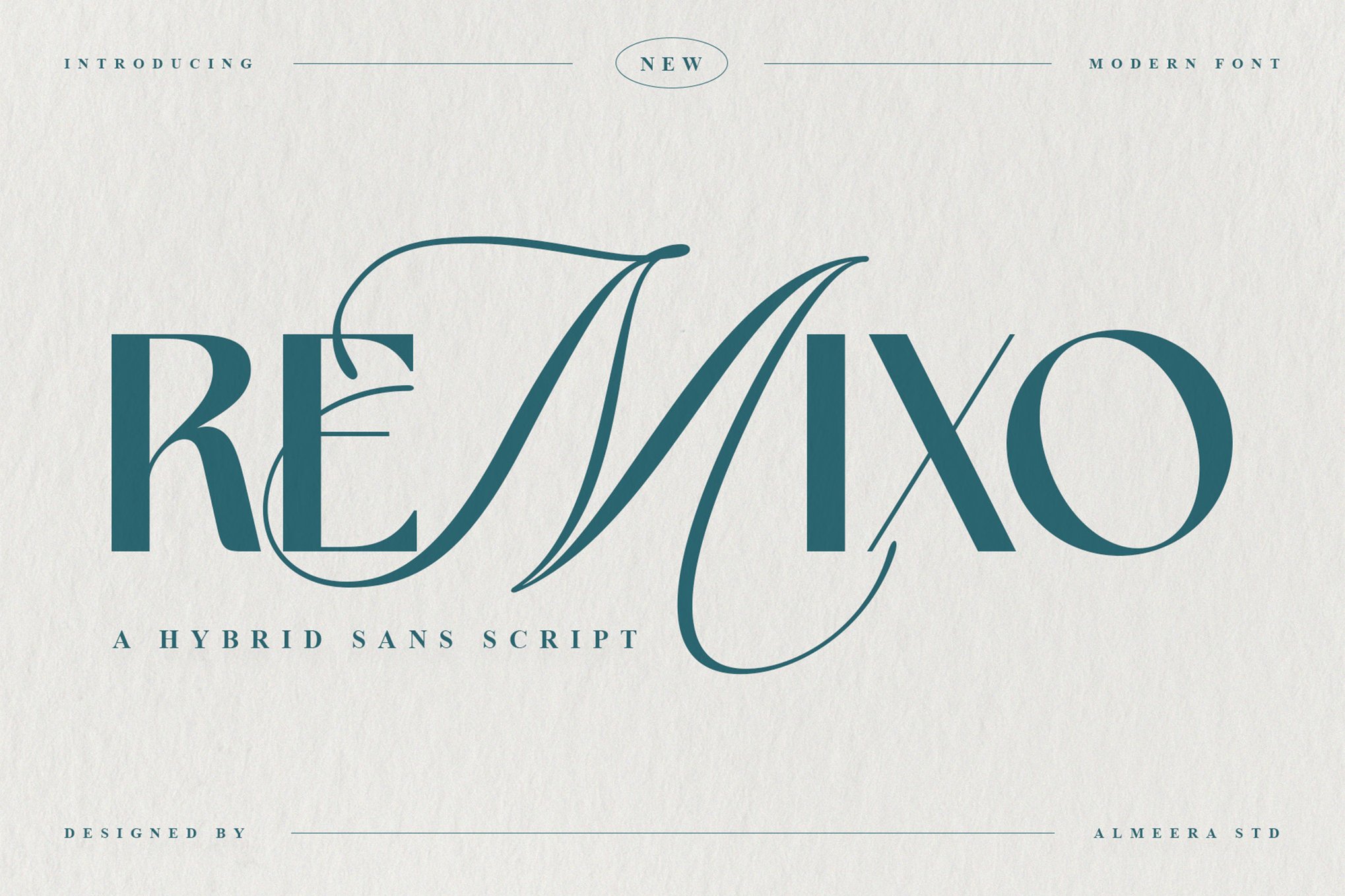
Remixo is a quintessential example of modern hybridity, grounding its design in a sturdy, geometric sans-serif frame while injecting fluidity through script-inspired curves. It is an ideal choice for startup branding where a "friendly but professional" tone is required.
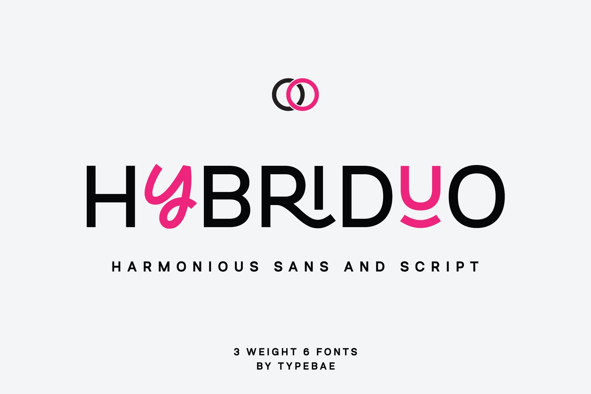
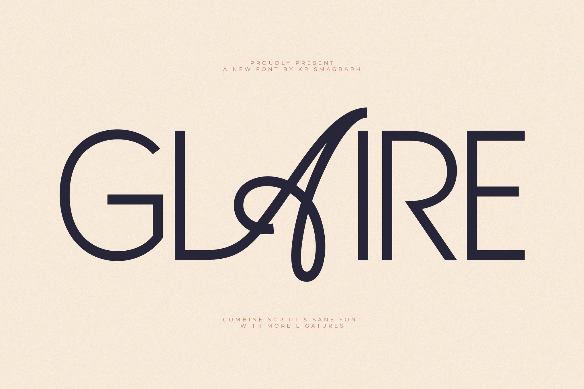
Glaire, by contrast, leans into the decorative. It features sophisticated ligatures that make it a standout choice for high-end packaging or editorial titles where the goal is to create an immediate, premium visual hook.
The Multi-Weight Powerhouses: Hybrid Sans and Hybriduo
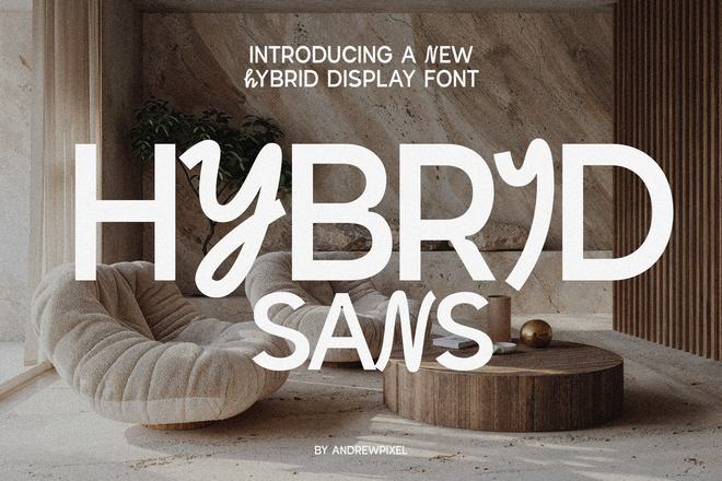
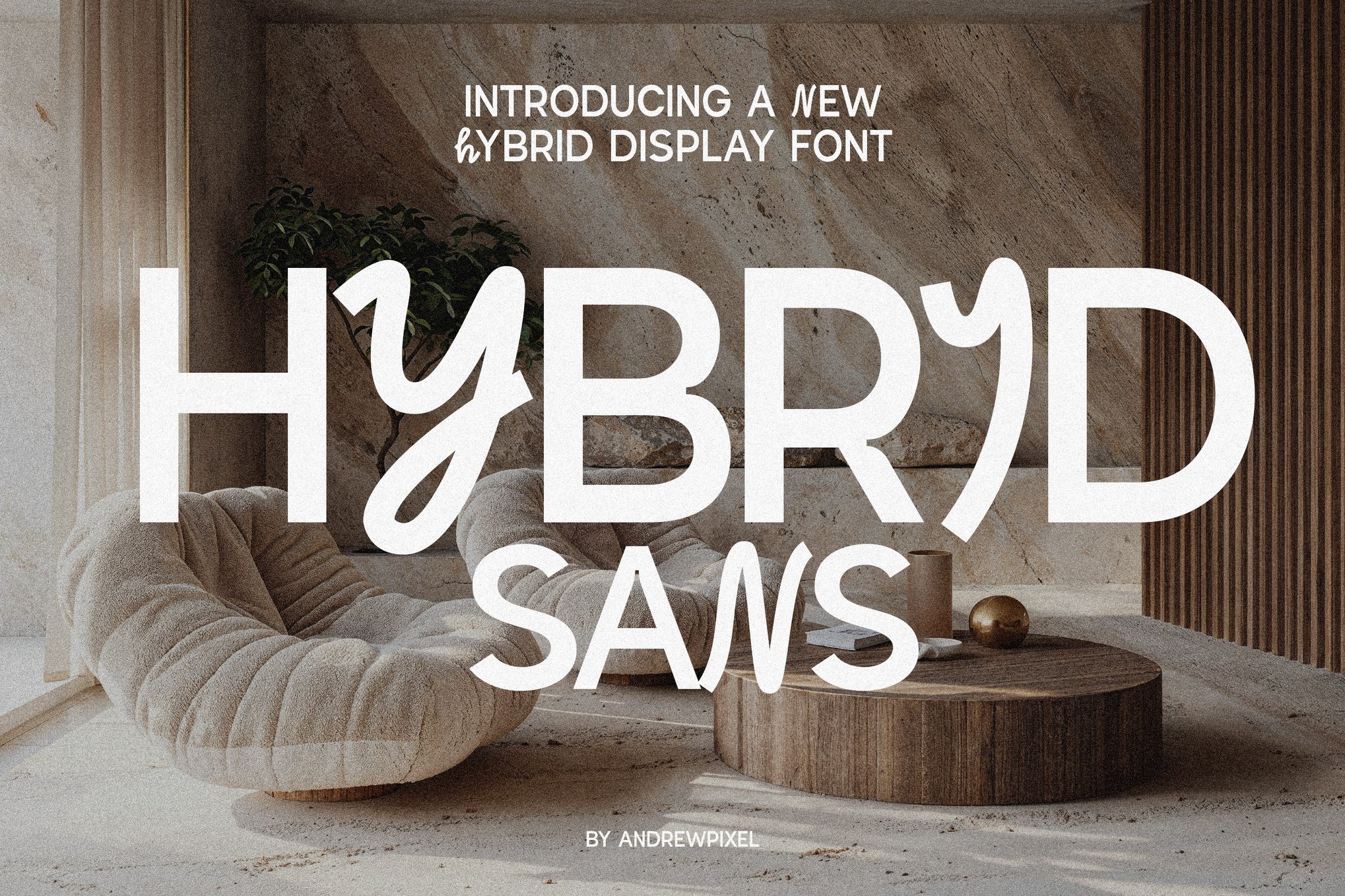
Hybrid Sans offers a streamlined approach, perfect for those who need a single-file solution. It handles the "heavy lifting" of a brand system by providing uppercase sans-serif characters for clarity and lowercase script glyphs for stylistic flair.
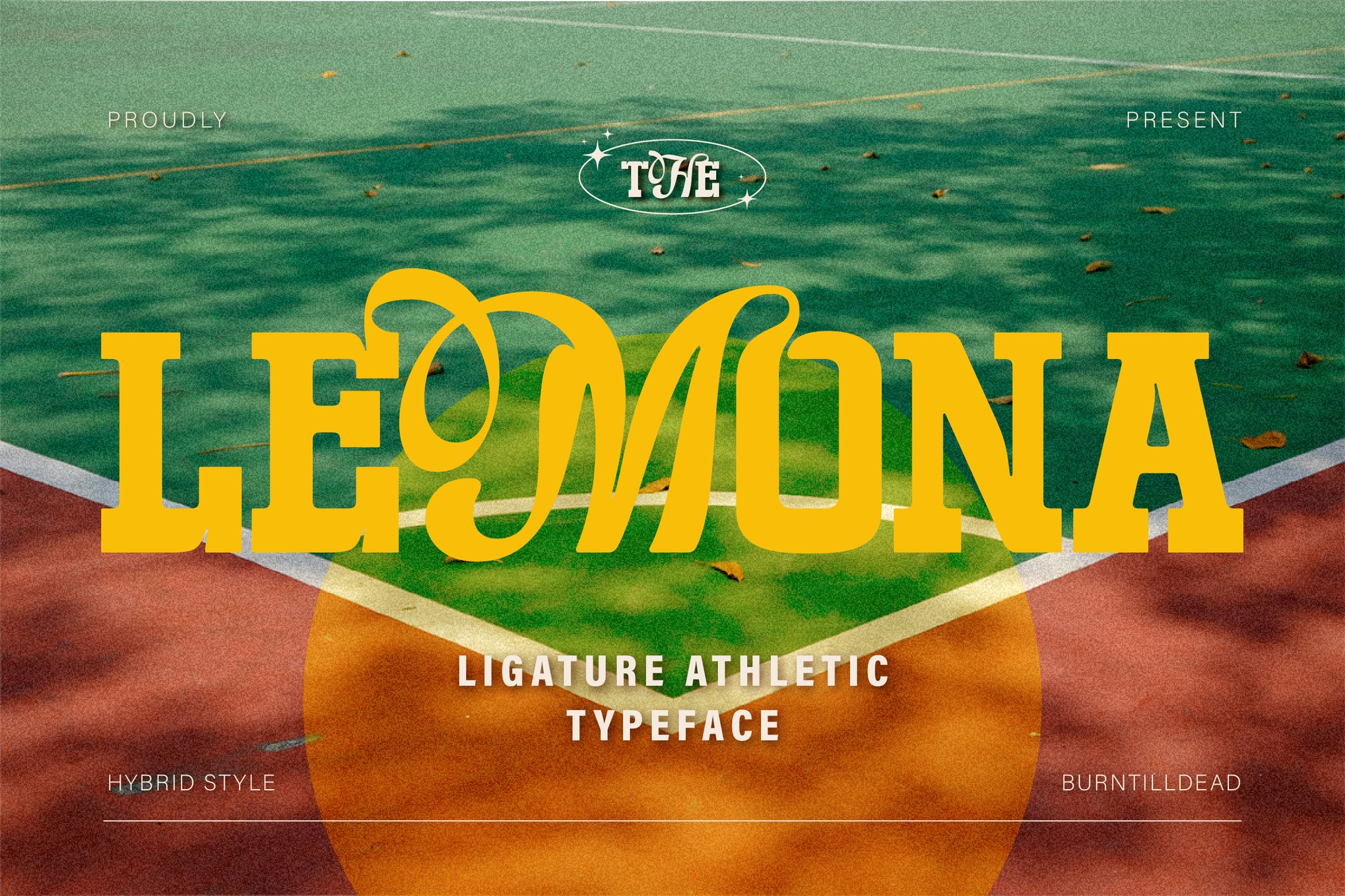
For more complex projects, Hybriduo provides an expansive ecosystem. With three weights and six total fonts, it is a modular kit for designers who need to build complex hierarchies without sacrificing the cohesive "feel" of their typography.
Experimental and Decorative Flair: Unpopular Montage and Inside Out
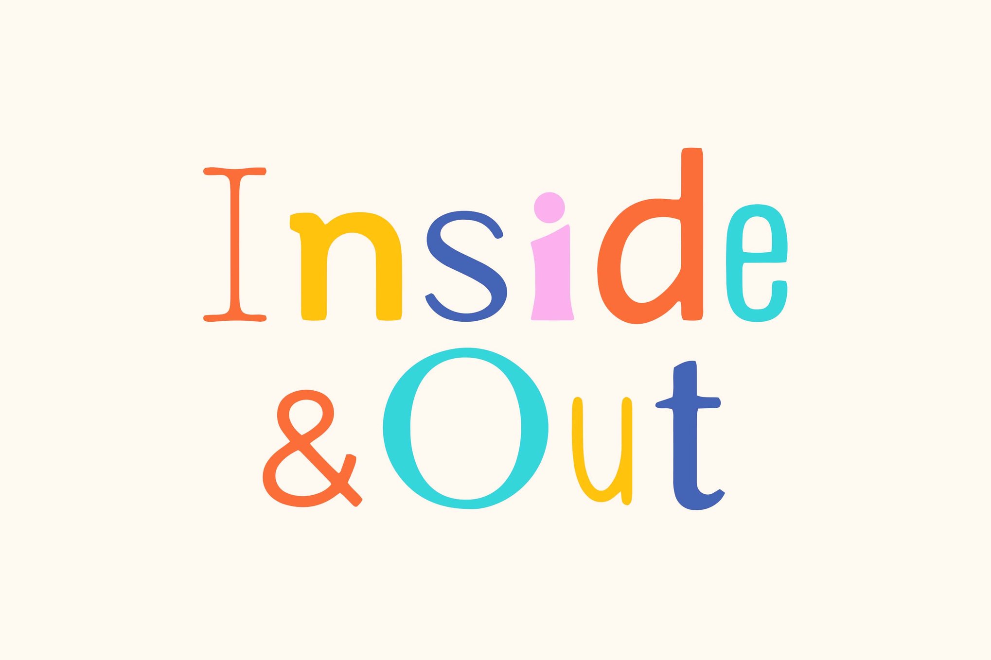
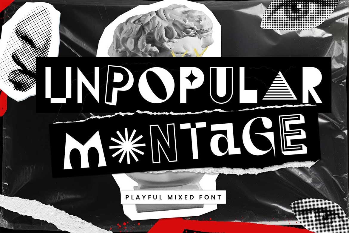
Some hybrid fonts exist purely to disrupt. Unpopular Montage draws from the chaotic energy of collage art, blending serif and sans-serif forms in a way that feels intentional and avant-garde. Inside Out takes a playful, structural approach, using negative space and "cutout" aesthetics to ensure that even at smaller sizes, the font retains its punchy, graphic identity.
Nature and Elegance: Moringans and Froxie
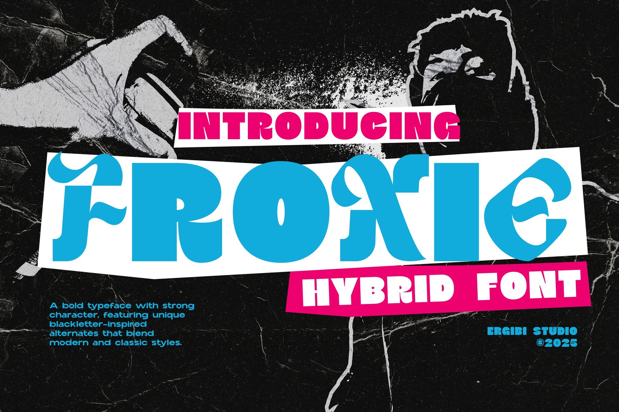
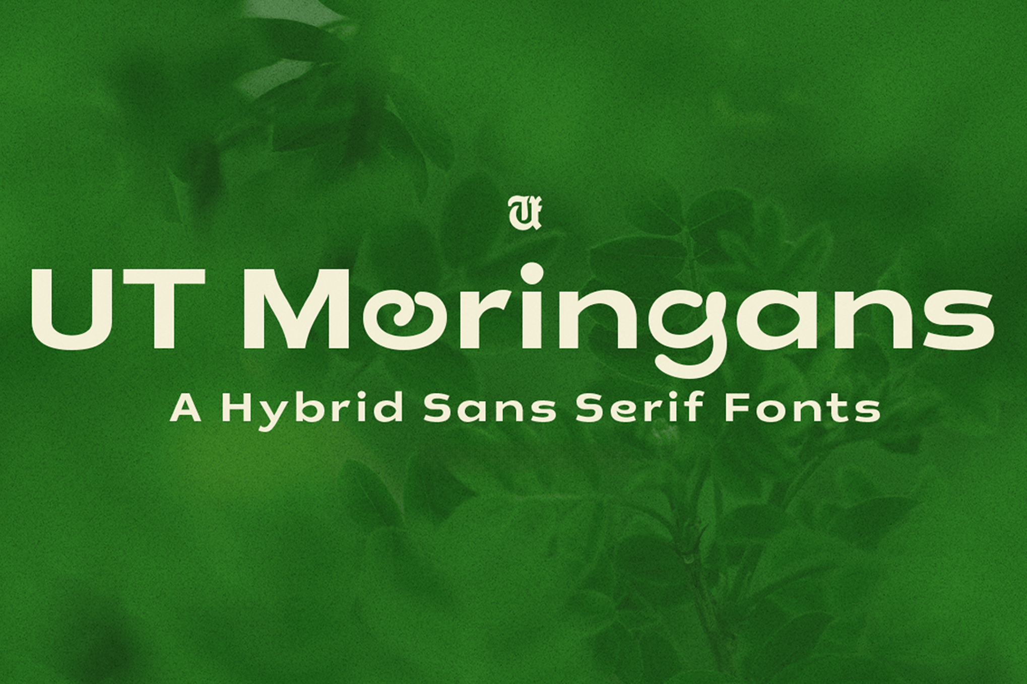
Moringans is a masterclass in conceptual design, mimicking the organic, rounded forms of nature to create a "sustainable" aesthetic. Froxie, meanwhile, bridges the gap between the historic and the modern, pairing the sharp, ornamental flair of blackletter with the clean, minimalist lines of contemporary sans-serifs.
Official Perspectives: The Designer’s Responsibility
In discussions with industry professionals, the consensus is clear: a hybrid font is only as good as its implementation. While these fonts offer immense flexibility, they require a disciplined hand.
"The danger with hybrid fonts is ‘over-designing’," says a leading typography consultant. "Because they have so much character, it is easy to let the font do all the work. The best brand systems use these fonts as an anchor, not a crutch. They must be supported by generous whitespace, thoughtful kerning, and a strict hierarchy."
Designers are encouraged to use the "80/20 rule" with hybrid typefaces: 80% of the brand system should rely on the font’s structural legibility, while 20% should leverage its decorative, hybrid elements to create focal points.
Implications for Future Design Systems
The rise of the hybrid typeface signals a broader shift in how we conceive of digital identity. As AI-generated content and automated design tools become more prevalent, the value of "human-centric" design—fonts that feel curated, intentional, and slightly irregular—is skyrocketing.
The Future of "Smart" Typography
We are moving toward a future where fonts will become even more responsive. Variable font technology, combined with the hybrid philosophy, will likely allow for typefaces that change their internal geometry based on the reader’s device or ambient light conditions. Imagine a font that is a clean, readable sans-serif on a smartphone but automatically introduces elegant serif flourishes when viewed on a high-resolution desktop monitor.
A Greener Web
Beyond aesthetics, the use of efficient, multi-purpose hybrid fonts has an environmental impact. By using a single, high-quality, versatile font file rather than multiple large files for different styles, web developers can reduce page load times and, consequently, lower the energy consumption required for data transmission.
Conclusion: Mastering the Hybrid Shift
Whether you are a freelancer crafting a logo for a boutique coffee shop or a lead designer managing a global brand’s visual guidelines, hybrid fonts offer a path to greater efficiency and higher visual impact. By mastering these tools, you are not just selecting a typeface—you are building a bridge between the functional demands of the digital age and the timeless need for human connection and artistic expression.
When you look at fonts like Lostmera, Sefrum, or the free, high-quality options like The Darling and NaN SuperX, you see a common thread: the courage to combine the old and the new. In a world that is increasingly crowded with generic visual noise, the hybrid font is your best tool for standing out, staying legible, and leaving a lasting impression.
Choose your hybrid wisely, space it generously, and watch as your brand identity transforms from a collection of assets into a unified, living language.

 Sagoh
Sagoh
 Asep Darmawan
 Raul Delapena Setiawan
 Reynand Wu

 Ali Ikhwan