
 Asro
In the modern digital landscape, where content is consumed across devices ranging from sprawling desktop monitors to compact wearable interfaces, the challenge of maintaining legibility has never been greater. As design real estate shrinks, the burden on typography grows. Whether you are building a complex data dashboard, crafting an e-reader interface, or designing the fine print of a high-end editorial document, the typeface you choose is the deciding factor between a seamless user experience and a frustrating hurdle.
Readability at small sizes is a specialized discipline that requires more than just scaling down a large font. It demands a sophisticated understanding of character structure, stroke contrast, and the nuances of negative space. This article explores the essential principles of small-text typography, highlights the premier font families currently dominating the market, and provides a professional roadmap for ensuring your designs remain crisp, professional, and accessible.
The Science of Scale: Why Readability Matters
When text is reduced to 10 points or below, the human eye begins to struggle with visual processing. The brain relies on the "gestalt" of letterforms to read quickly; if a font’s internal structures (the counters) are too closed or its strokes are too thin, those letterforms begin to blur.
A font that looks magnificent as a 72-point headline often fails in a 9-point footnote because the very features that make it "elegant" at large sizes—such as delicate serifs or high-contrast weight transitions—become visual noise at smaller scales. Professional designers understand that "small text fonts" are not merely smaller versions of standard fonts; they are engineered for endurance. They often feature larger x-heights, sturdier serifs, and more open apertures to ensure that every letter remains distinct, even when pixel density is low.
A Curated Selection: Premium Small Text Typefaces
To achieve the perfect balance of aesthetic personality and functional clarity, designers often turn to specialized font families. Here are some of the most effective solutions currently available for projects where every pixel counts.
1. Quarty: The Serif Specialist
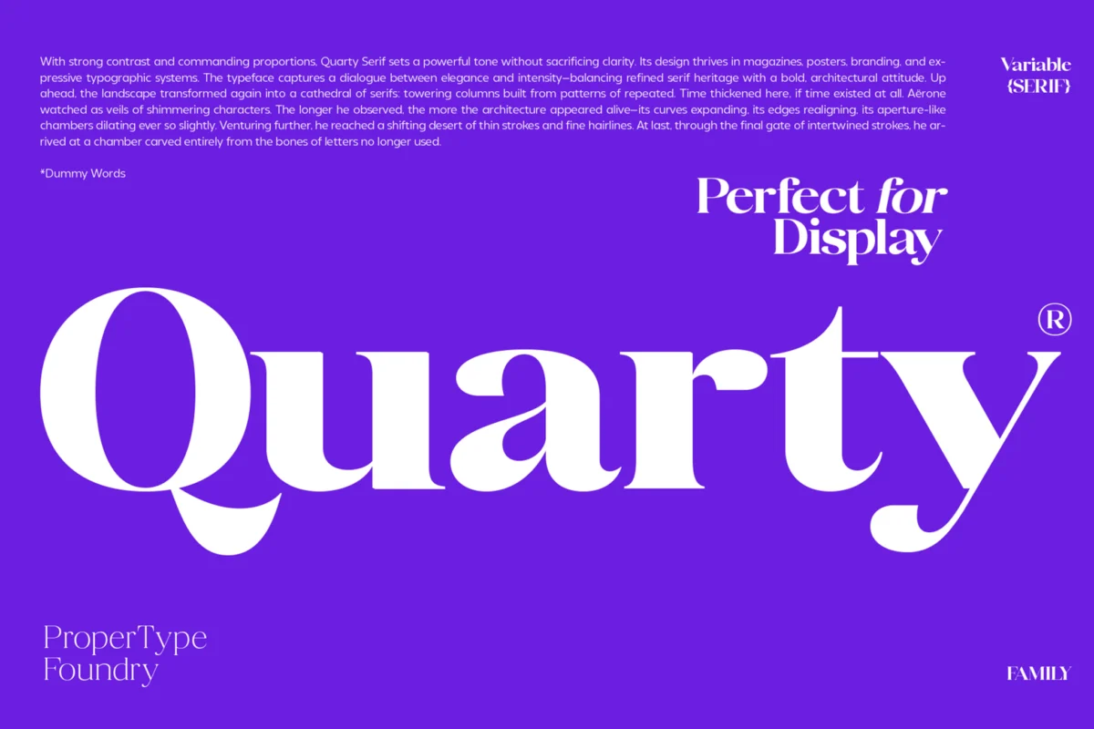
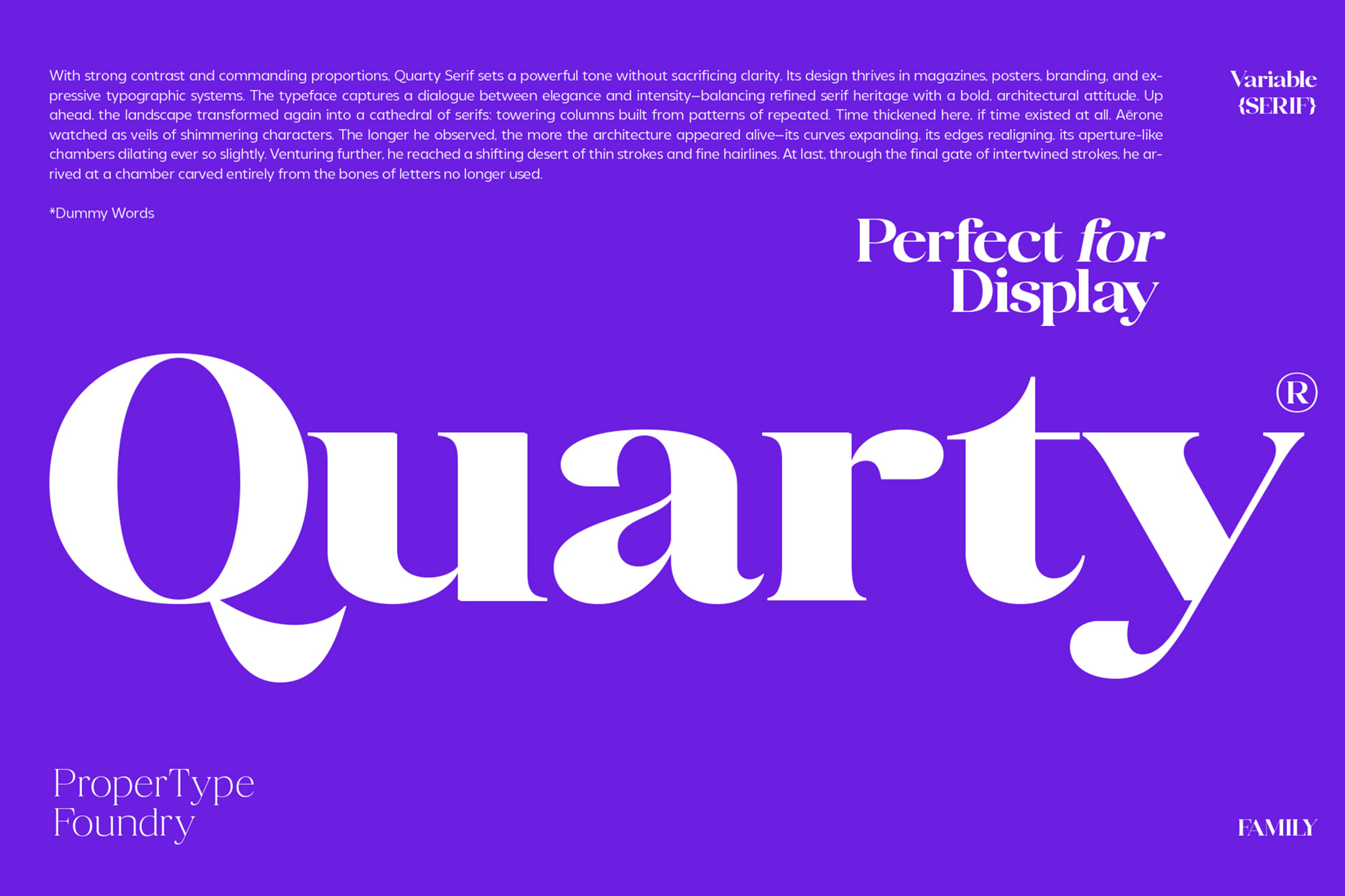
Quarty represents a masterclass in modern serif design. By blending geometric foundation with subtle, graceful curves, it manages to retain a high degree of character identity while remaining exceptionally legible at small sizes. It is an ideal choice for editorial work where you need to convey sophistication without sacrificing the reader’s comfort.
2. Carlgine: The Versatile Workhorse
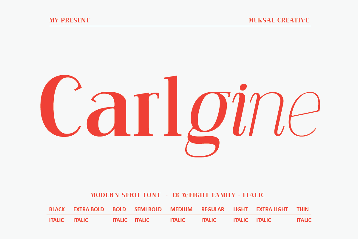
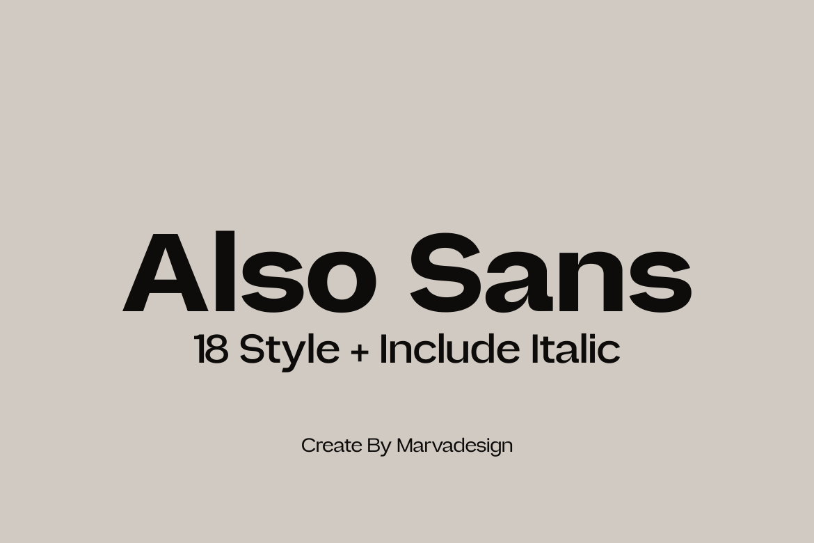
With 18 distinct weights, Carlgine is designed for the modern brand identity. It provides enough range to handle everything from thin, delicate body copy to bold, authoritative UI labels. Its extensive support for stylistic glyphs ensures that even at small scales, your text retains a bespoke, hand-crafted feel.
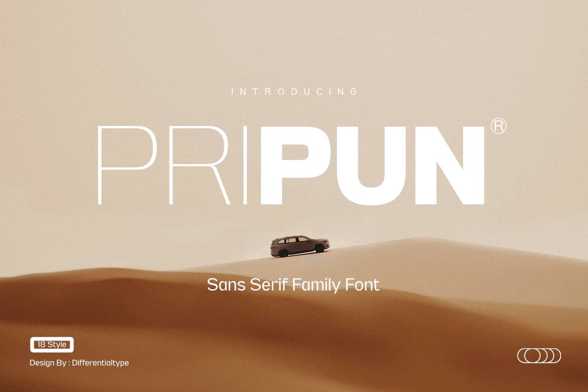
3. Pripun: Precision Sans Serif
Pripun is the epitome of the "less is more" philosophy. This sans-serif family is engineered for high-impact interfaces. Because it lacks the decorative complexity of serifs, it offers a clean, neutral reading experience that excels in dense, information-heavy environments like dashboards or financial reports.
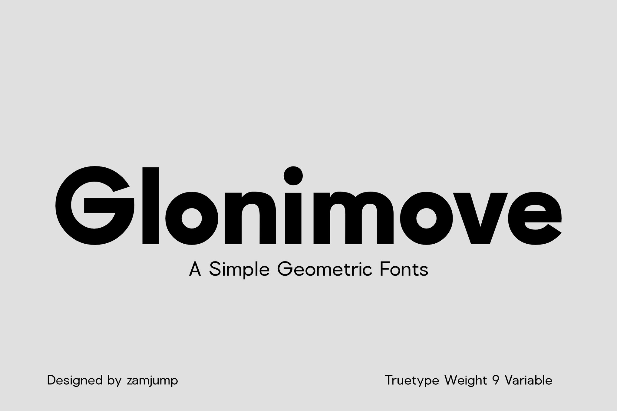
4. Glonimove: Modern Geometric Elegance
For those working in tech-forward branding, Glonimove offers a sleek, modern aesthetic. Its geometric construction is remarkably steady, providing a sense of stability that is often lacking in more "expressive" fonts. Its wide range of variable weights makes it an excellent choice for responsive design systems.
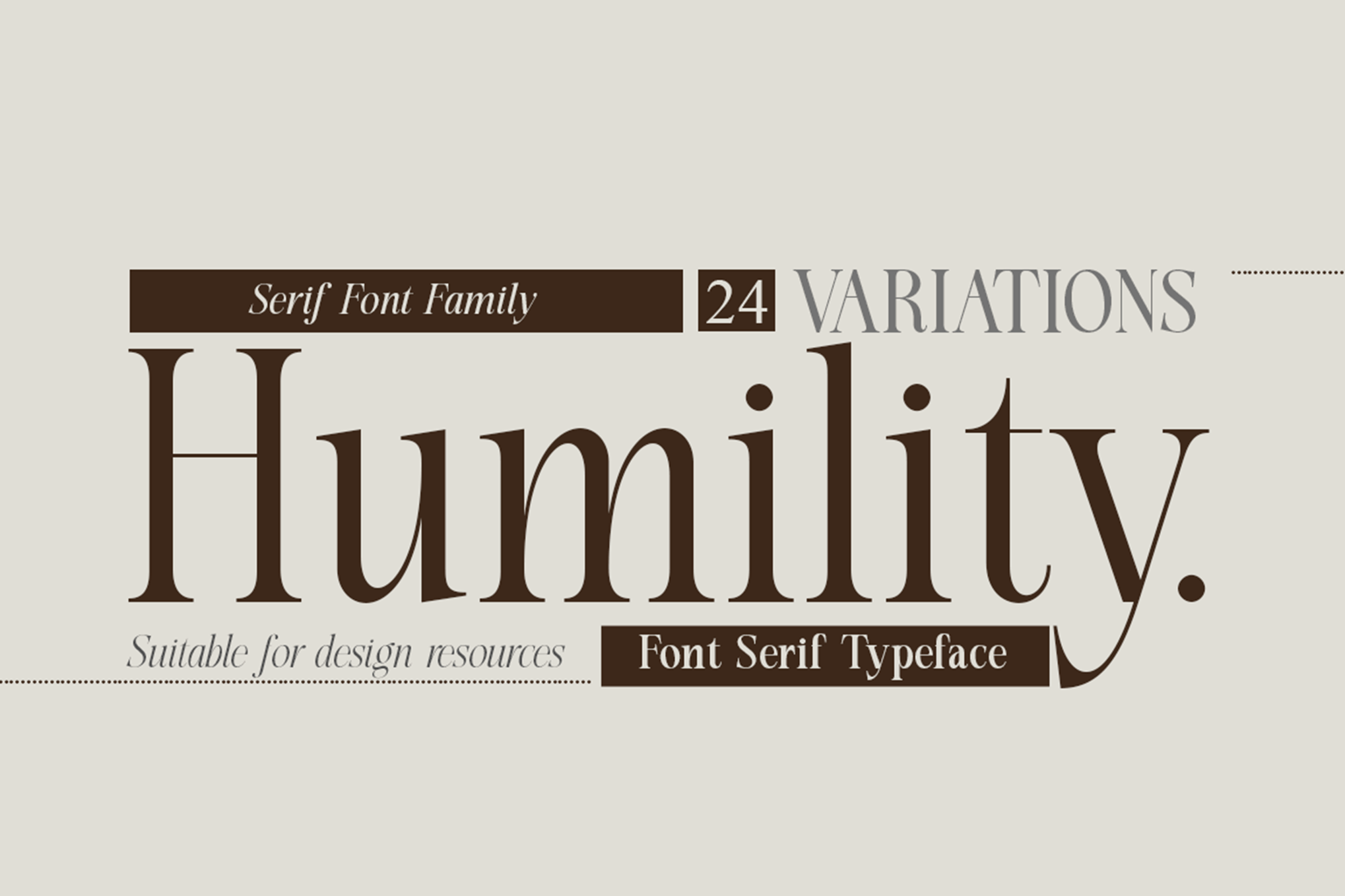
5. Humility: Vintage Flair with Modern Clarity
Humility bridges the gap between classic editorial typography and contemporary needs. It is particularly effective for fashion-forward publications or luxury branding where you want to evoke a "vintage" sentiment without forcing the reader to squint at the fine print.
Free Resources: High-Quality Type for Every Budget
You do not always need a massive budget to secure top-tier typography. The open-source and free-for-personal-use market has matured significantly, offering professional-grade tools for independent designers and small businesses.
- Caviler: A narrow sans-serif that is a miracle for space-constrained layouts. Its steady spacing prevents the "clustering" effect that often plagues narrow fonts.
- Orbito: Features rounded, friendly shapes that are highly effective for mobile apps and social media, where the user’s focus is often fleeting.
- Gudlak: A robust, professional-looking family that works exceptionally well for long-form reading, such as blogs or digital newsletters.
- Groza: A low-contrast powerhouse. By minimizing the difference between thick and thin strokes, Groza ensures that no part of the letter disappears when printed or rendered on lower-resolution screens.
8 Professional Tips for Selecting Small Text Fonts
Selecting the right font is an iterative process. If you want to elevate your typography, follow these eight expert-verified guidelines:
- Clarity Above All: Never sacrifice readability for a "unique" look. If a user cannot distinguish an ‘e’ from a ‘c’ at a glance, the font has failed, regardless of how beautiful it is.
- Prioritize Large x-Heights: The x-height is the height of lowercase letters like ‘x’ or ‘o’. A larger x-height relative to the capital letters makes a font appear larger and more readable at small sizes.
- Monitor Stroke Contrast: High contrast (the difference between the thick and thin parts of a letter) is a major culprit in small-text illegibility. Stick to "low-contrast" fonts for body copy.
- Evaluate the Counters: The "counter" is the empty space inside a letter (like the center of an ‘o’ or ‘a’). Ensure these are open and clear; if they are too small, they will fill in at low resolutions.
- Test at Actual Size: Never evaluate a font in your design software at 200% zoom. Zoom out to 100%—or better yet, print a proof—to see exactly how the letters will look to the end user.
- Optimize for Screens: Digital screens have specific rendering challenges. Look for fonts that mention "hinting" or "screen optimization" in their technical specifications.
- Limit Decorative Details: Avoid fonts with ornate flourishes, excessive ligatures, or highly unconventional shapes for small-text applications.
- Weight Matters: In many cases, a "Regular" or "Medium" weight is more readable than a "Light" weight at small sizes. The extra ink density (in print) or pixel density (on screen) provides better visual anchor points for the eye.
Implications for Future Design
As we move toward a future of augmented reality, smartwatches, and increasingly compact interface designs, the importance of micro-typography will only grow. The ability to render text that is simultaneously beautiful and functional at 4-point or 6-point sizes is a skill set that distinguishes a junior designer from a master of the craft.
Typography is the interface between information and the human mind. When we design for the smallest scales, we are not just choosing a font; we are ensuring that the message survives the medium. By adopting these rigorous standards, you ensure that your work remains timeless, legible, and profoundly effective, no matter how small the screen may be.
Invest the time in testing your font choices, respect the physics of optical character recognition, and prioritize the comfort of your reader. In the world of design, the smallest details often yield the largest impact.

 Sagoh

 Asep Darmawan

 Raul Delapena Setiawan

 Reynand Wu



 Azzam Bilal Chamdy

 Ali Ikhwan
